Typographical correspondence
mediation – edition – graphic design – typography
Typographical
correspondence
Date
– 2014
Client
– Personal project
Role
– artistic direction
– graphic design
– edition
– mediation
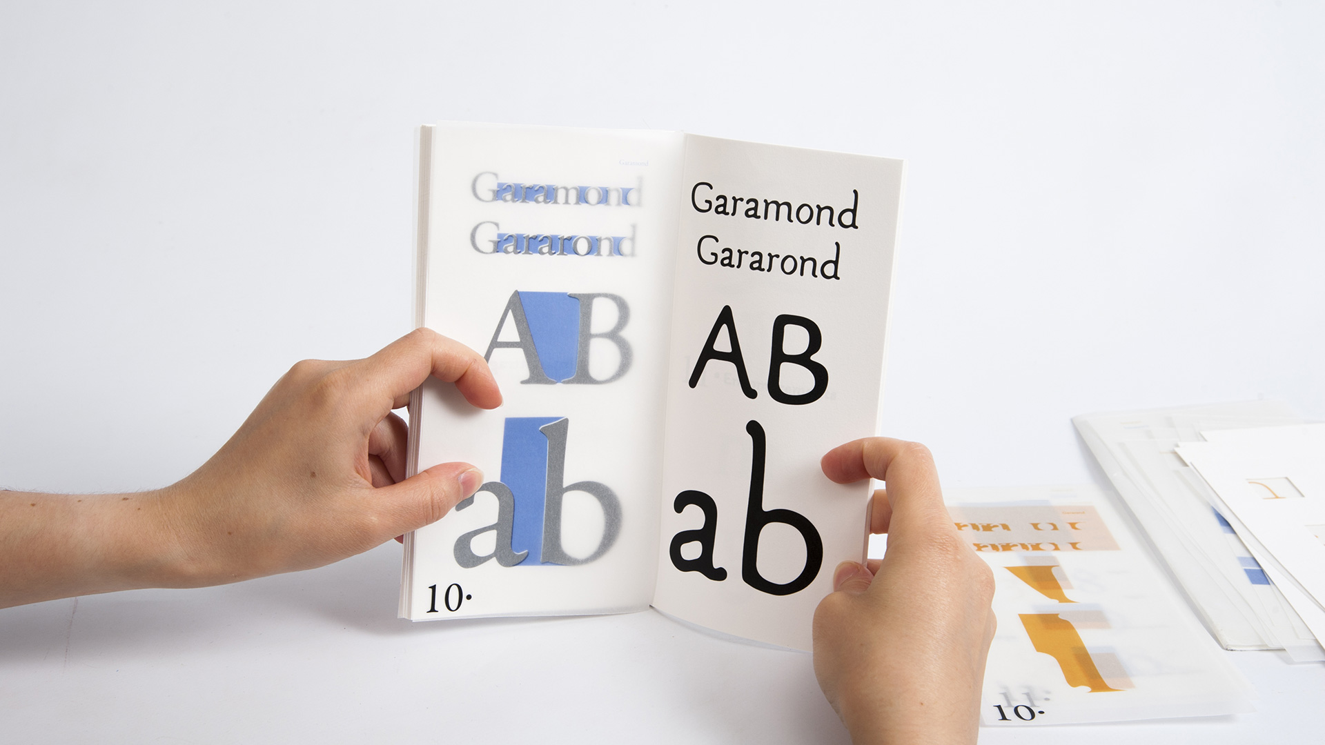
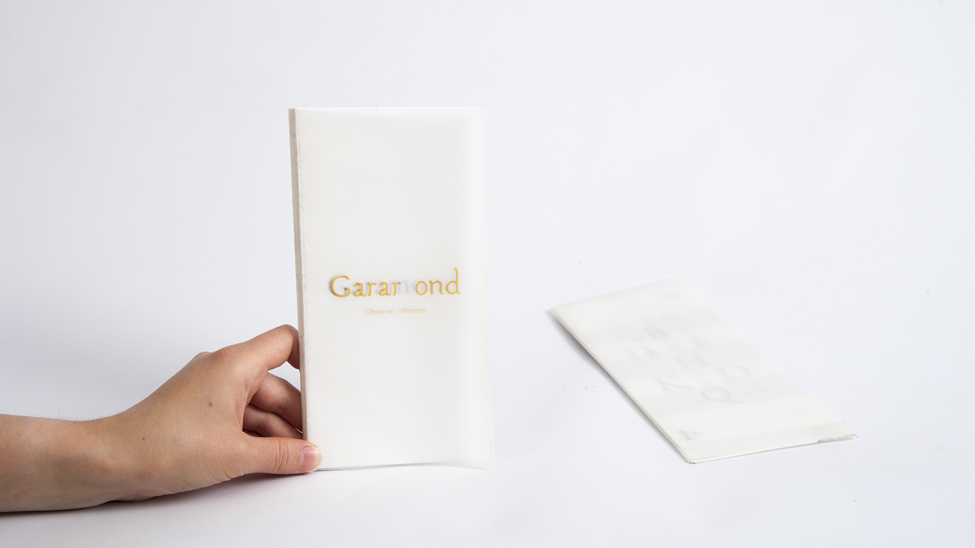
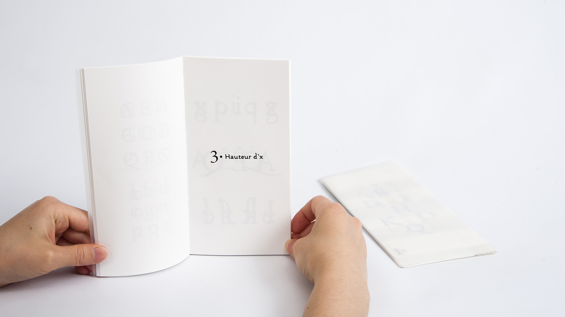
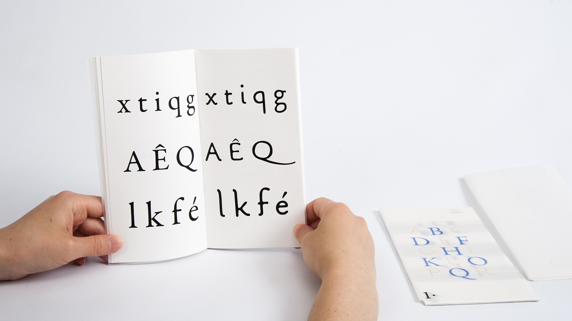
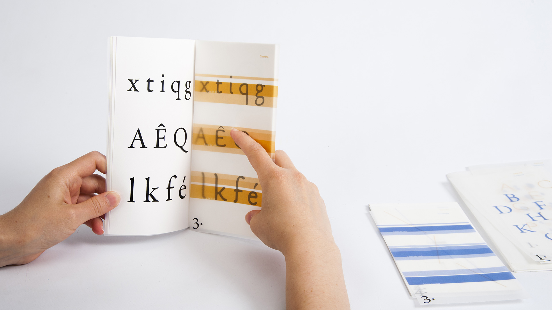
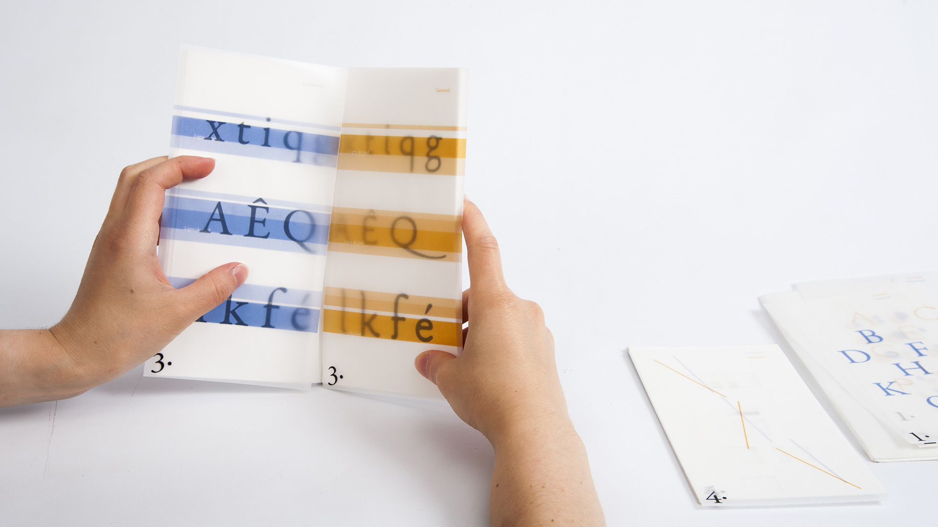
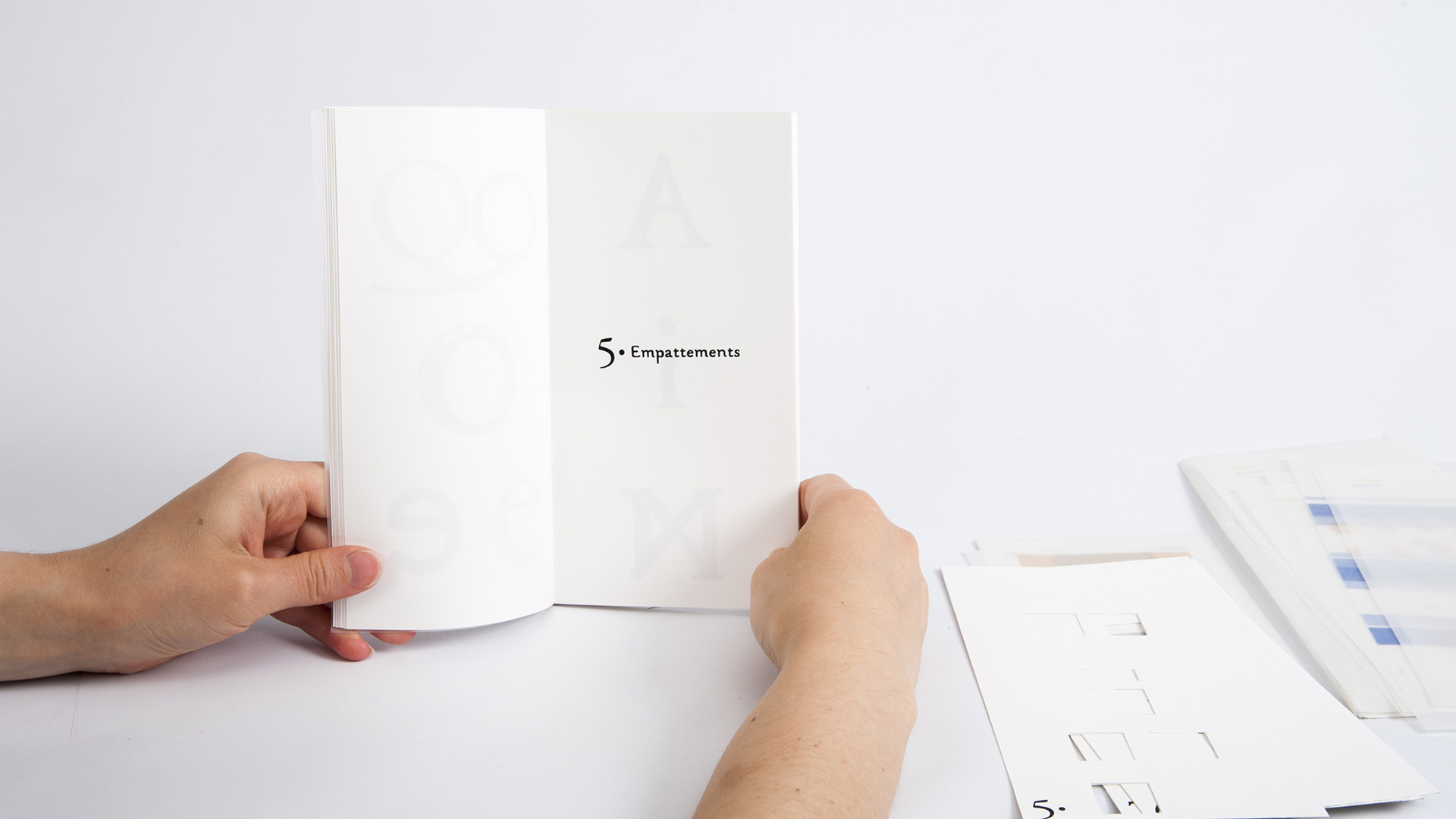
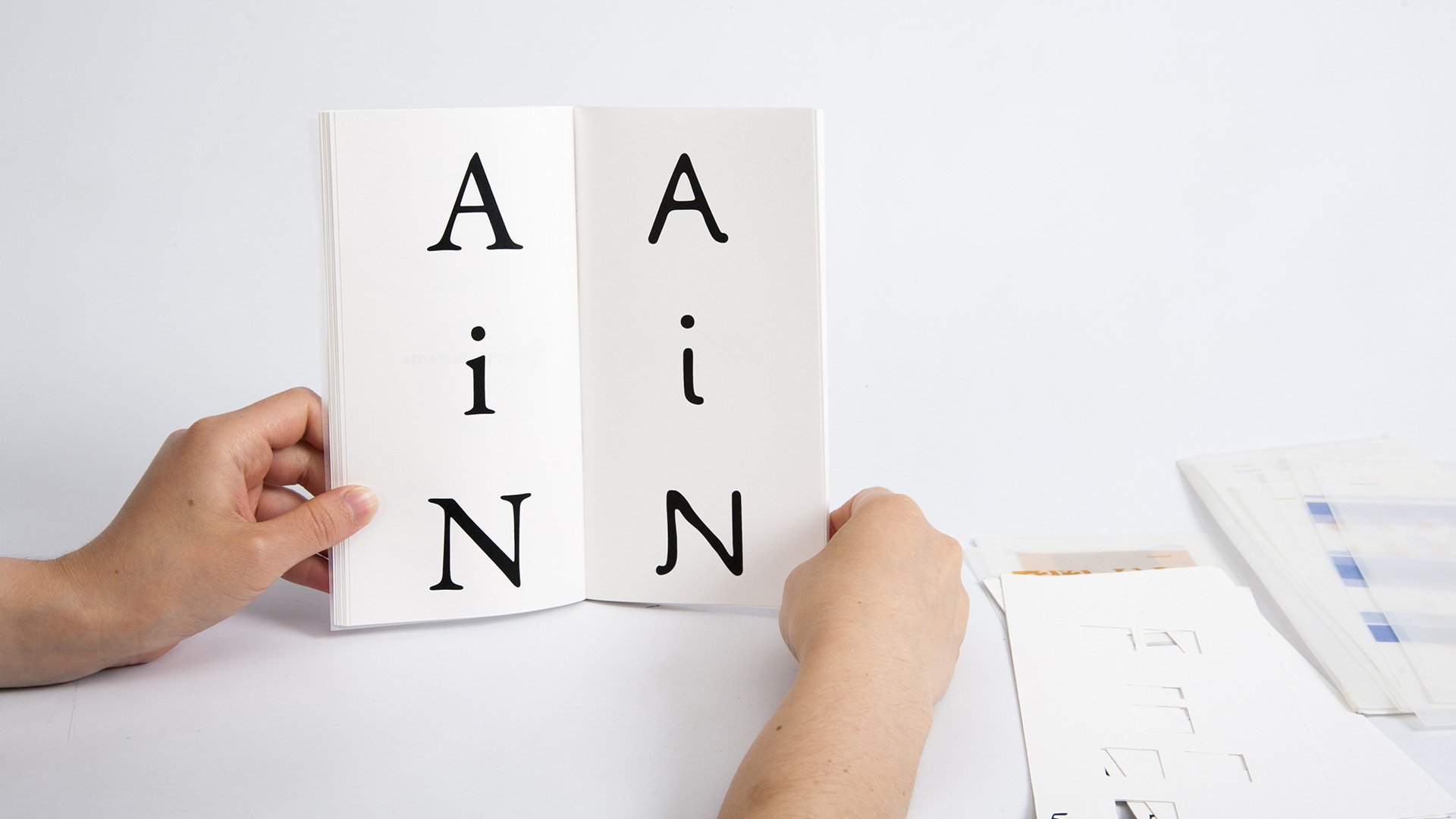
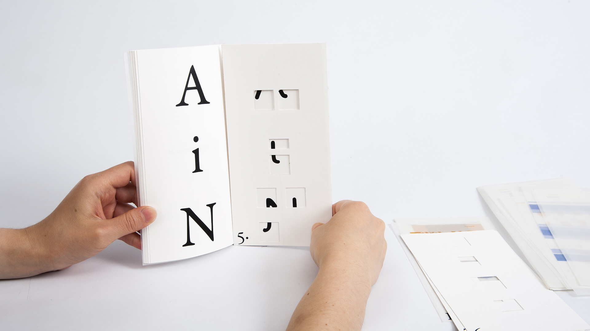
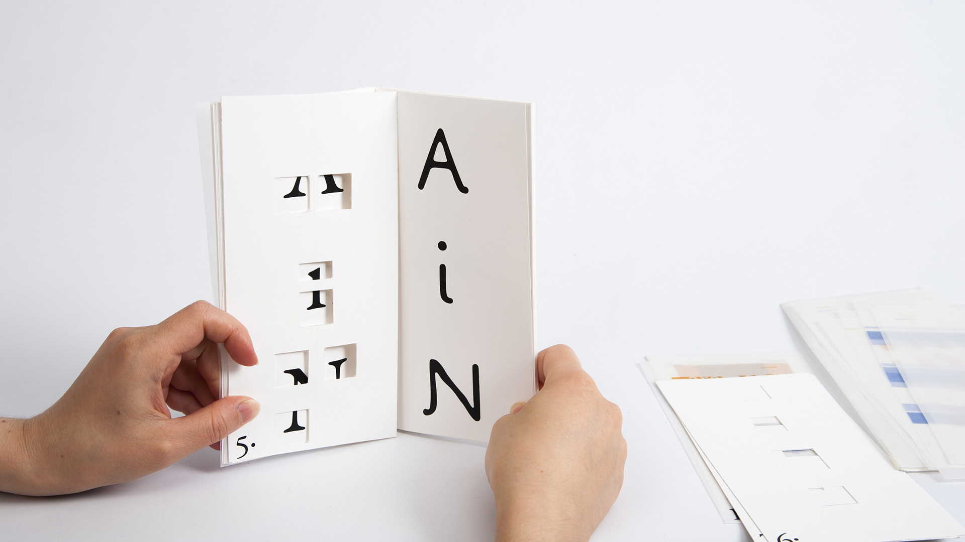
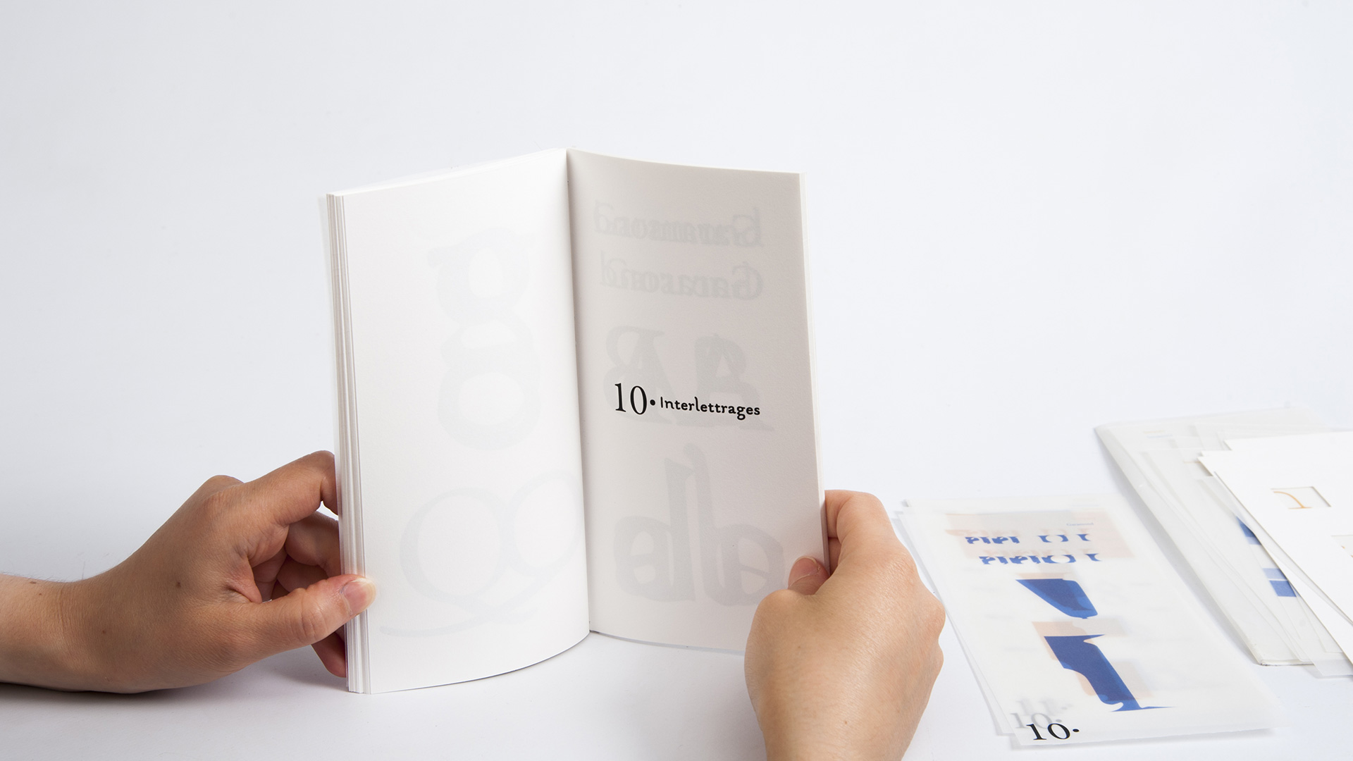
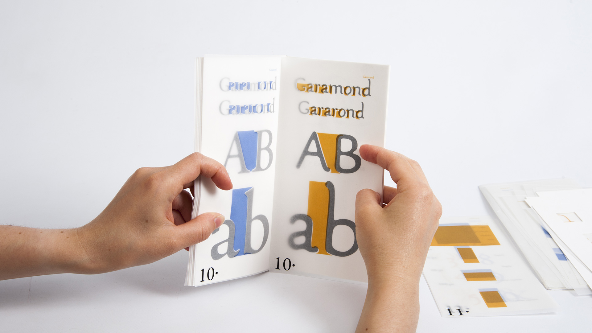
Creation of a didactic booklet to compare the two font: Garamond and Gararond. This project is aimed at both passionate typographers and neophytes who want to develop their knowledge of typography. Thanks to the use of numbered layers (according to the concept studied – there are 14 which are discussed), it’s possible to compare the two typographies employing superposition sets. These layers make it possible to understand the concept studied in the double page (wheelbases, height of x…) but also to compare the Garamond (in blue) and the Gararond (in orange). The reader is therefore an actor in comparison and not a mere spectator. It is up to him to manipulate to understand the notions addressed and the typographical differences.