C3 Glomerulopathies portal: Designing clarity in an almost empty landscape
Ux research – UX/UI design -content structuration – art direction – strategic design
C3G & IC-MPGN Glomerulopathies portal
Designing clarity in an almost empty landscape
Date
– 2025
Client
– Sobi Global – Nephrology
with Vivactis agency
Role
– Ecosystem & competitive analysis
– Research design & questionnaire development
– Patient journey mapping
– Insight synthesis
– Content audit & structuring
– Information architecture
– Feature matrix definition
– Wireframing
– Art direction & template design
– Cross-stakeholder mediation
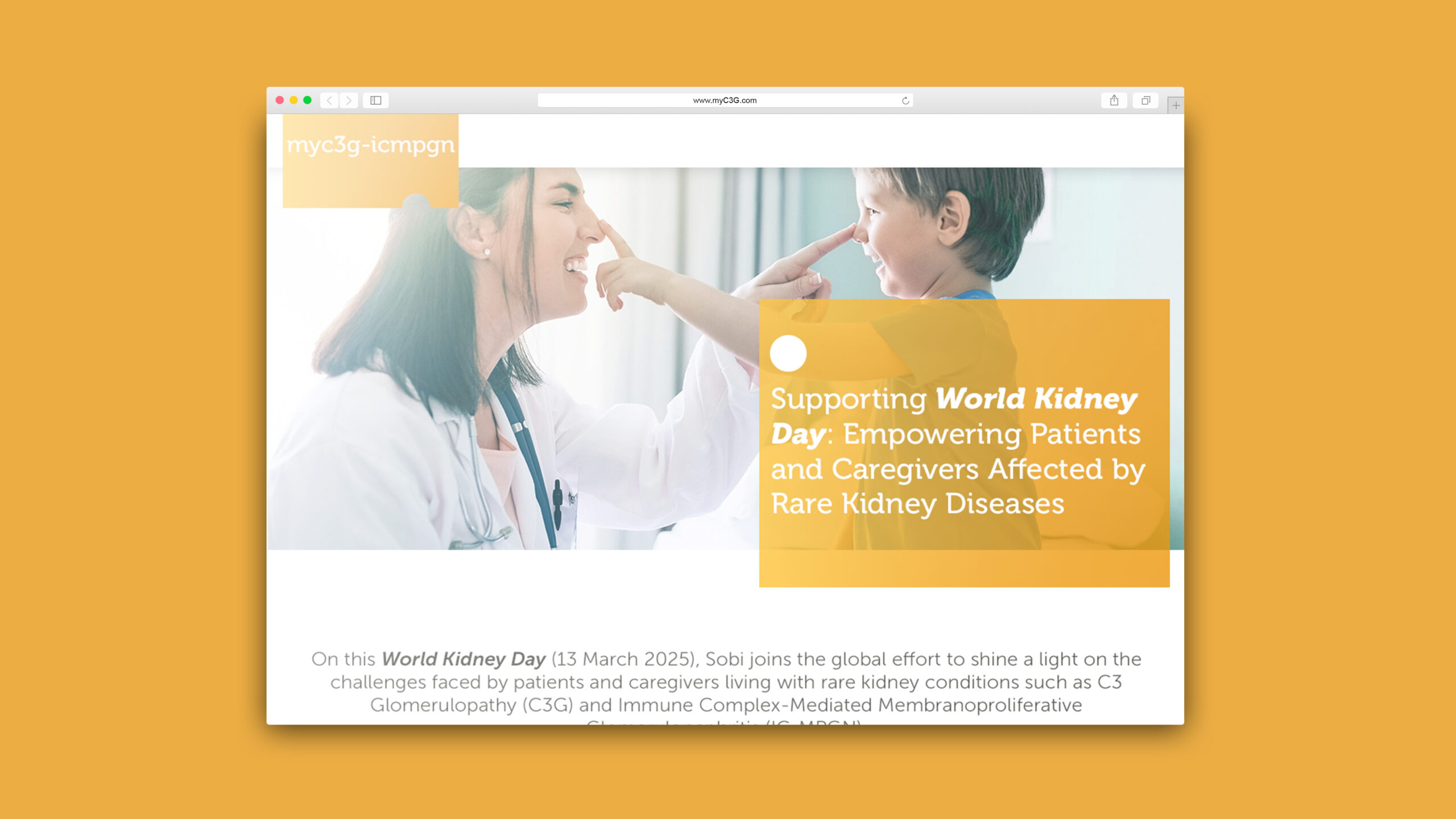
Sobi’s digital presence for C3 Glomerulopathies (C3G & IC-MPGN) was limited to a single awareness landing page, primarily centered on World Kidney Day messaging.
It offered minimal pathology-specific information in a context where: the diseases are ultra-rare, the complement system is complex and poorly understood by the public, patient associations are scarce and mostly non-specialized, pharmaceutical data is often confidential or unpublished, some competitors’ patient platforms have disappeared following acquisitions (e.g., Achillion’s WeC3G), the digital landscape is split between patient-facing and HCP-facing content…
The opportunity was to position Sobi as a credible, long-term digital reference for patients and caregivers through a structured, SEO-driven, patient-centered platform.
Before initiating user research, I conducted a full digital and scientific landscape analysis.
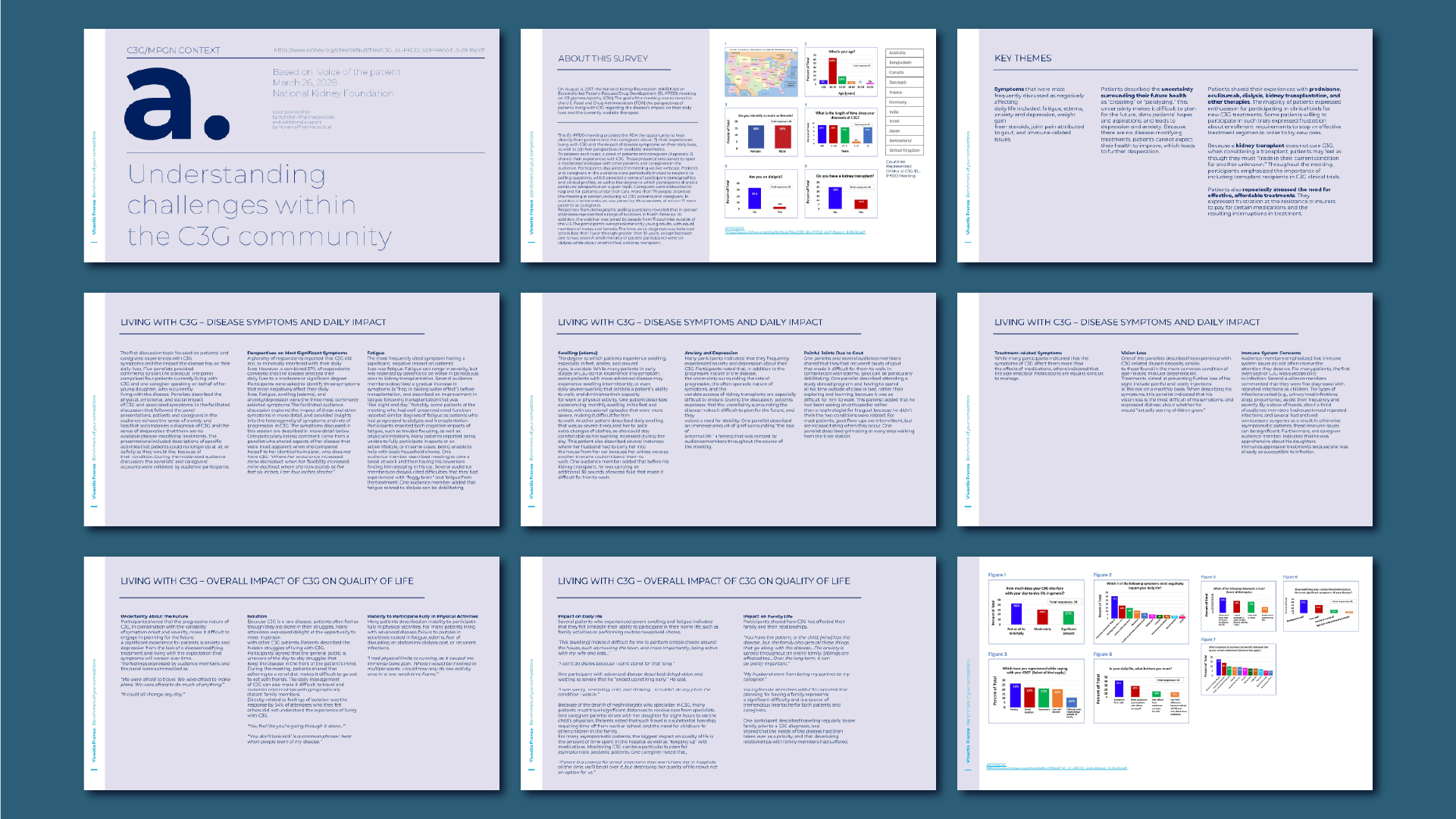
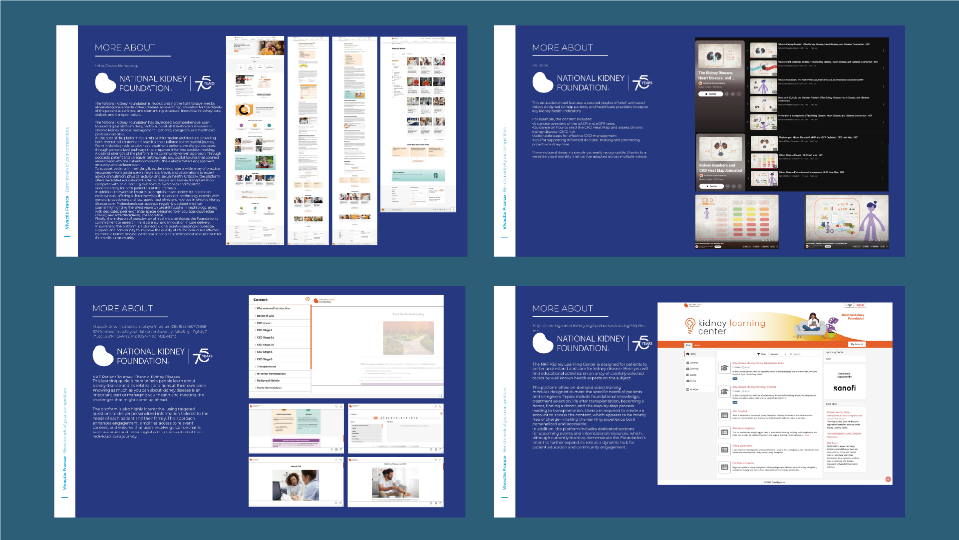
I review the major publications on this pathologies, including Voice of the Patient (National Kidney Foundation, 2023)
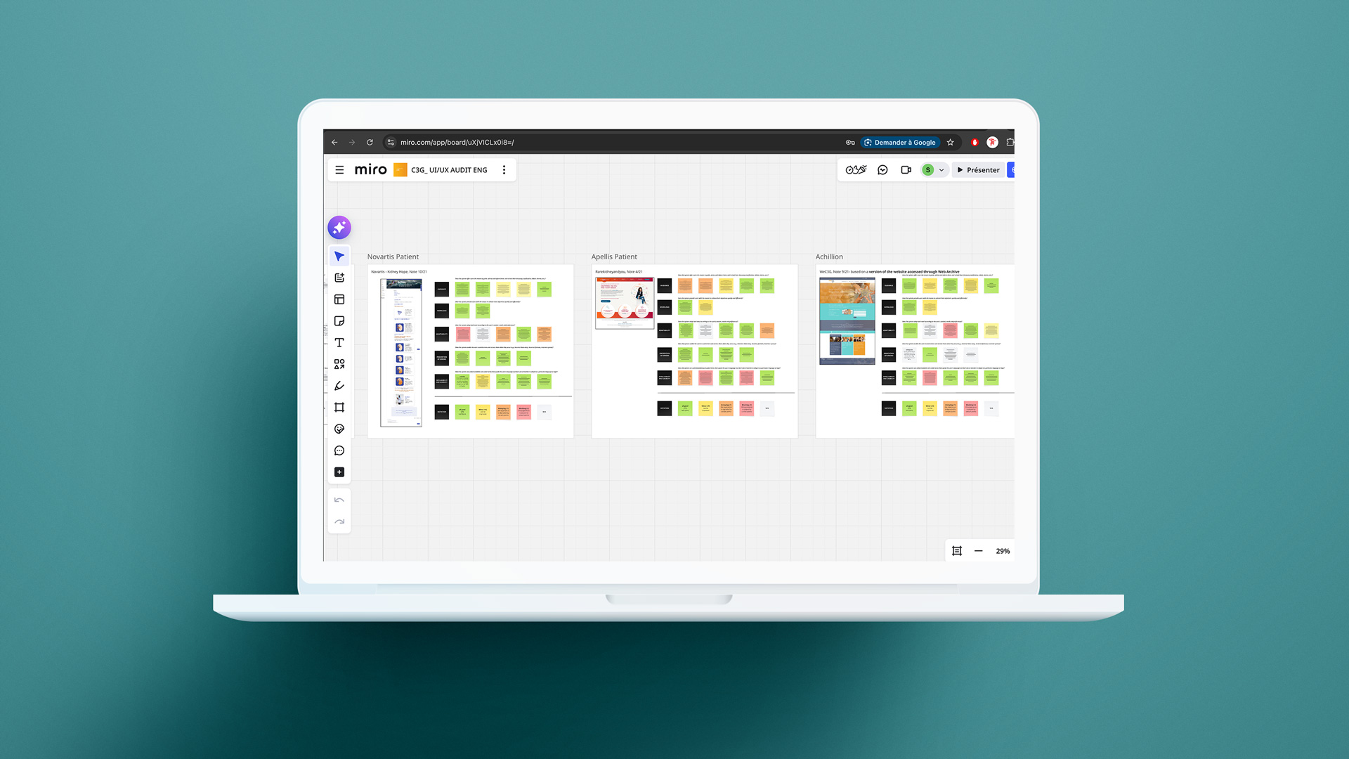
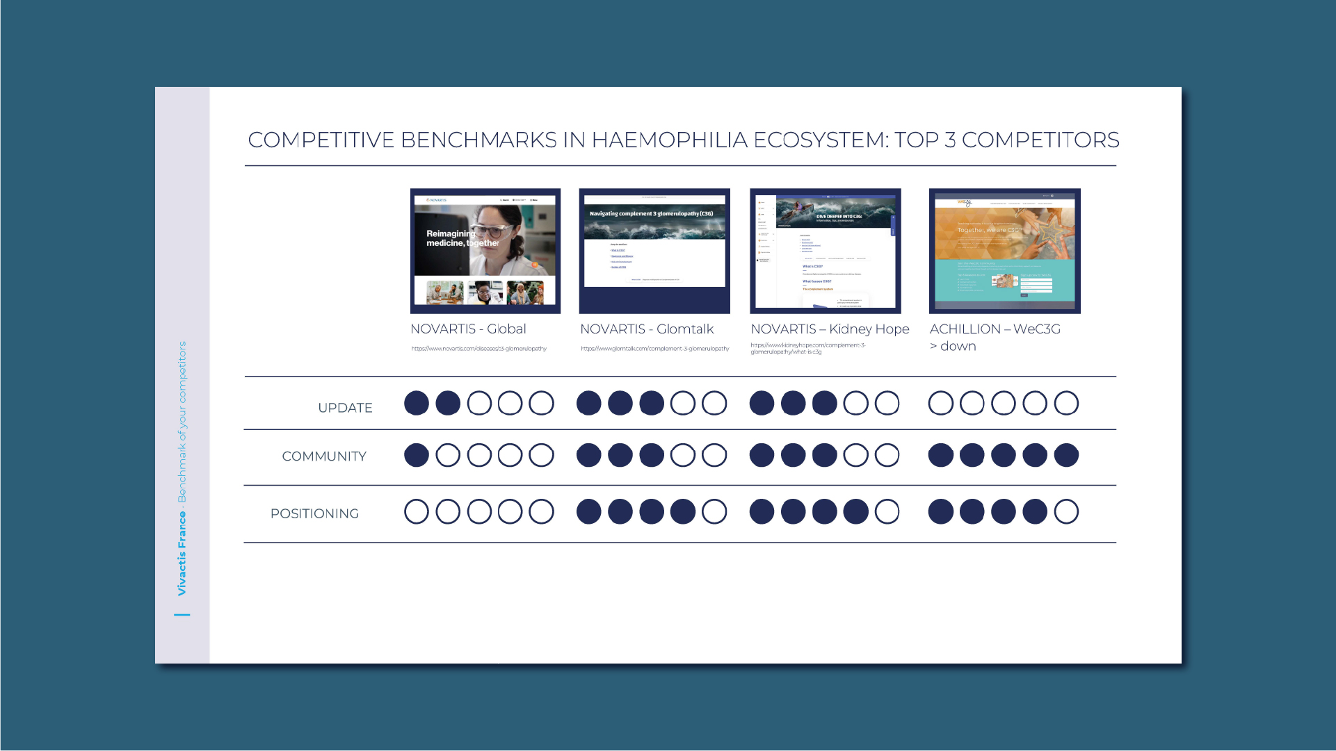
I subsequently conducted a competitive analysis between the main Sobi’s competitors : Novartis (global, kidney hope & GlomTalk), Achillion (archived WeC3G), Silence Therapeutics, Apellis. I also conducted an audit of rare nephrology expert centers and a benchmark of chronic kidney disease patient organizations and their digital services
I discovered that the informational ecosystem is fragmented, unstable, and largely driven by non-specific patient associations (rare kidney disease) rather than industry. This created both a reputational risk and a strategic SEO opportunity.
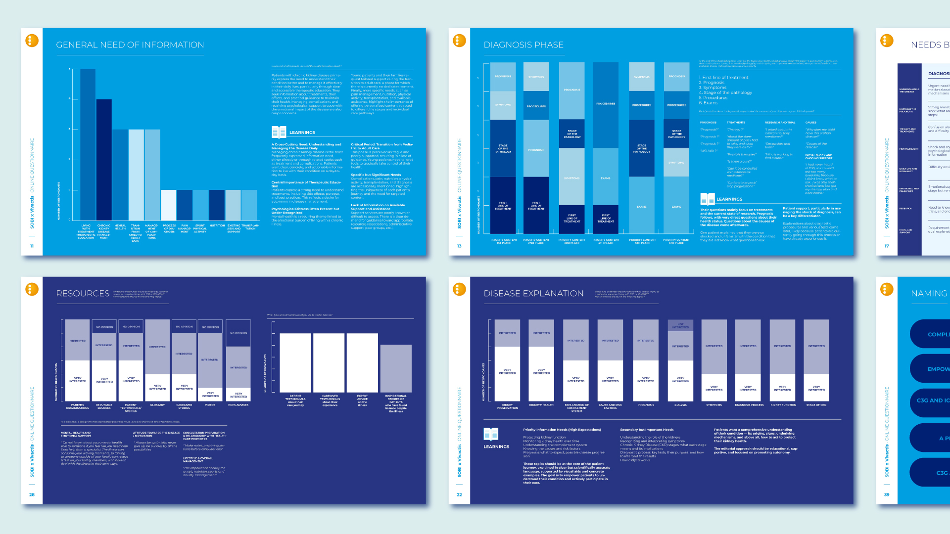
But the core of the project was patient involvement so I implemented a structured UX research phase.
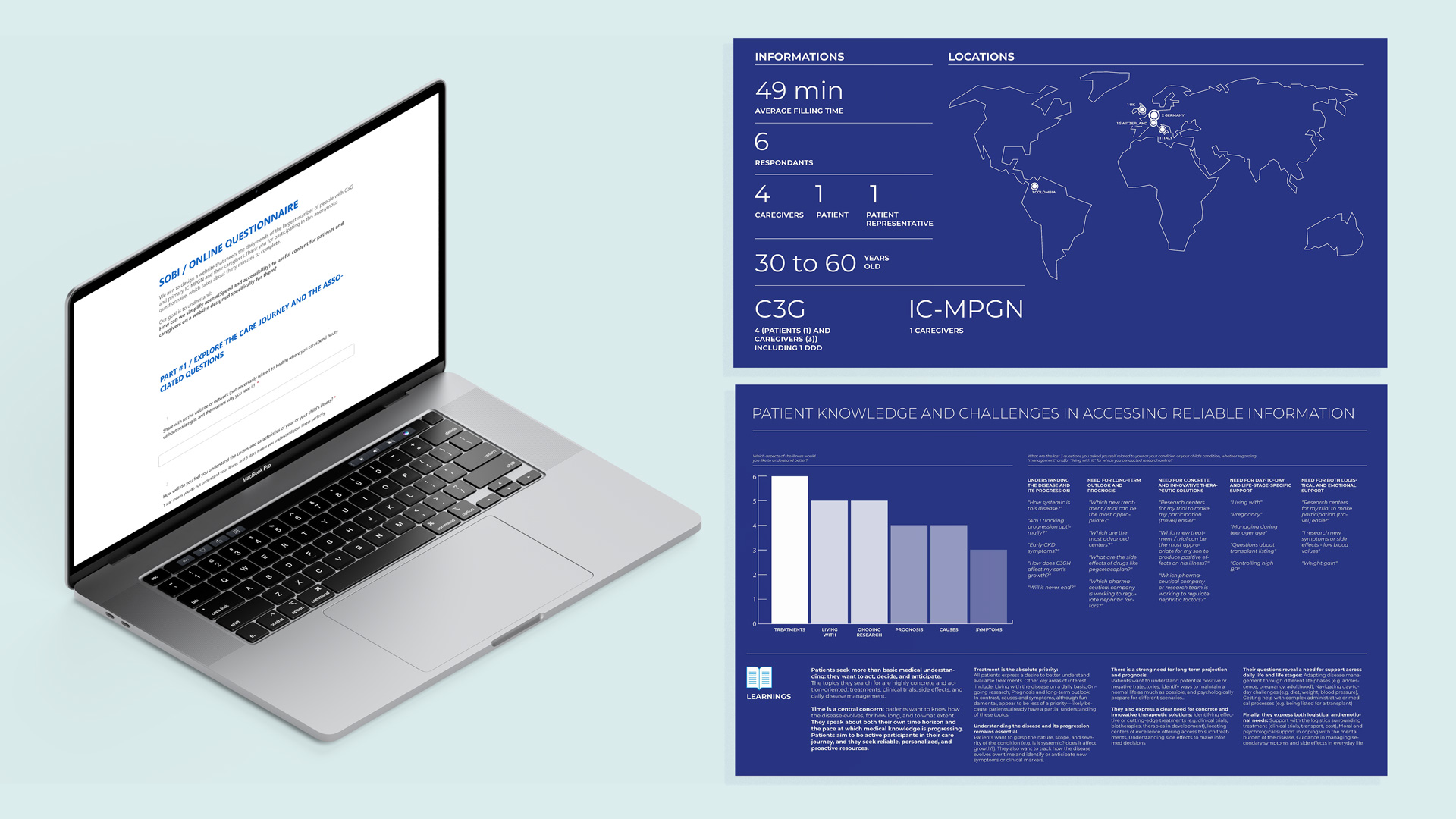
Through patient associations, we were able to recruit patients and caregivers with diverse profiles (age, stage of the disease, type of condition, etc.). Given the rarity of the pathology, we gathered a panel of six participants from Germany, Italy, Colombia, the UK, and Switzerland.
I designed a detailed online questionnaire and structured a patient feedback process to explore their care journeys, their content gaps and pain points, the emotional experience, the care journey friction points, their digital service and formats expectations (search, saving content, tools) and their tone and format preferences.
Using an online English-language questionnaire (with an average completion time of 49 minutes), we guided participants through a structured patient journey draft to gather qualitative insights on their needs, as well as feedback on content prioritization, information architecture, and proposed digital services.
After individual responses, I synthesized findings and presented them to the patient panel for validation and discussion, creating a feedback loop between individual insight and collective validation.
Three pillars emerged:
1. Understanding is empowerment.
Patients need clear explanations of the disease, complement system, test results, and prognosis in simple but never simplistic language.
2. Treatment transparency reduces anxiety.
Side effects, clinical trials, transplantation clarity matters more than reassurance.
3. Living “normally” is essential.
Nutrition, work, mental health, school, travel… daily life content is as important as medical content.
They expressed the need for all of this to be centralized on a single platform, structured through a coherent and educational narrative : they needed structured, navigable, human information.
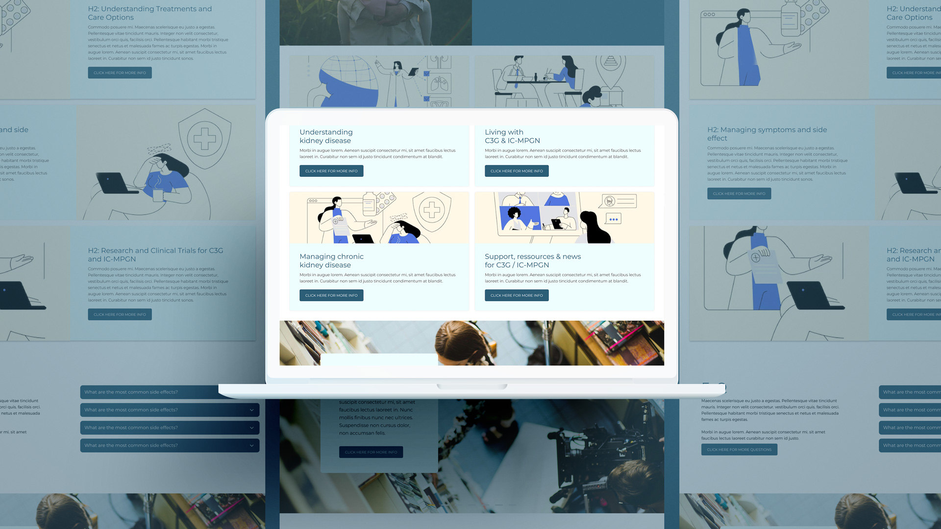
Following the research phase, I led the information architecture design, structuring the platform into five distinct yet interconnected pillars reflecting real patient needs across their journey.
The first pillar, Understanding Kidney Disease, was designed as a funnel-based educational pathway. This section provides essential foundational knowledge for patients and caregivers, particularly at or around the time of diagnosis. The strategic principle was simple: to live better with a disease, you must first understand it. The content moves intentionally from general to specific, from CKD to C3G/IC-MPGN, supporting patients before diagnosis, at diagnosis, and during early understanding.
The second pillar focuses on Living with the Disease. While the first section builds knowledge, this one supports day-to-day adaptation. It delivers practical guidance to help patients maintain a sense of normalcy and control after diagnosis and during treatment. This section shifts the narrative from “understanding” to “coping and acting.”
The third pillar, Managing Chronic Kidney Disease, addresses treatment literacy and care navigation. Designed to support patients from diagnosis through long-term follow-up, this section balances a primary CKD focus while ensuring relevance for C3G and IC-MPGN. It is structured into three core areas.
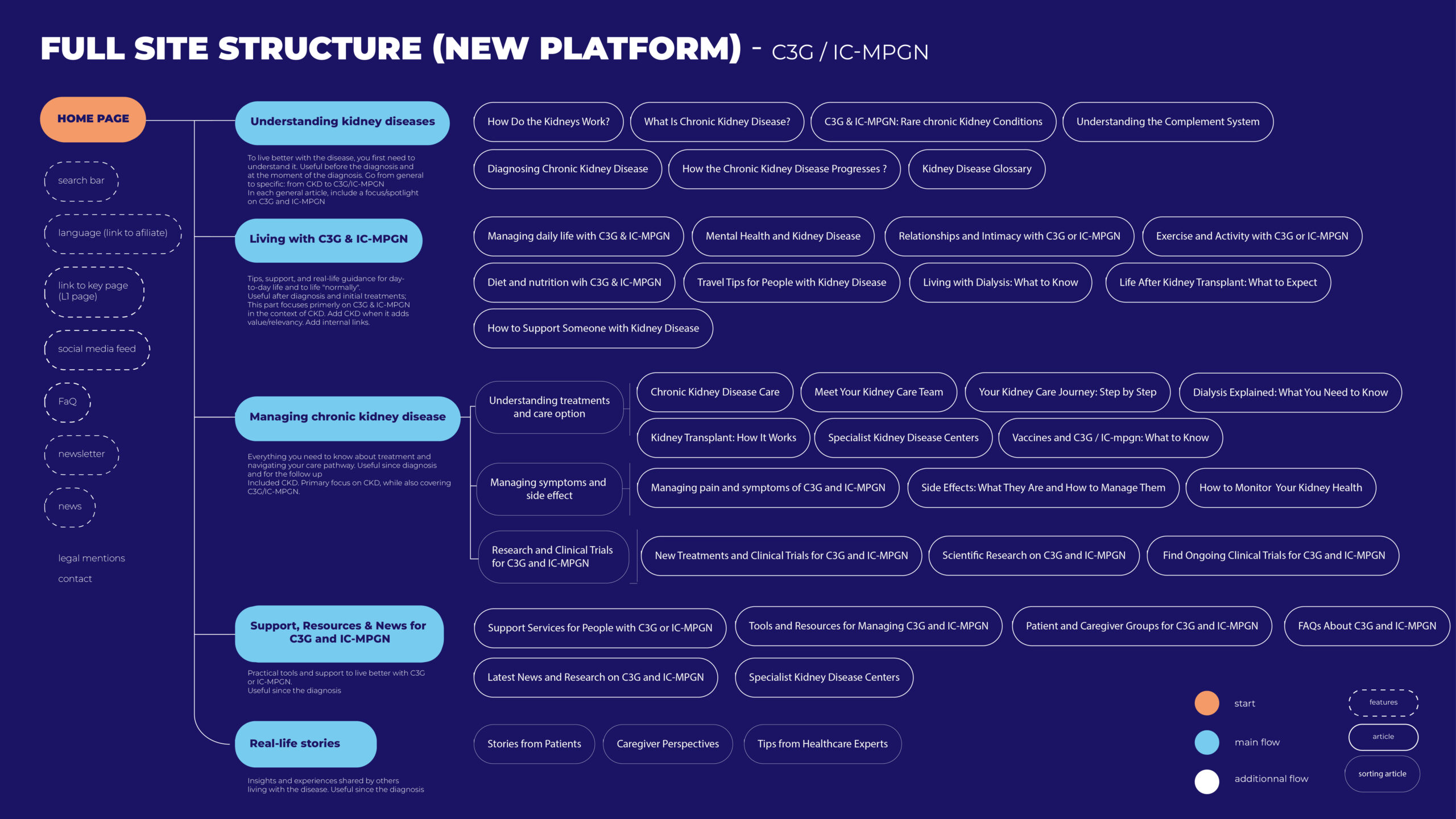
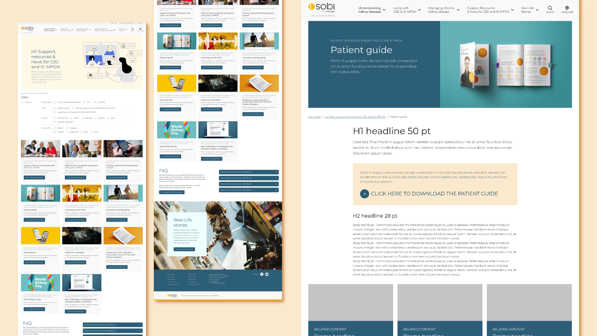
The fourth pillar, Support, Resources & News, centralizes practical tools and external support mechanisms available to patients with C3G and IC-MPGN. From diagnosis onward, patients can access support services, existing tools and educational resources, patient associations and peer groups, FAQs, scientific updates, and expert nephrology centers. This section strengthens empowerment through access and orientation.
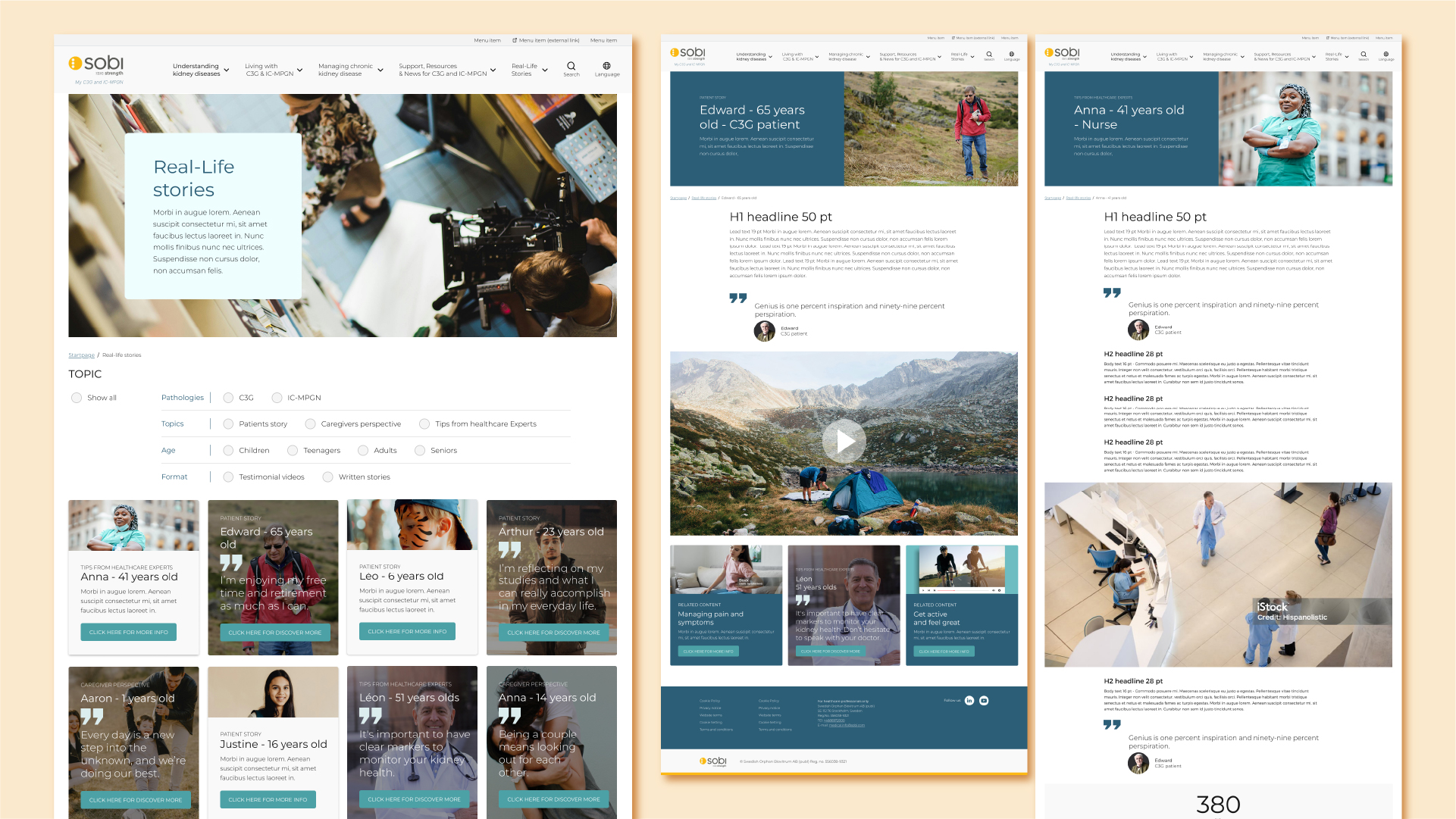
The final pillar brings forward Patient and Caregiver Stories, alongside insights from specialists. These testimonials humanize the experience, reinforce credibility, and create emotional reassurance. Beyond information, this section builds identification and trust, allowing patients to see themselves reflected in others’ experiences from the moment of diagnosis onward.
I worked with an Sobi’s SEO expert to be sure to use the right naming of the different part. Once the architecture was validated, I sequenced the roadmap strategically. The platform needed to launch quickly, while the medical copywriting agency could not produce all content simultaneously. I worked on prioritization scenarios, defining which pillars and modules were critical for launch and which could be phased.
In parallel, I acted as the voice of the patient in discussions between the pharmaceutical laboratory and the medical writing agency, ensuring that strategic decisions remained aligned with patient insights, real-life needs, and usability principles.
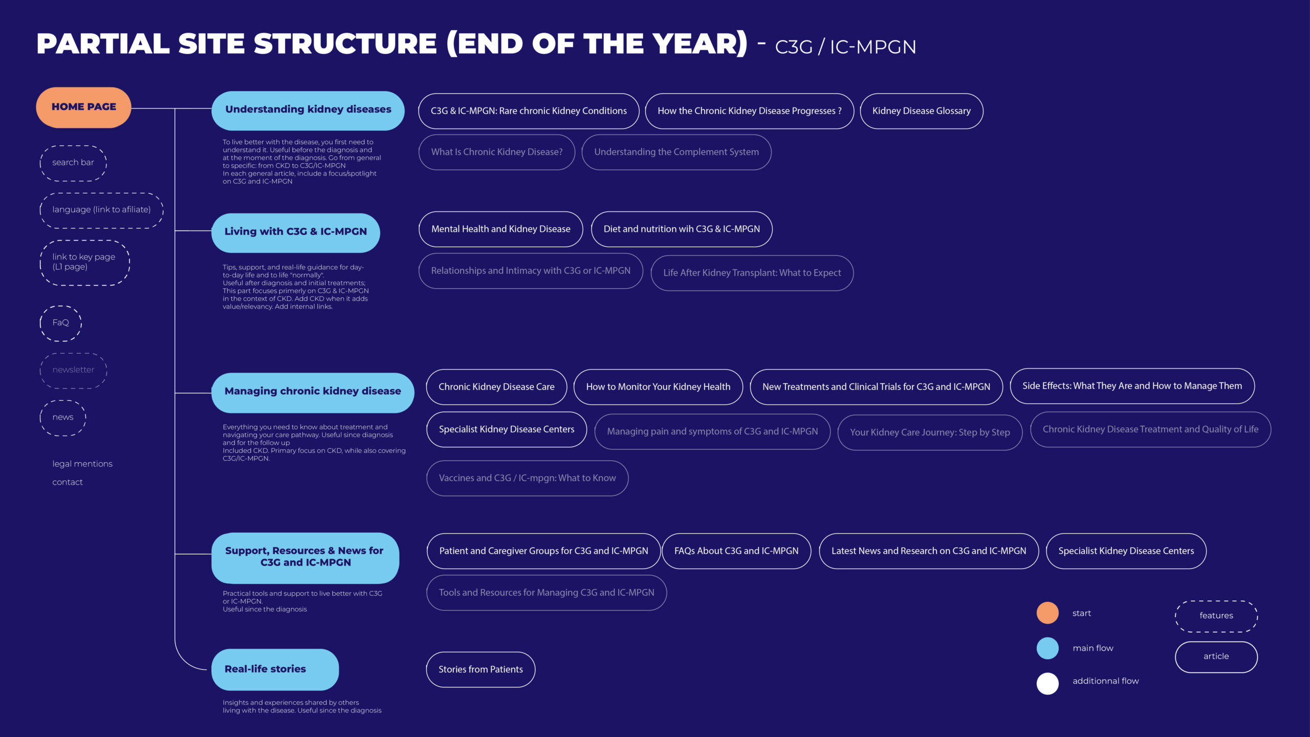
Grounded in patient insights and ecosystem benchmarking, I identified key content typologies and designed a phased feature strategy aligned with evolving user needs across platform versions. This enabled us to establish a structured content roadmap and clearly prioritize upcoming actions across imagery, visual assets, and medical copy production.
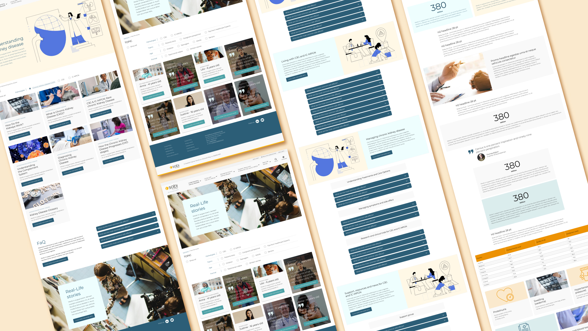
The next phase focused on wireframing and template design, structured around a modular Drupal component system.
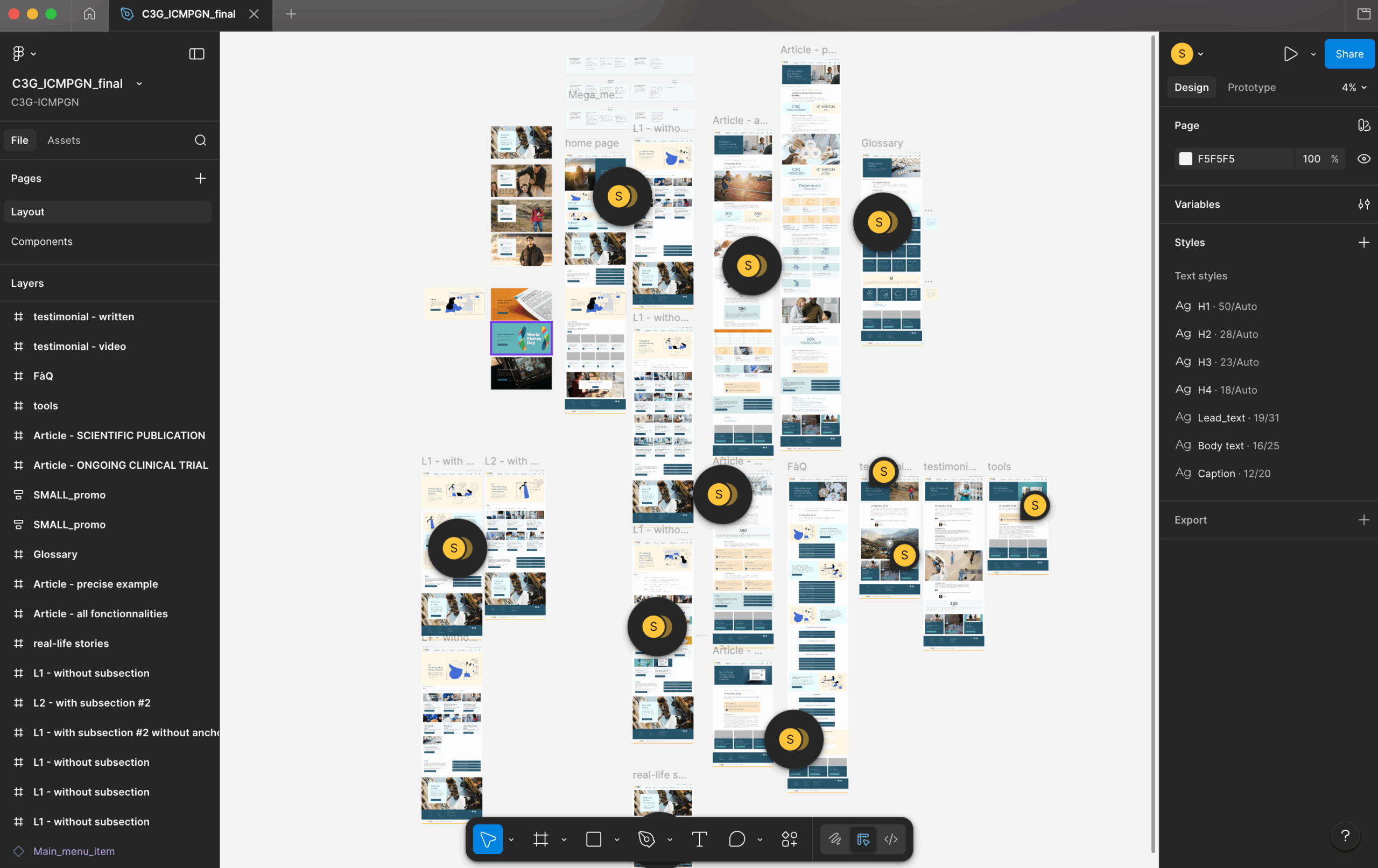
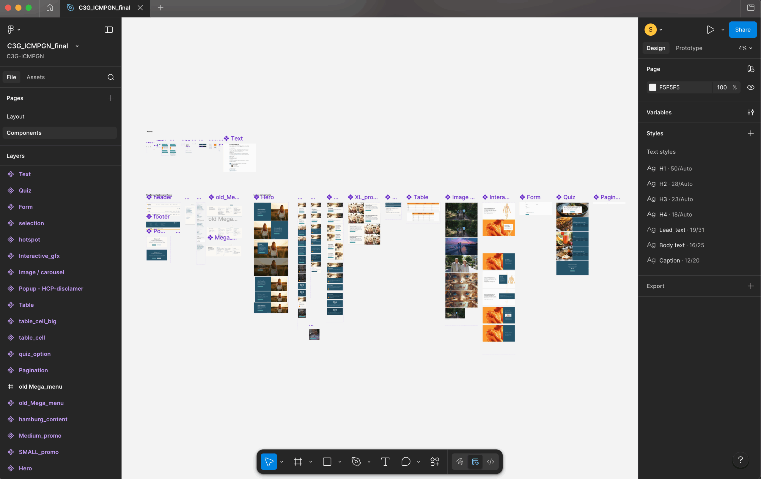
I leveraged existing design foundations, which I then enriched and adapted to meet specific patient and content needs. The process was highly iterative, involving continuous validation with marketing, medical, copywriting, and development teams.
We moved progressively from low-fidelity wireframes to high-fidelity mockups to ensure alignment across stakeholders and secure consensus on the overall direction. I created detailed documentation to empower content teams to construct pages independently, ensuring they understood the purpose and proper use of each modular component.
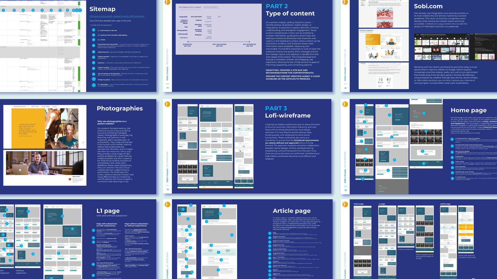
The objective was clear: to design a platform that felt warm and human, while remaining visually accessible, structured, and generous in its use of white space.
This project transformed a single awareness landing page into a scalable digital ecosystem and positioned Sobi within a low-competition, high-authority SEO niche. Together, we translated complex scientific content into accessible, user-centered journeys, designing modular templates that enable long-term content expansion while strengthening patient trust in a fragile informational environment.
In ultra-rare diseases, digital presence is not about volume. It is about authority, clarity, and sustainability : UX becomes a strategic lever, SEO becomes a credibility engine and design becomes infrastructure.
This project illustrates my ability to operate at the intersection of UX research, digital strategy, and SEO architecture, aligning patient needs with long-term brand positioning.
The project is currently in active deployment.