
Revitalizing
“La Ville aux Roses”:
A bold social housing renovation
artistic direction – graphic design – illustration – information design
Revitalizing “La Ville aux Roses”:
A bold social housing renovation
Date
– 2022
Client
– Habitat 44
Role
– artistic direction
– graphic design
– illustration
– information design


Habitat 44, the public housing authority for Loire-Atlantique, is leading an ambitious four-year renovation project in the heart of the La Ville aux Roses neighborhood in Châteaubriant. This large-scale initiative will rehabilitate 300 out of 500 homes, improving comfort, energy efficiency, and accessibility for residents, while rethinking the local housing offer to better meet community needs.
From creating the visual identity to rolling out all communication and design tools, I worked with Sennse to actively shape the visual and editorial universe of this project. The approach I chose combines clear, accessible information with a cohesive, human-centered graphic system.


Color Palette & Materials
We draw primarily from Habitat 44’s official color scheme, complemented by hues and textures inspired by the future architectural renovations. This palette blends warm tones, mineral shades, and natural textures, creating a visual bridge between the existing neighborhood and its transformation.
Shape Library
The visual identity relies on simple, modular shapes that stylize upcoming urban improvements. These evolving forms, enriched with subtle textures, are assembled into dynamic, figurative compositions that illustrate each communication piece.

Architectural Details
Special emphasis is given to balconies, a signature feature of the architectural concept, represented with and without textures. The thickness of patterns is carefully balanced to ensure visual strength and consistency across media.
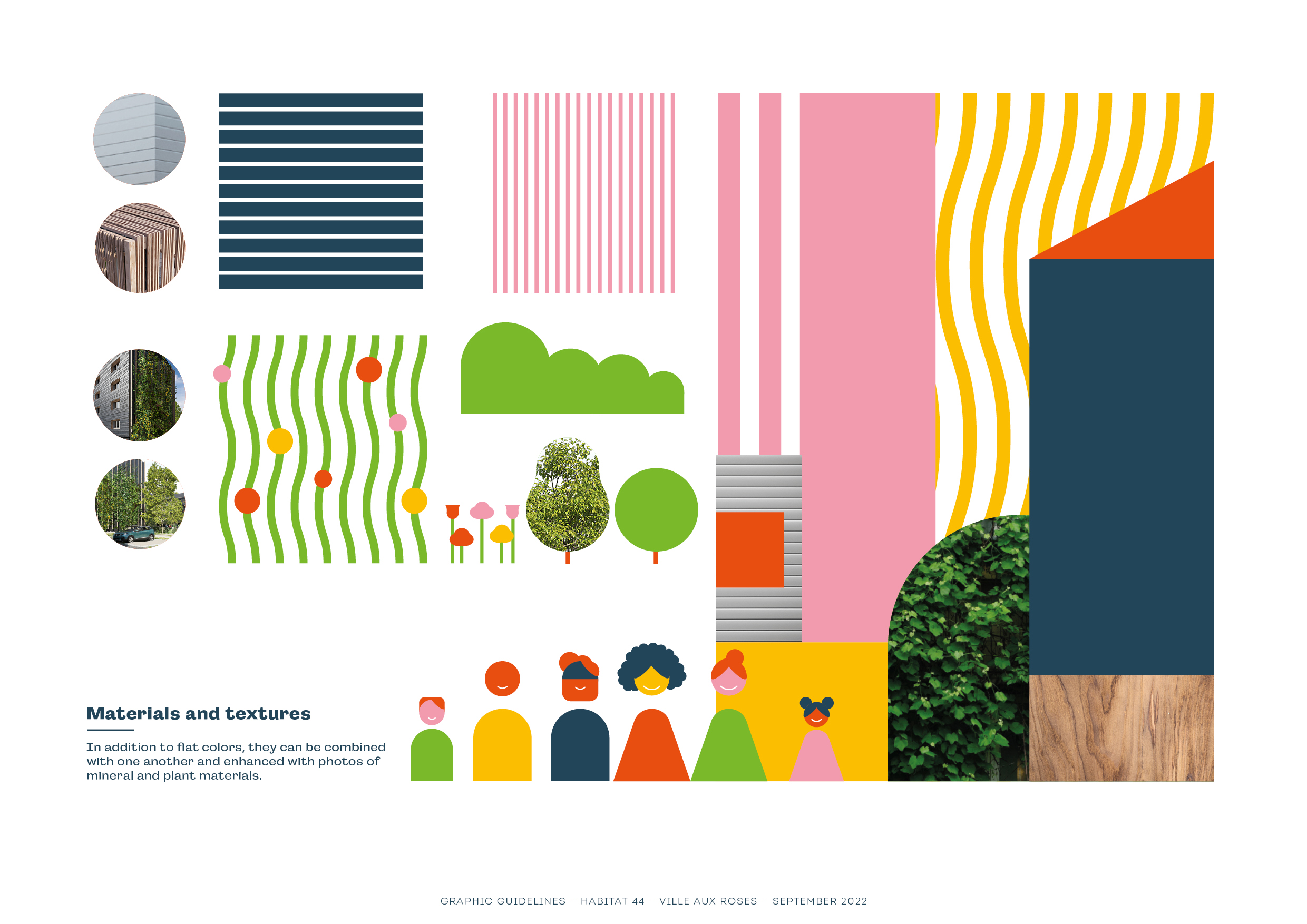
Textures & Patterns
Beyond flat color blocks, we integrate mineral and plant textures, sometimes blending them with photography, to evoke the tangible materials of the renovated spaces.
Pictograms
Custom pictograms extend the same graphic style and color harmony as the illustrations, ensuring a consistent and recognizable visual language.

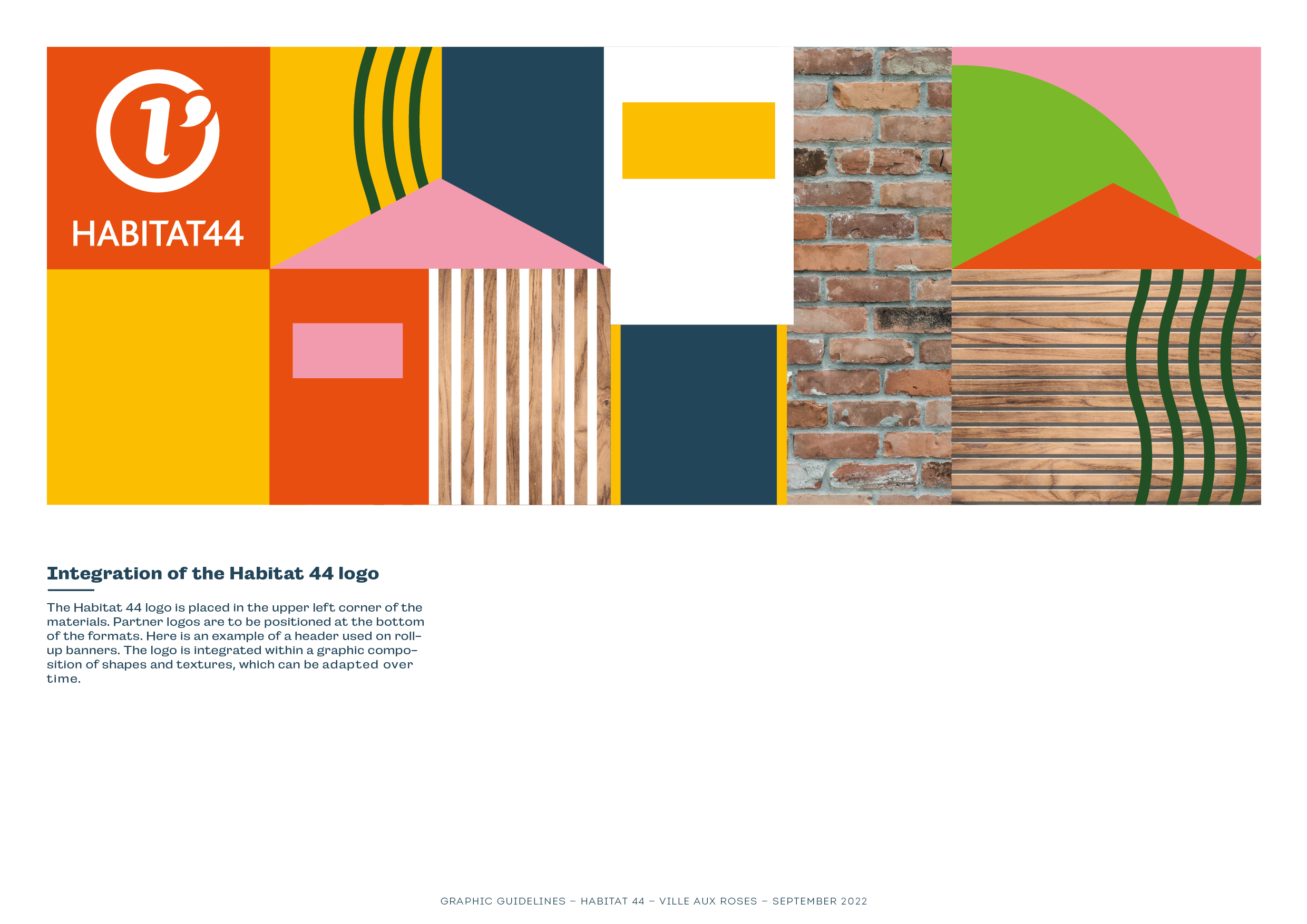


Logo Integration
The Habitat 44 logo is placed in the top-left corner of materials, with partner logos positioned along the bottom edge. The logo often appears embedded within form-and-texture compositions, allowing the visual identity to remain flexible yet coherent.
Typography
We use the Campaign typeface (Adobe Fonts), available in 12 styles to structure information hierarchically. It is never used in black, but instead adapts to the project’s color palette, reinforcing cohesion.
Layout & Composition
The newsletter cover features a mosaic-style composition where illustrations, photographs, and text interact fluidly. The overall layout is intentionally airy, punctuated by graphic elements, photographs, and key figures, supported by a varied color range that brings vibrancy to each page.
