Barbaricum – Vol. I
A collective editorial
exploration of Democracy
artistic direction – editorial direction – illustration – graphic design
Barbaricum – Vol. I
A collective editorial
exploration of Democracy
Date
– 2020
Client
– Okoni
Role
– artistic direction
– illustration
– graphic design
– editorial direction
– editorial design
– print production coordination
A Year-Long Collective Editorial Journey
Barbaricum is the outcome of a full year of collaborative work by the entire team at Okoni, a strategic design agency based in Paris. I had the opportunity to contribute at multiple levels, both as a team member and as the lead for editorial and artistic direction.
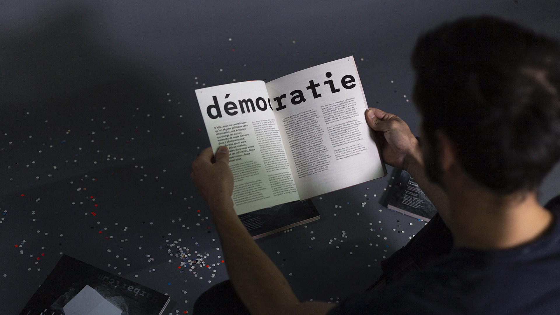
The goal was to produce an annual print publication exploring a theme that resonates deeply with our work and societal context: democracy.
Designing a Living, Fragmented, Yet Hopeful Narrative
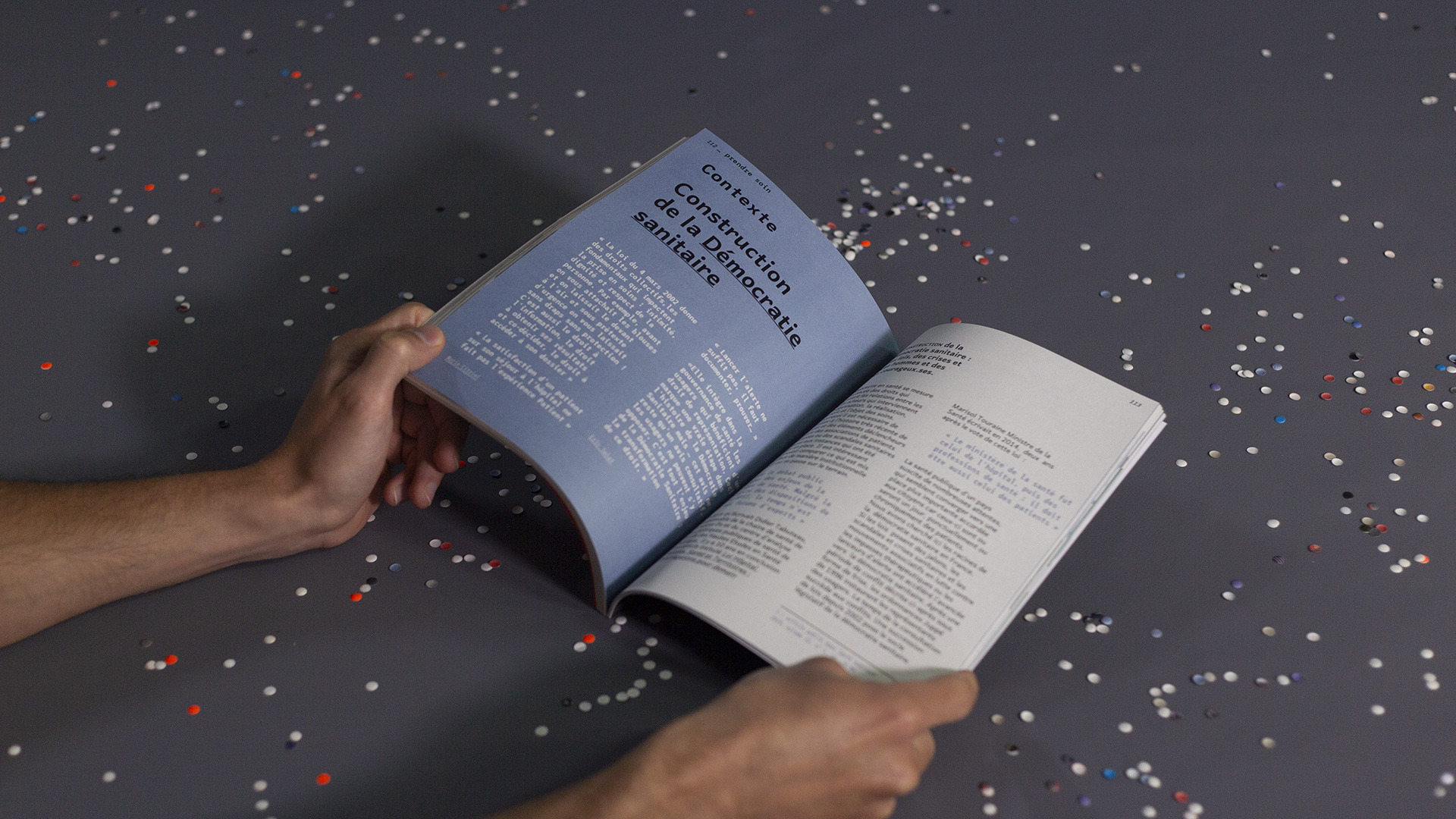
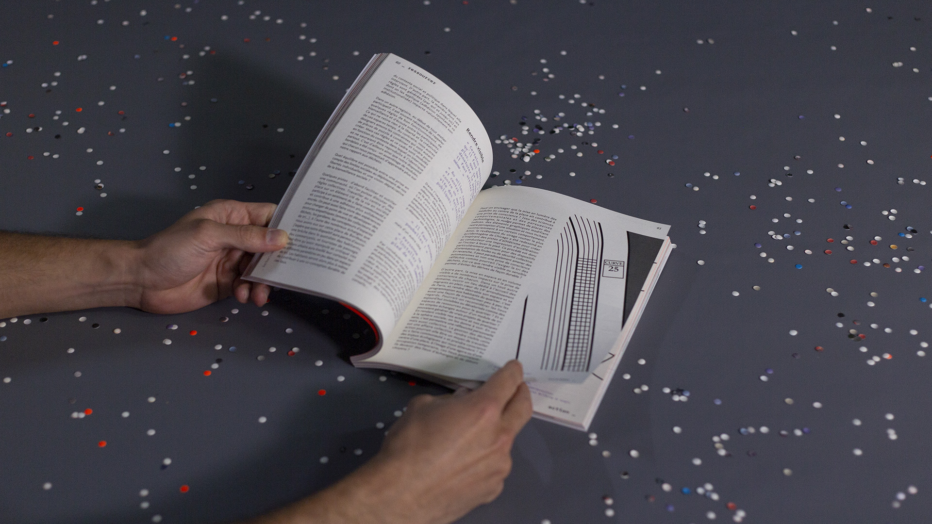
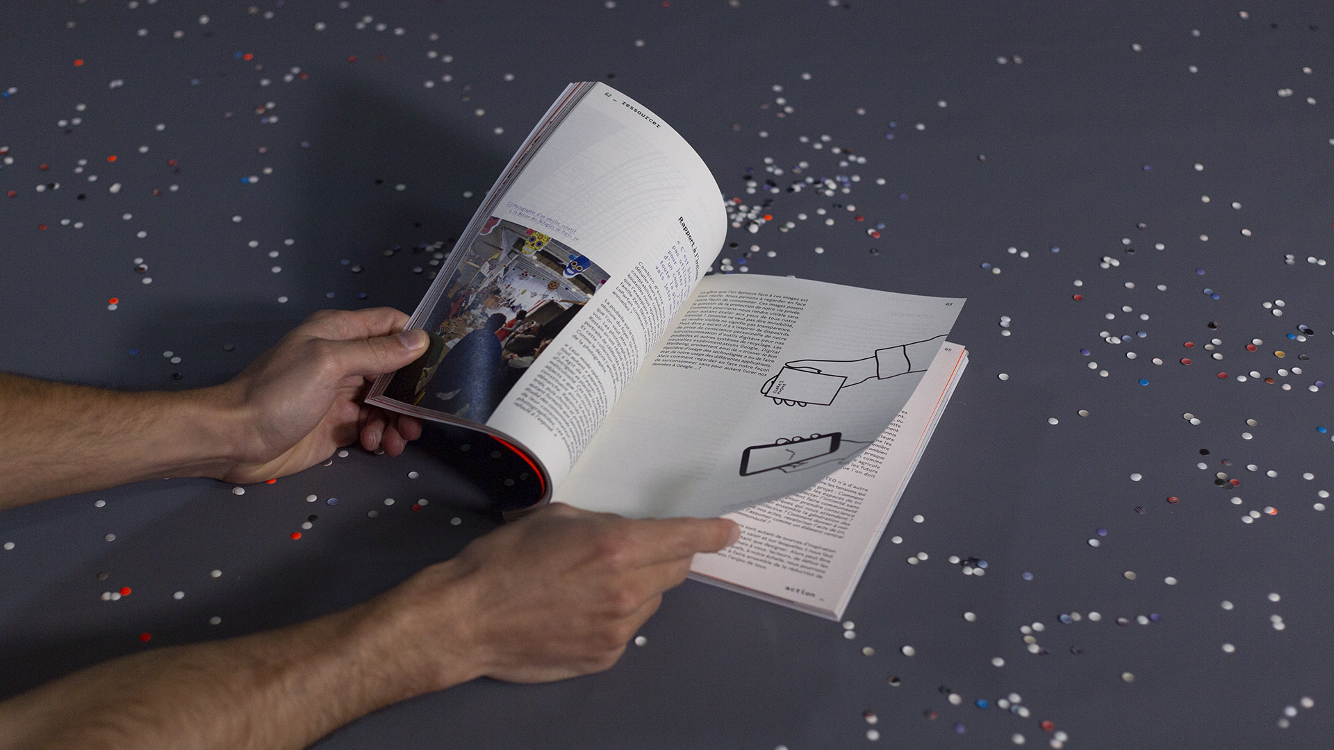
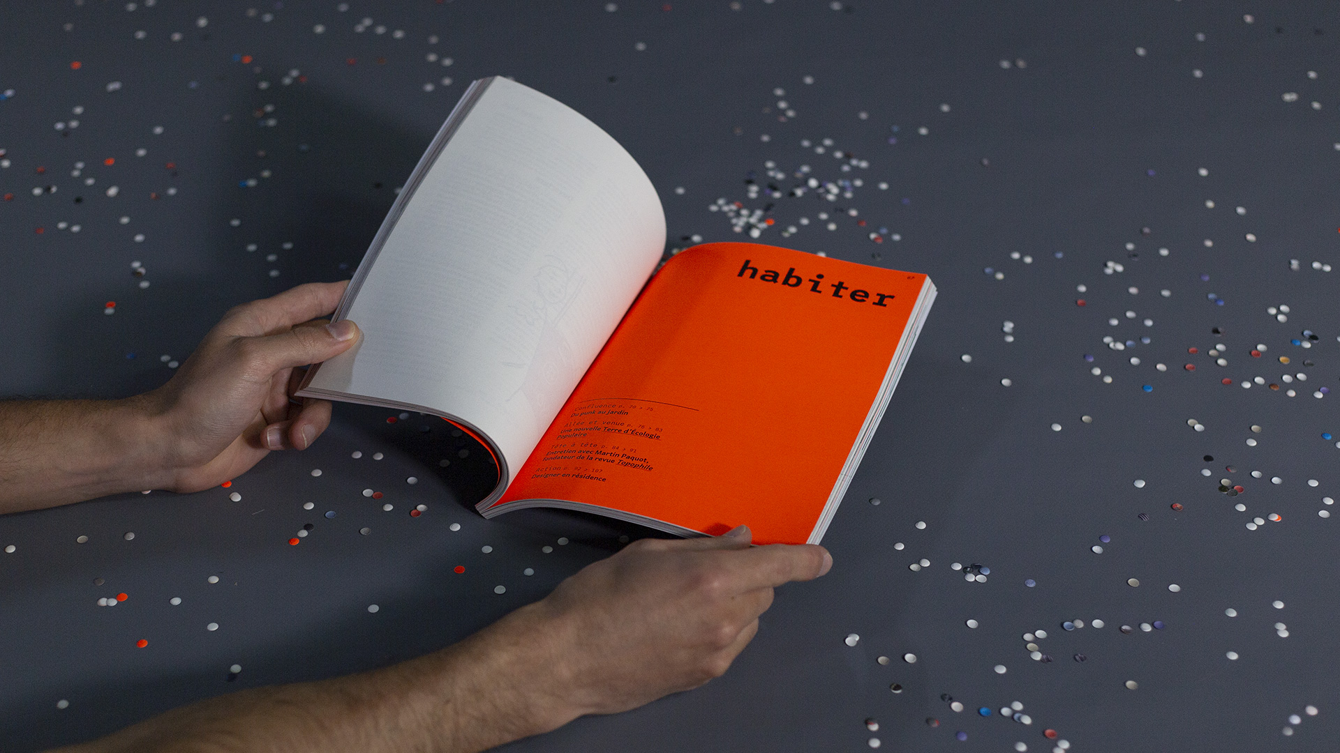
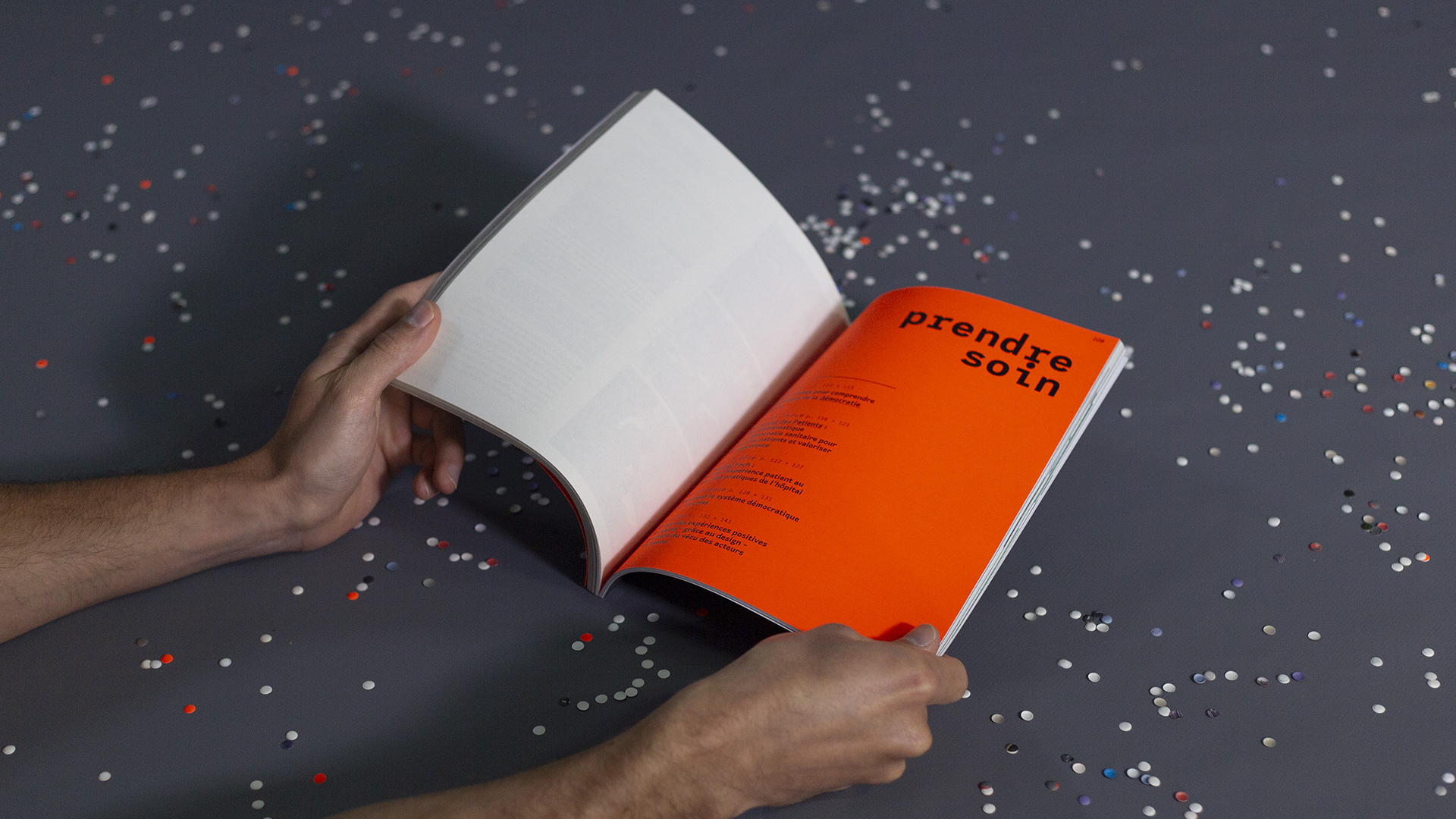
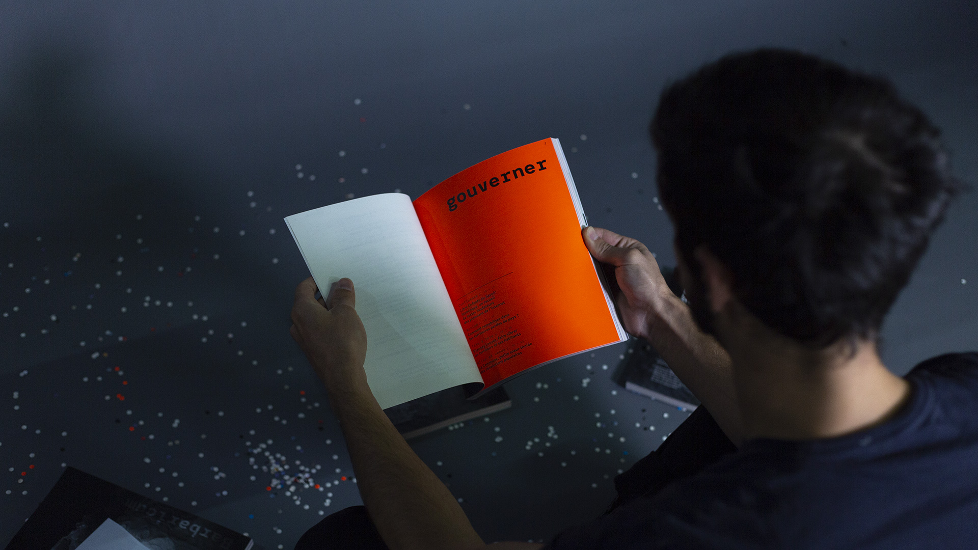
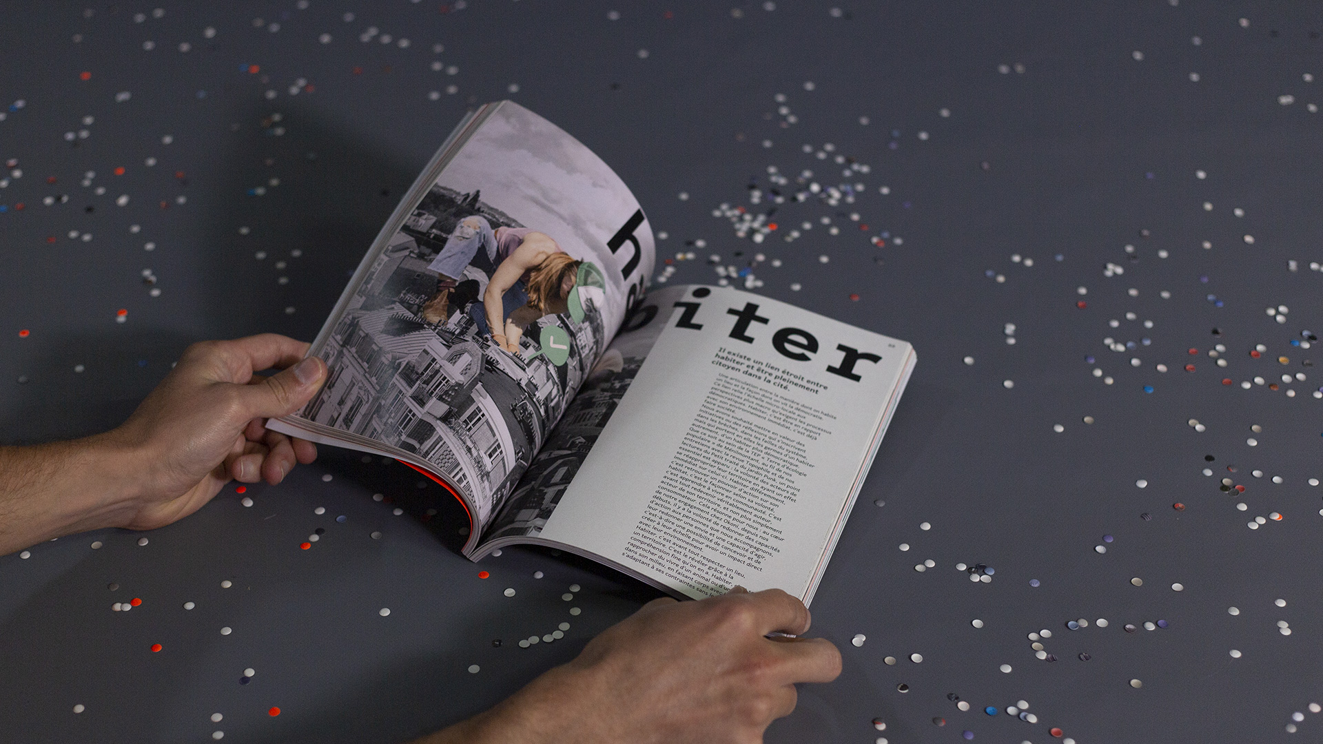
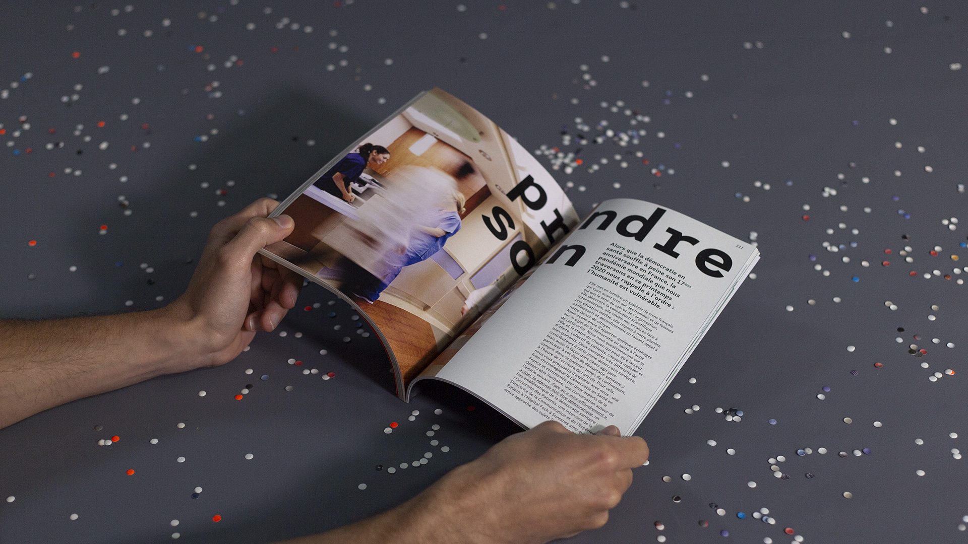
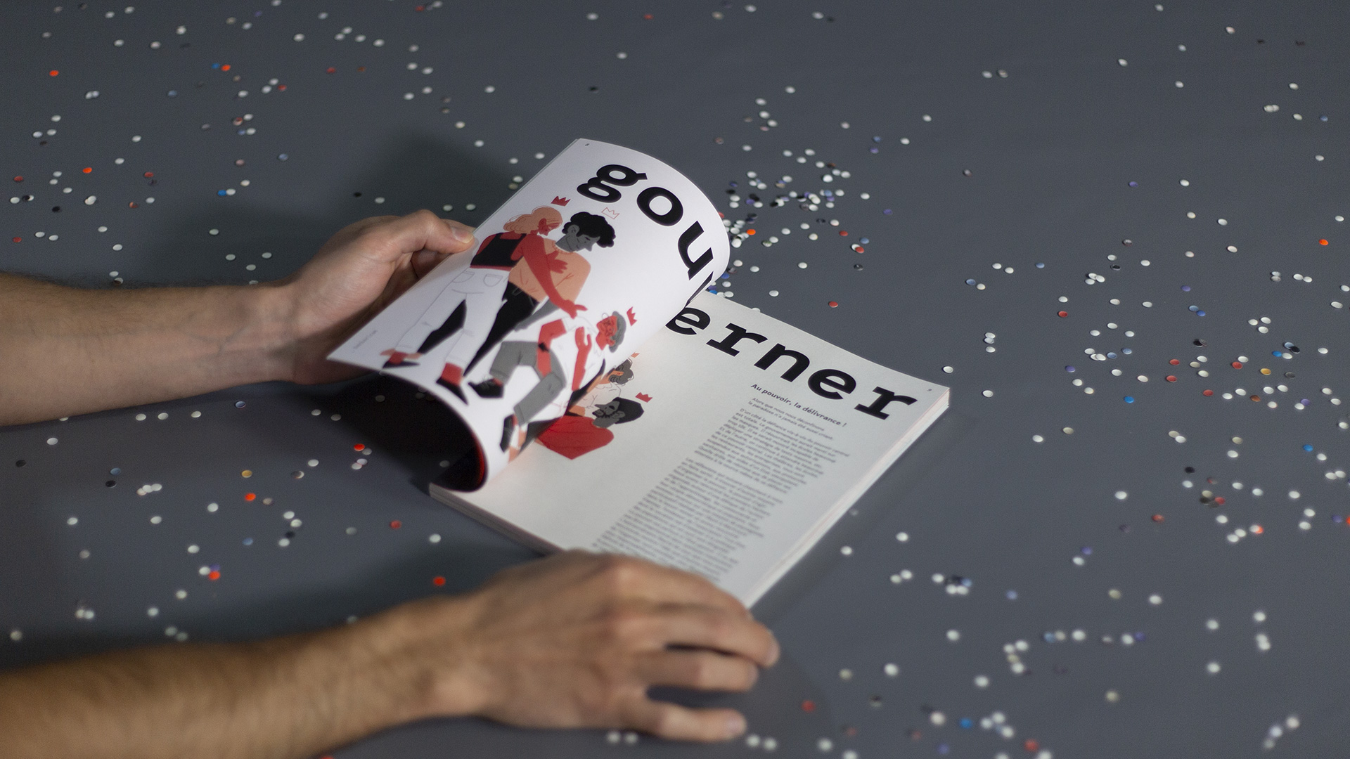
At Okoni, our work is structured around four “territories” that reflect different dimensions of everyday life: Inhabit, Rejuvenate, Govern, Take care
Each team member explored the theme of democracy through the lens of their own territory. This involved interviews, literature reviews, field stories, and personal reflections. The result is a plural and sensitive editorial object, full of tensions but also energy and optimism.
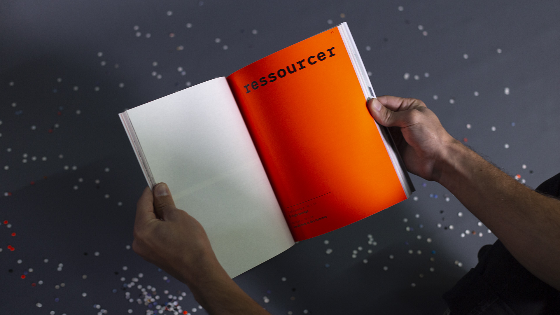
Editorial Structure & Visual Diversity
The book is organized into four editorial formats that offer varied narrative entry points:
-
Confluences – open discussions around a reference book
-
Coming & Going – visits and explorations that open up new practices
-
Actions – analysis of emblematic missions and design work
-
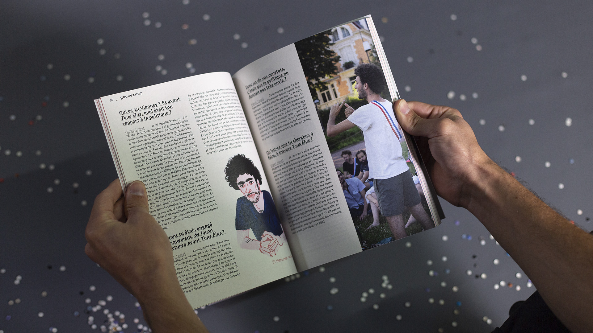
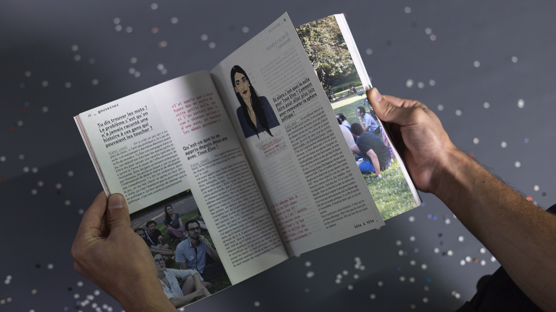
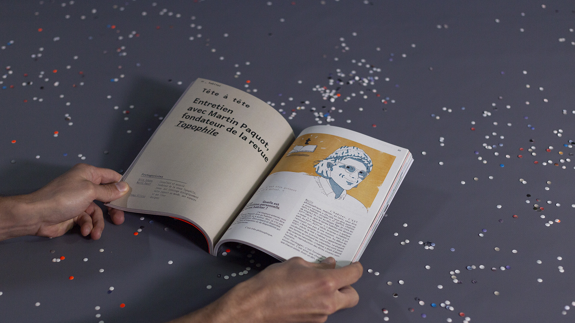
Face-to-Face – interviews with field actors
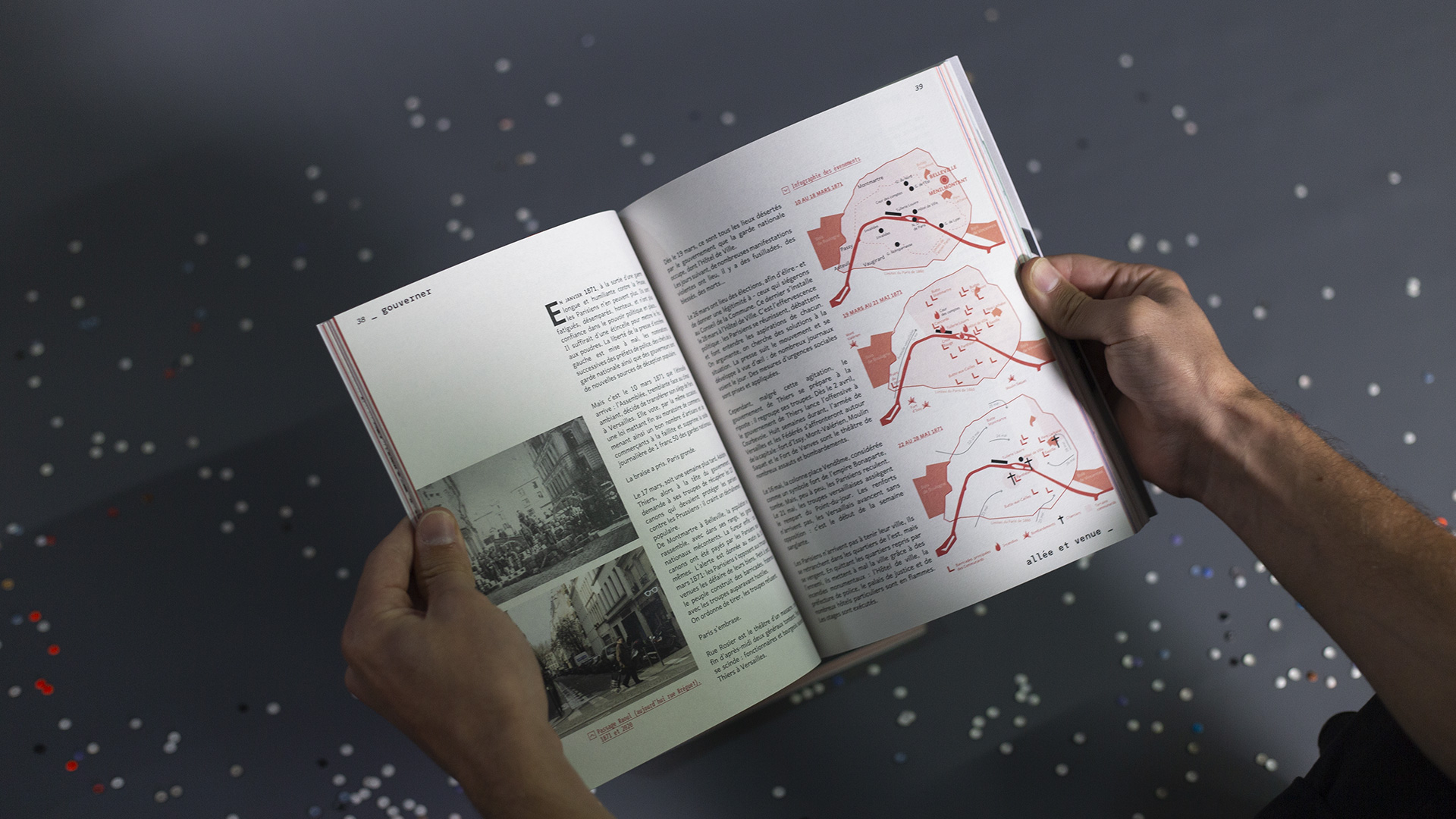
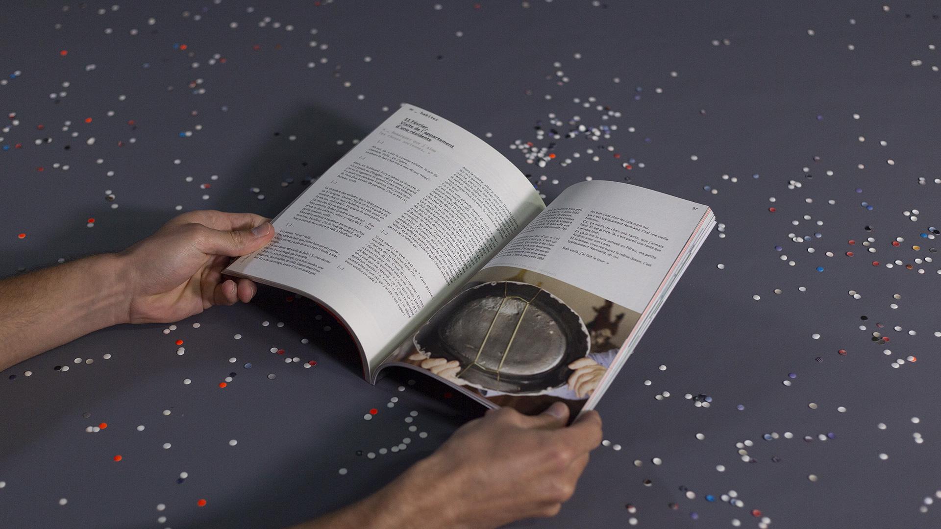
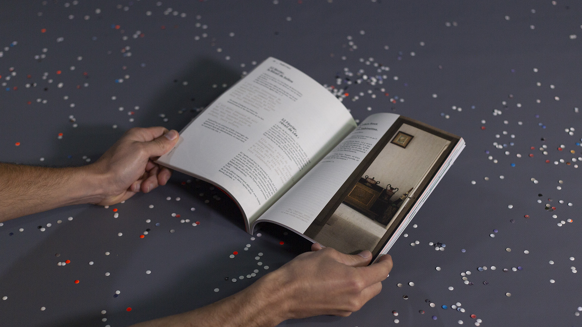
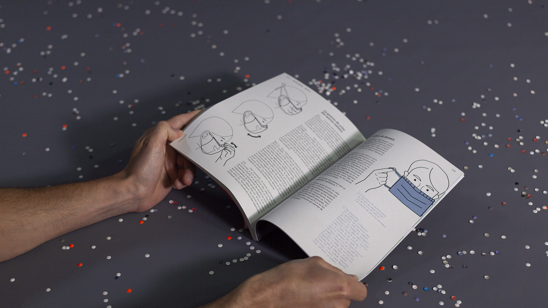
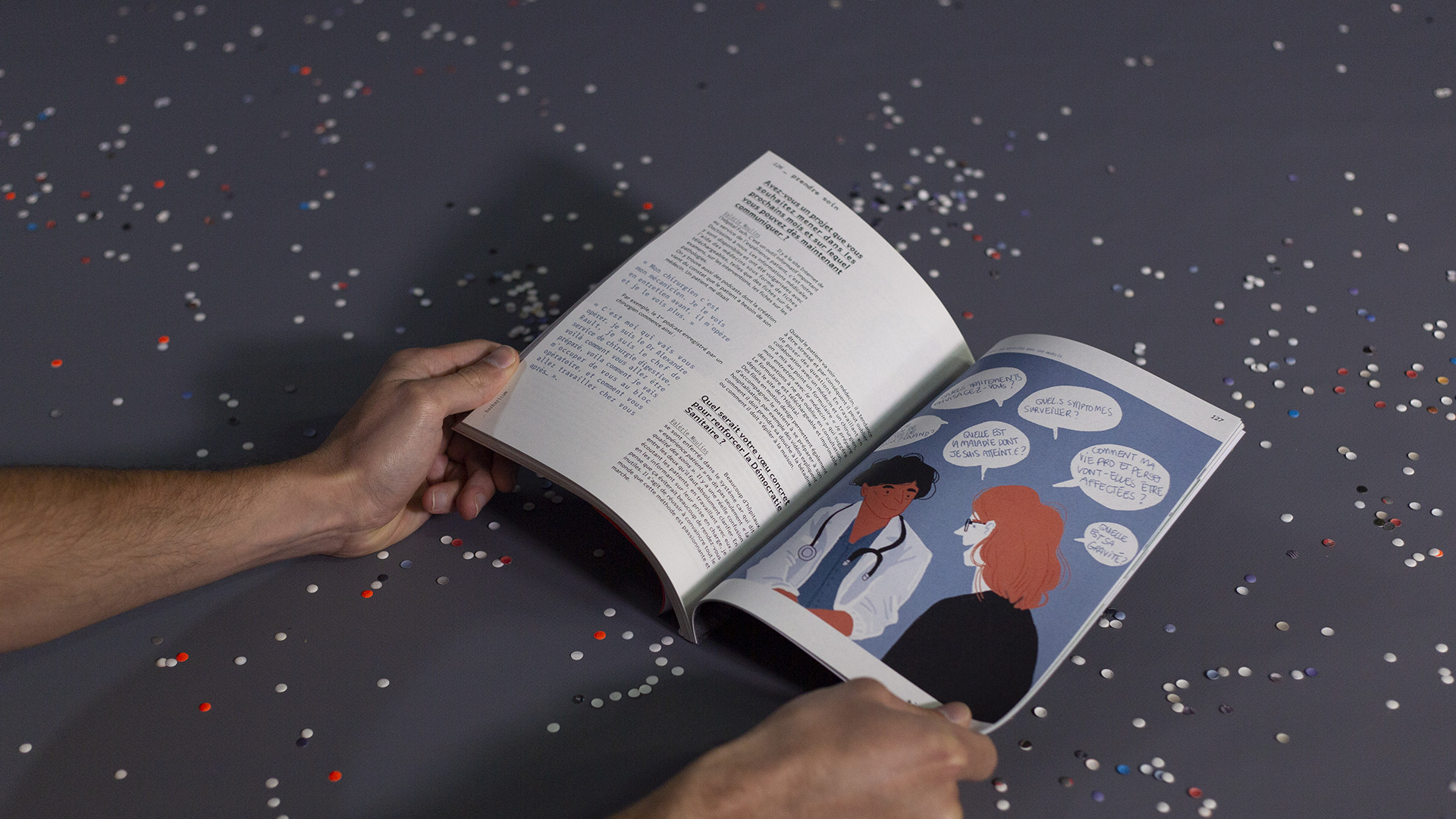
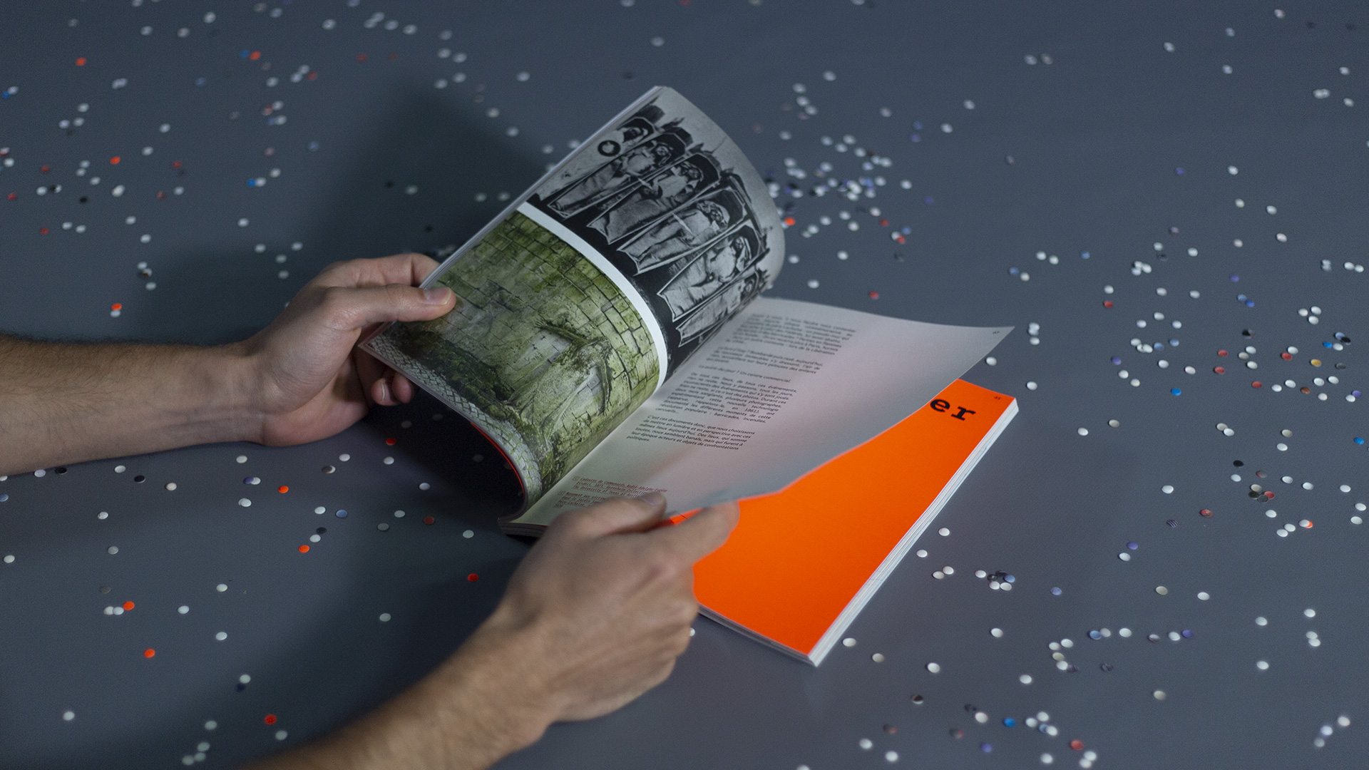
Each article is illustrated by a different designer from the agency, highlighting our wide visual palette: watercolor, data visualization, sketching, photomontage, photography, and even painting. This diversity reinforces the idea of a shared but polyphonic authorship.
A Tangible & Thoughtful Object
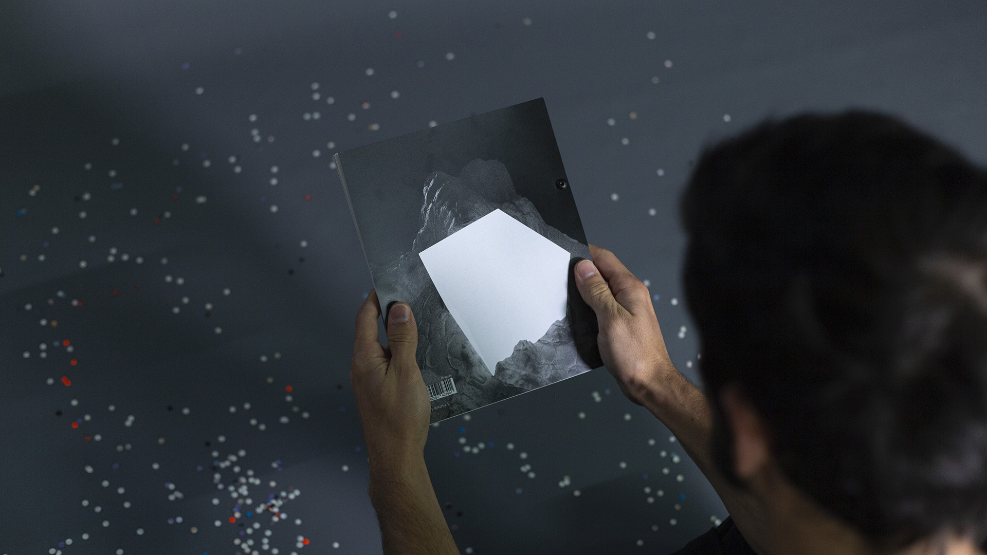
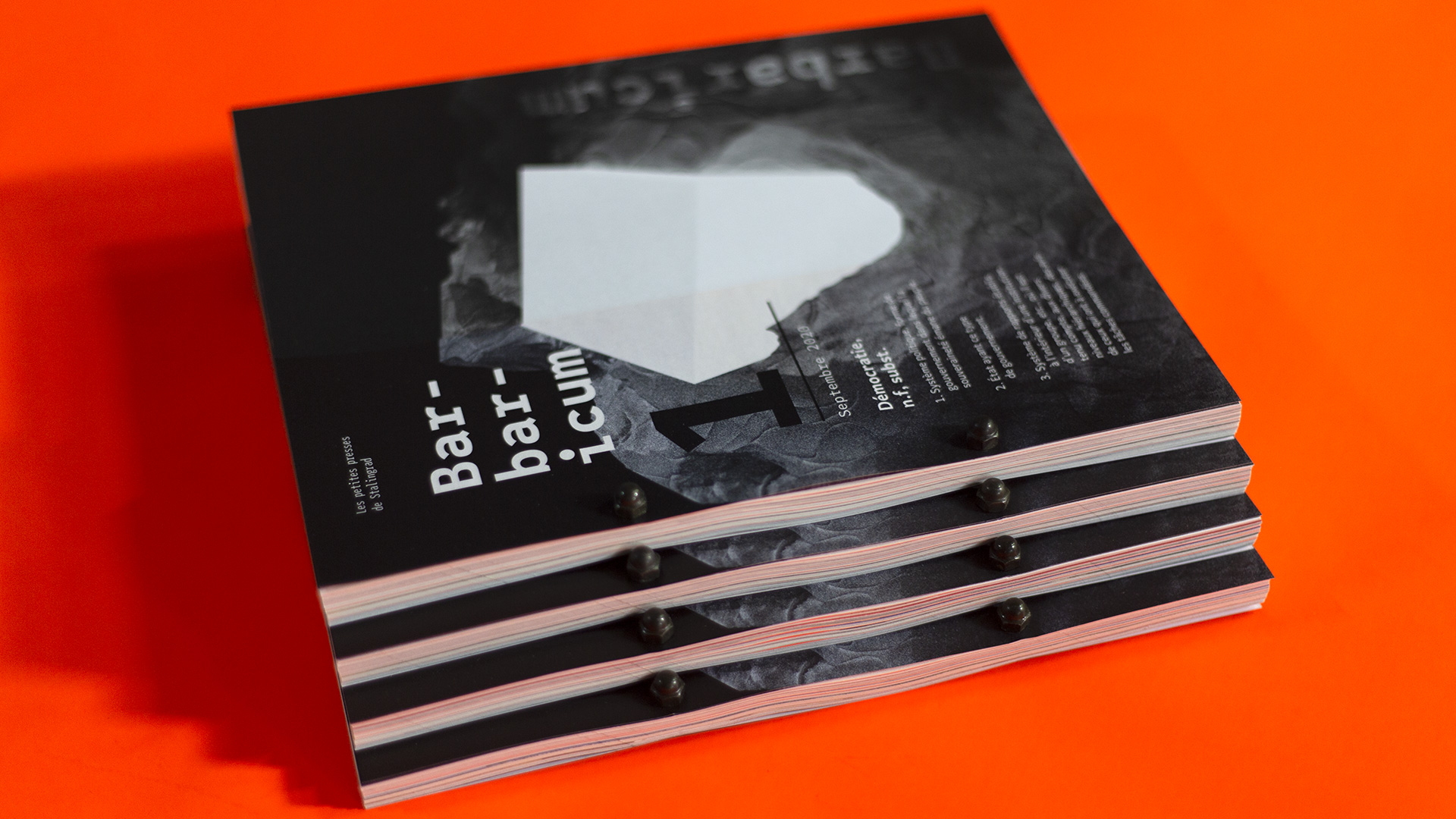
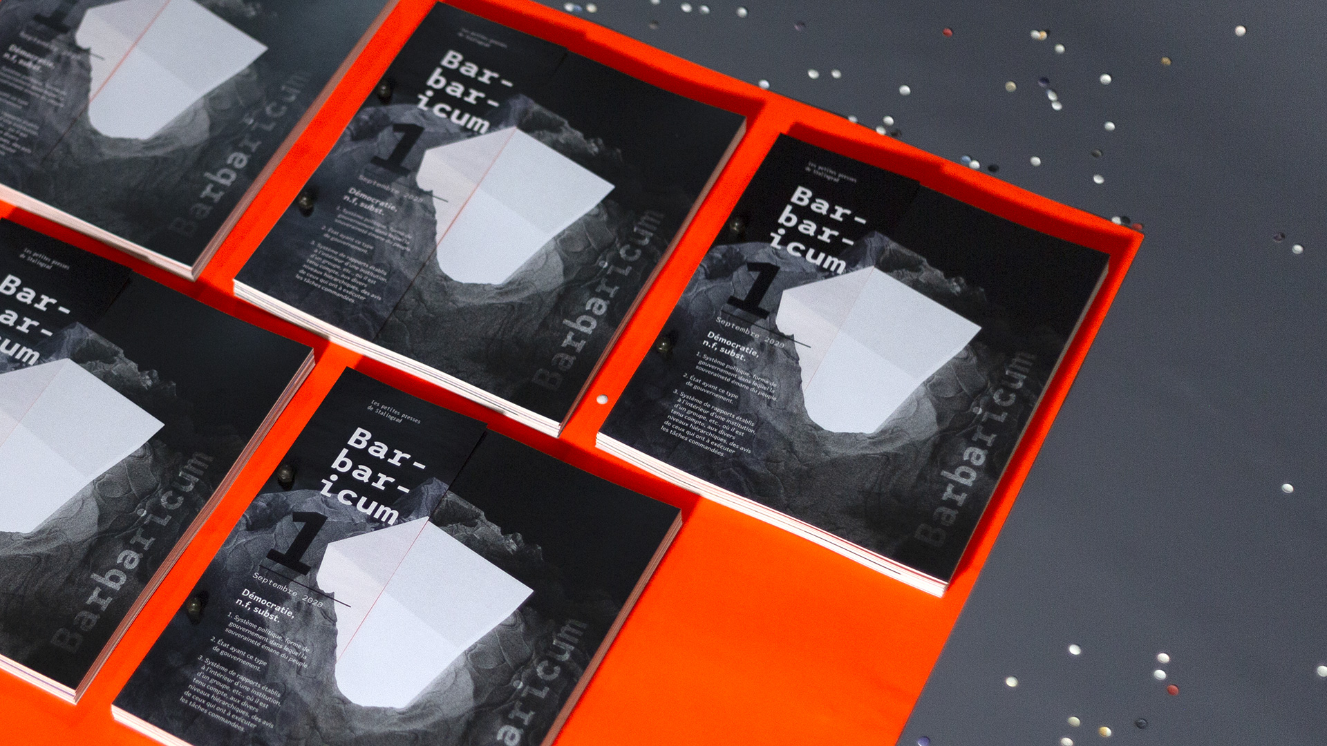
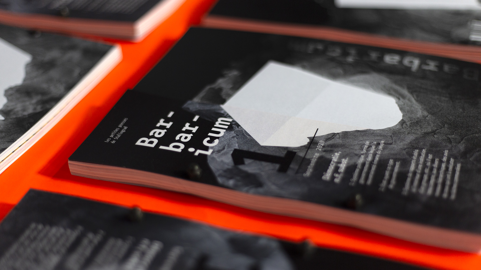
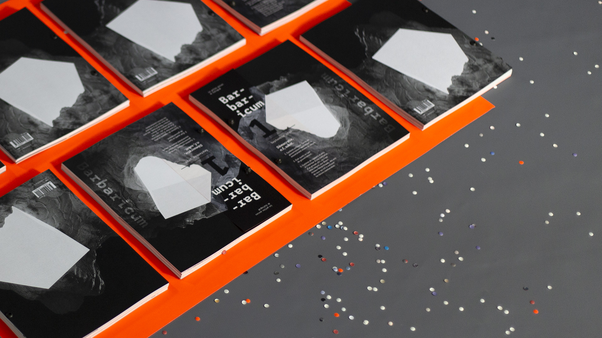
The cover illustration, created in Cinema 4D, offers a visual metaphor of democracy as a beacon illuminating the agency’s territories.
We chose Quebec and League Mono typefaces for layout to offer contrast between humanistic warmth and editorial structure, enabling readers to navigate the content based on interest or territory.
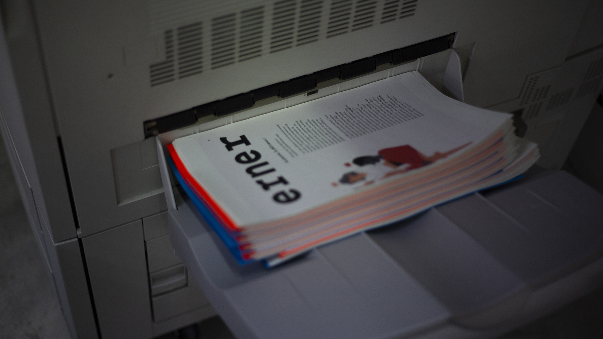
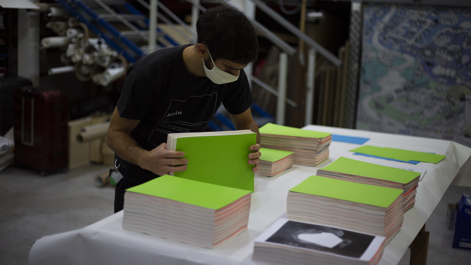
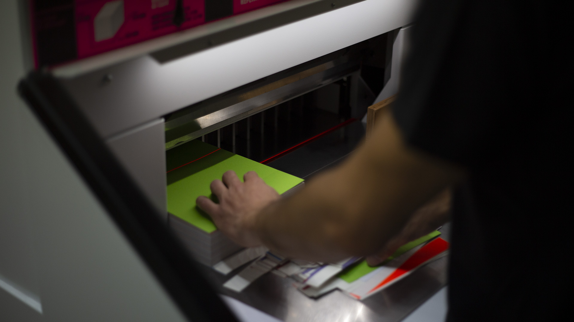
To reflect our hands-on, maker-driven culture, the book is screw-bound, simple, functional, and original. We produced the entire first edition (250 copies) in-house, using Munken cream paper for a soft, tactile feel, and fluorescent poppy accents to mark transitions between sections.