Designing a patient-centered haemophilia digital hub
UX research – U/UX design – Content structuration – Content population
Liberate Life:
Transforming a complex patient
website into a modular and accessible
digital companion.
Date
– 2024
Client
– Sobi Global – Haematology
with Vivactis Agency
Role
– UX research and patient insights analysis
– Patient journey mapping and personas
– Information architecture redesign
– UX/UI design and modular design system
– Co-creation workshops and usability testing
– Content structuration, strategy and integration supervision
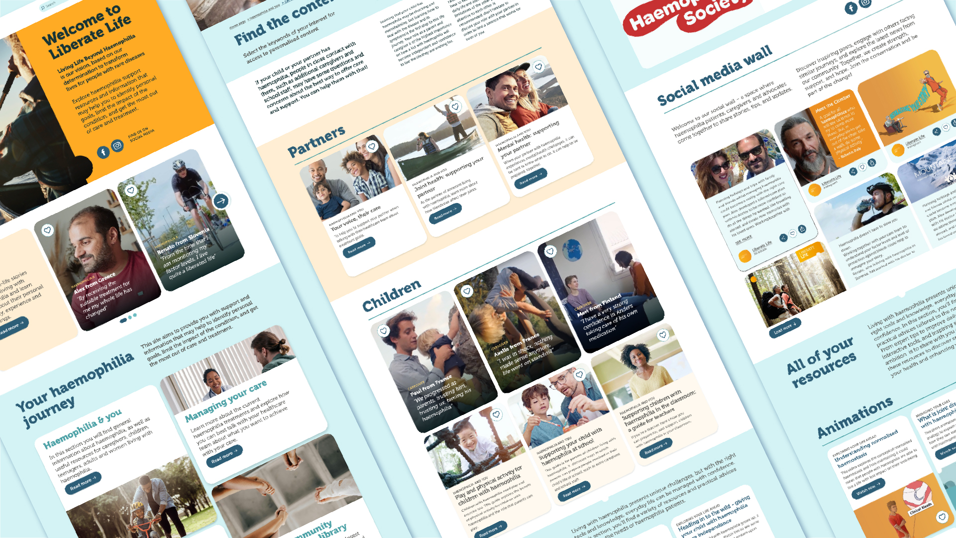
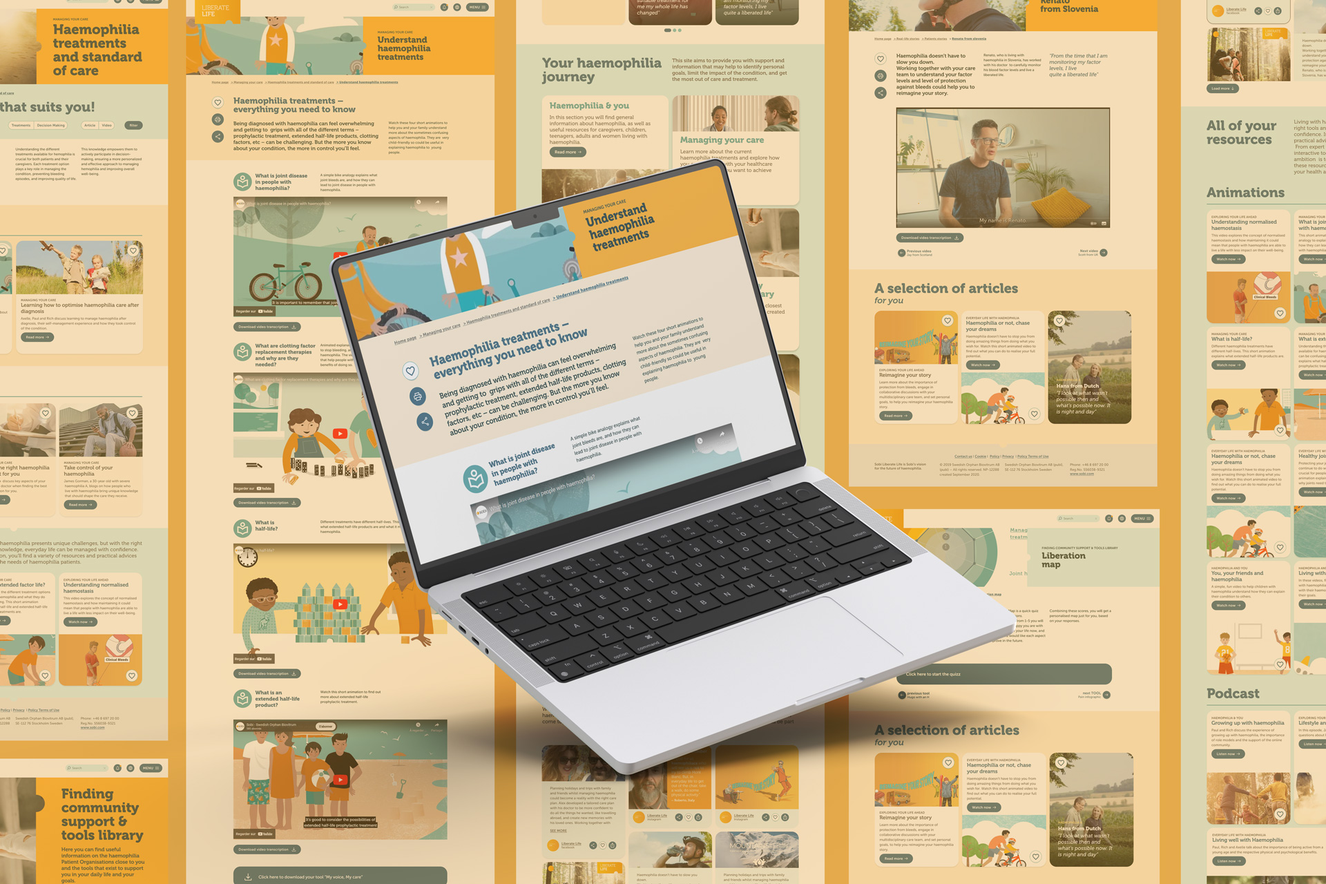
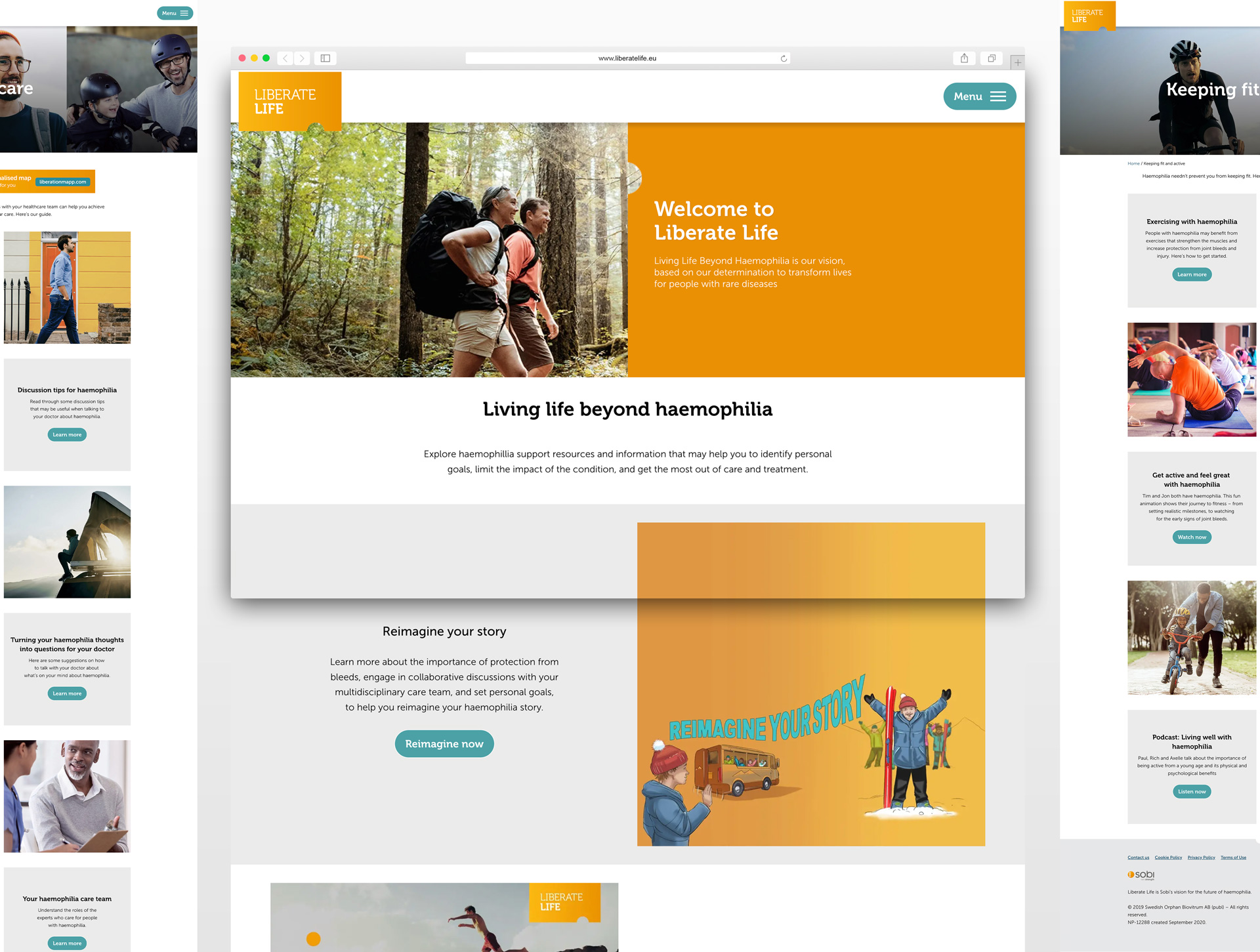
LiberateLife.eu was designed to support people living with haemophilia and their caregivers by providing reliable information and practical resources.
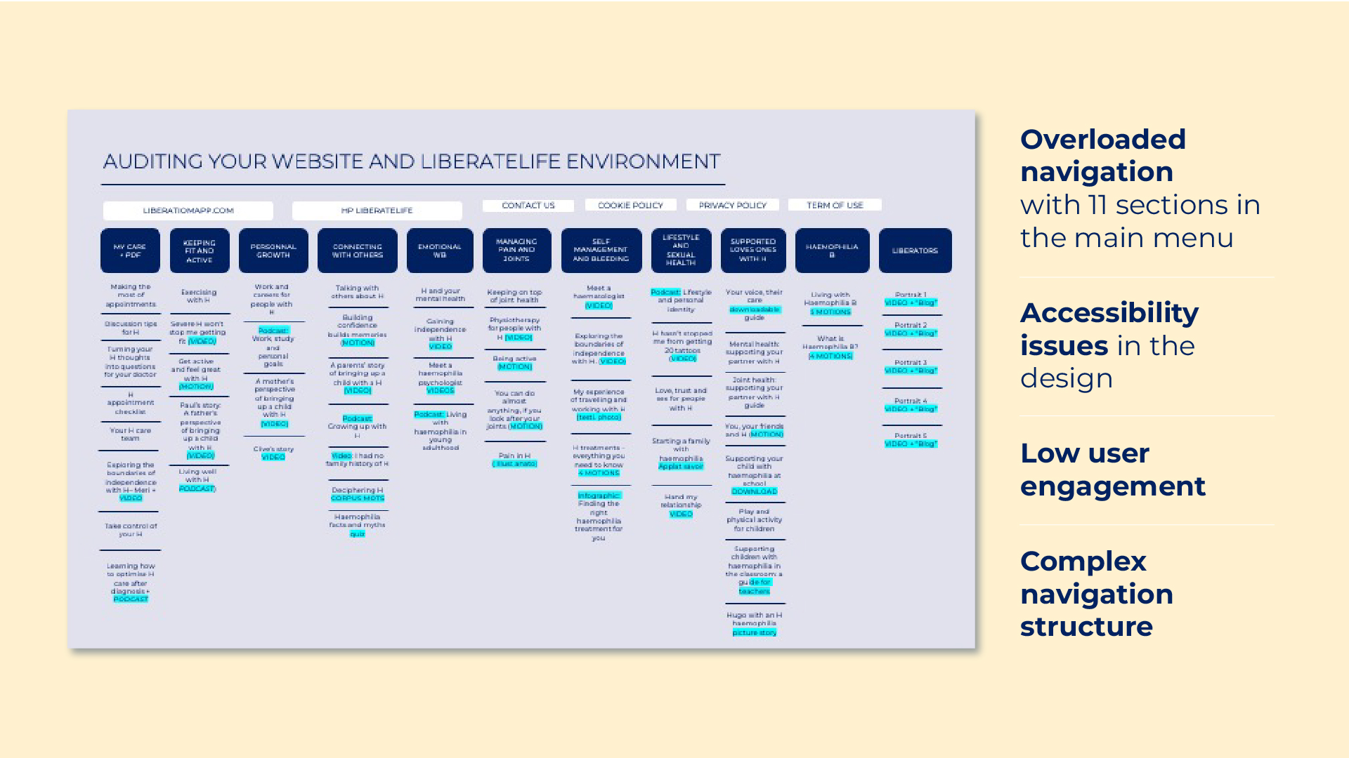
Over time, however, the platform had become increasingly complex. The navigation structure contained more than eleven primary sections, making it difficult for users to identify relevant content quickly. The design felt outdated, information was sometimes repetitive, and analytics showed a high bounce rate and limited engagement.
At the same time, the expectations of the haemophilia community were evolving. Patients and caregivers were looking for clearer information, practical tools for daily life, and content adapted to their personal journeys.
The redesign therefore had a broader ambition:
transform Liberate Life from a static information website into a living digital companion for the haemophilia community.
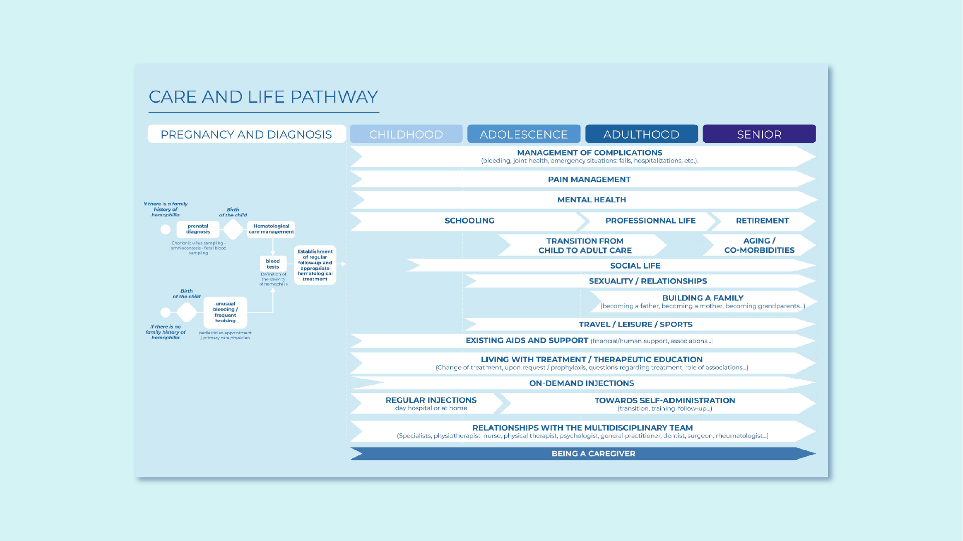
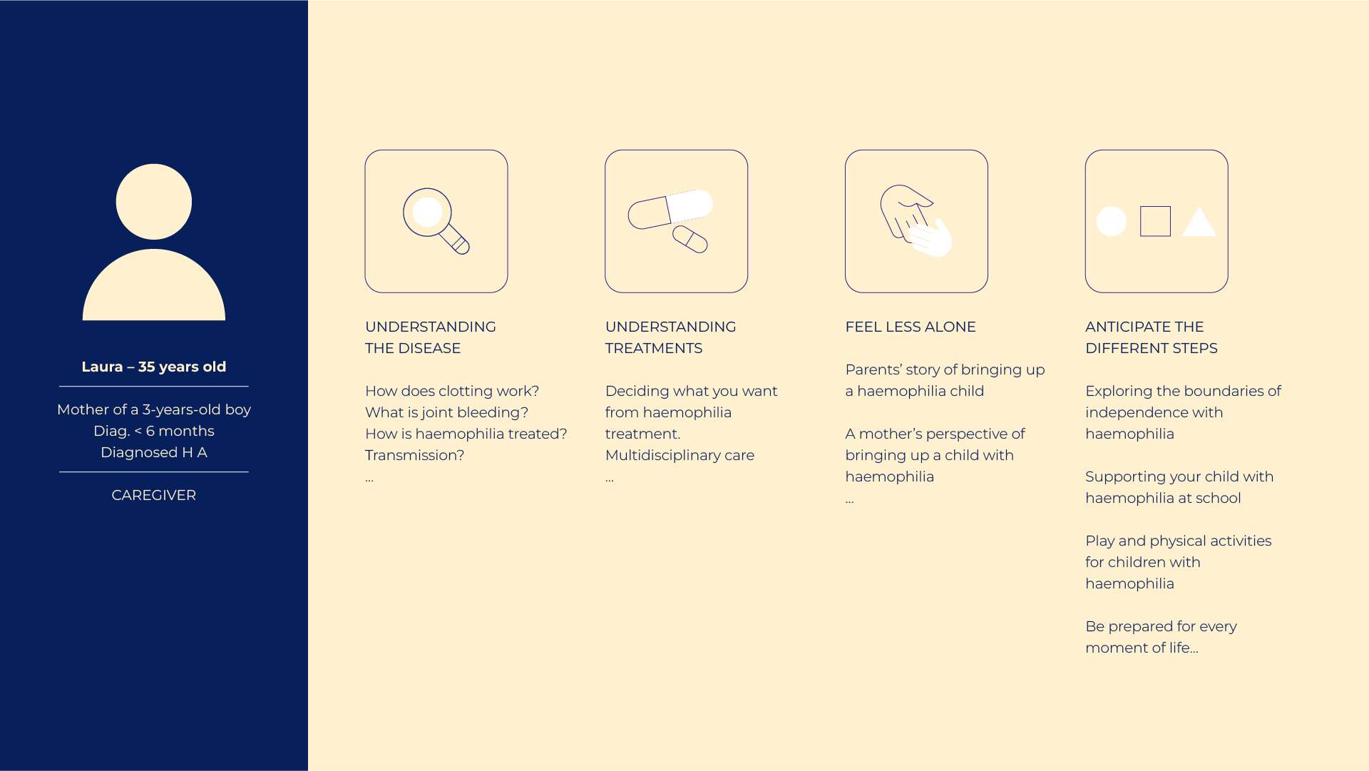
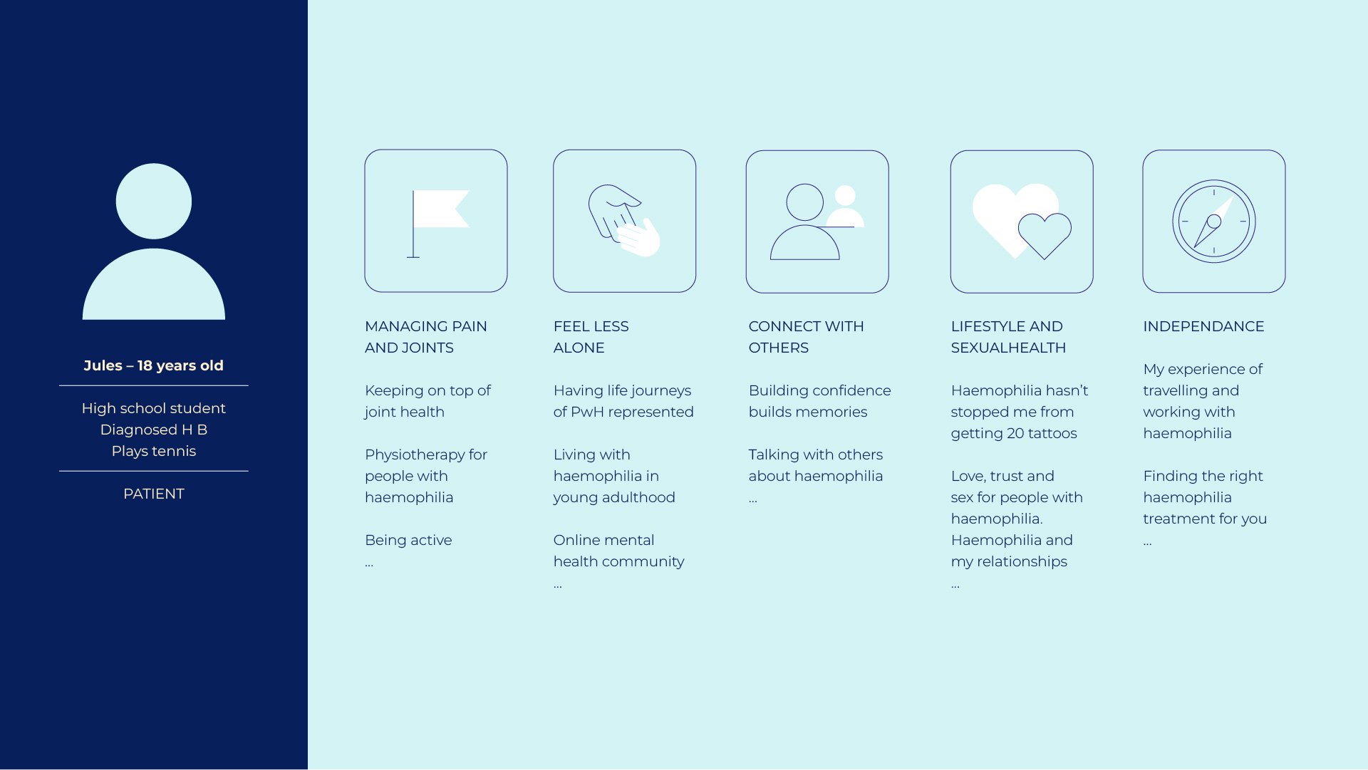
Haemophilia patients do not share a single journey. Some are parents learning how to manage their child’s condition. Others are teenagers who want to practice sports safely. Young adults are navigating education and professional life, while older patients may be dealing with joint complications and long-term treatment management. Each stage brings different questions, concerns and information needs.
Yet the existing platform treated all users in the same way, presenting information through a complex structure that did not reflect real-life patient journeys.
Another key insight emerged from conversations with patients and patient organisations: they did not only want medical information, they wanted support for everyday life. Advice, experiences, community resources and practical tools were just as important as clinical knowledge.
The redesign strategy focused on one guiding principle: anchor the platform in the real voice of patients. To achieve this, the project combined several research and design methods.
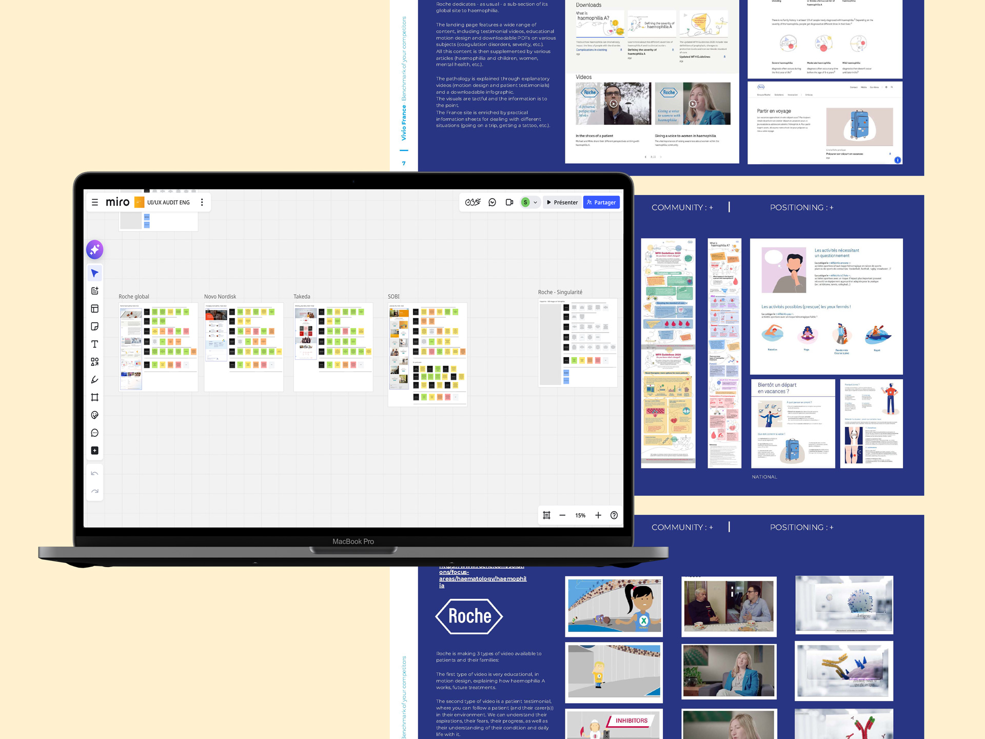
First, an audit of analytics, content and user behaviour helped identify navigation friction points and engagement gaps.
This was complemented by a UX audit of the existing journeys, as well as a review of comparable patient platforms.
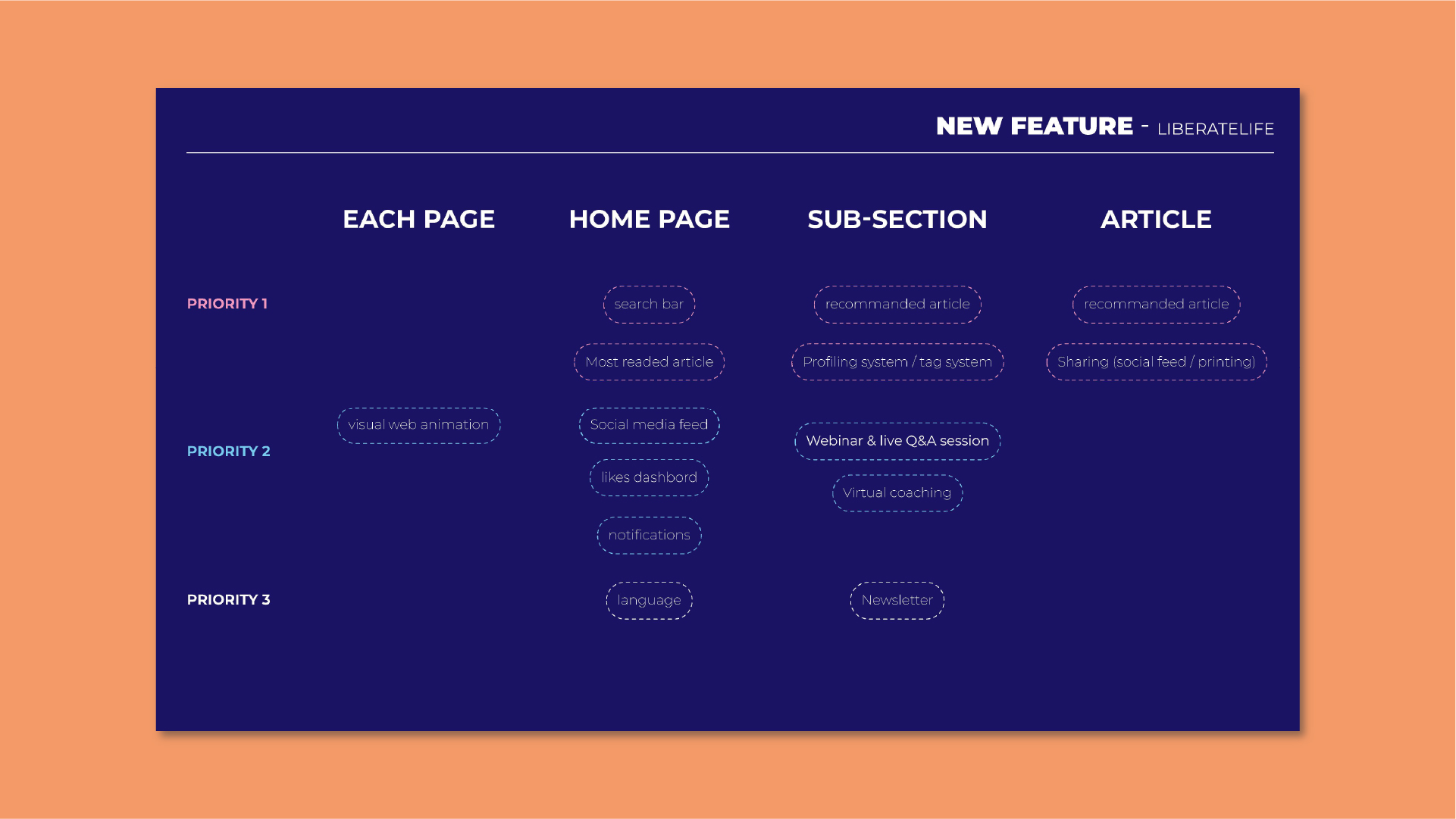
Based on these insights, we developed patient personas and journey maps, modelling the informational needs of different profiles across key life stages.
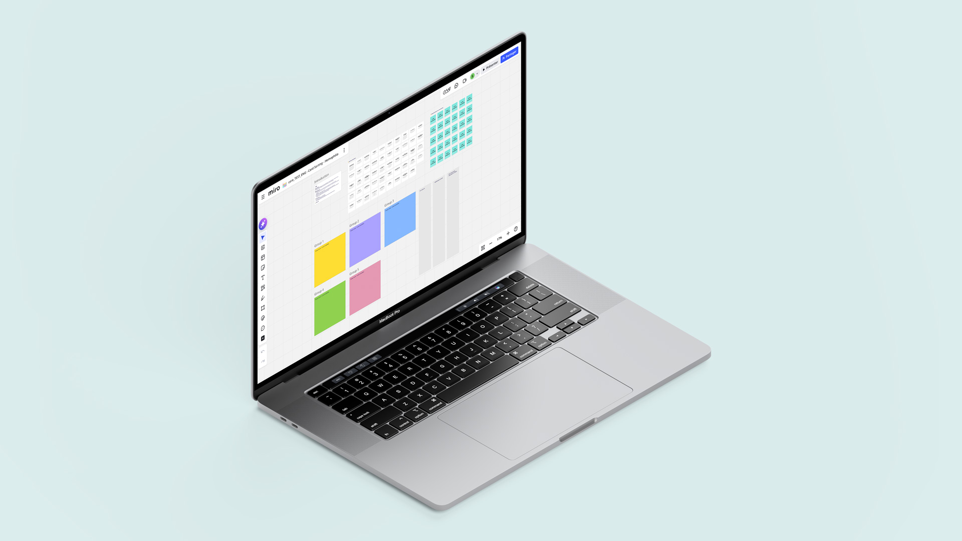
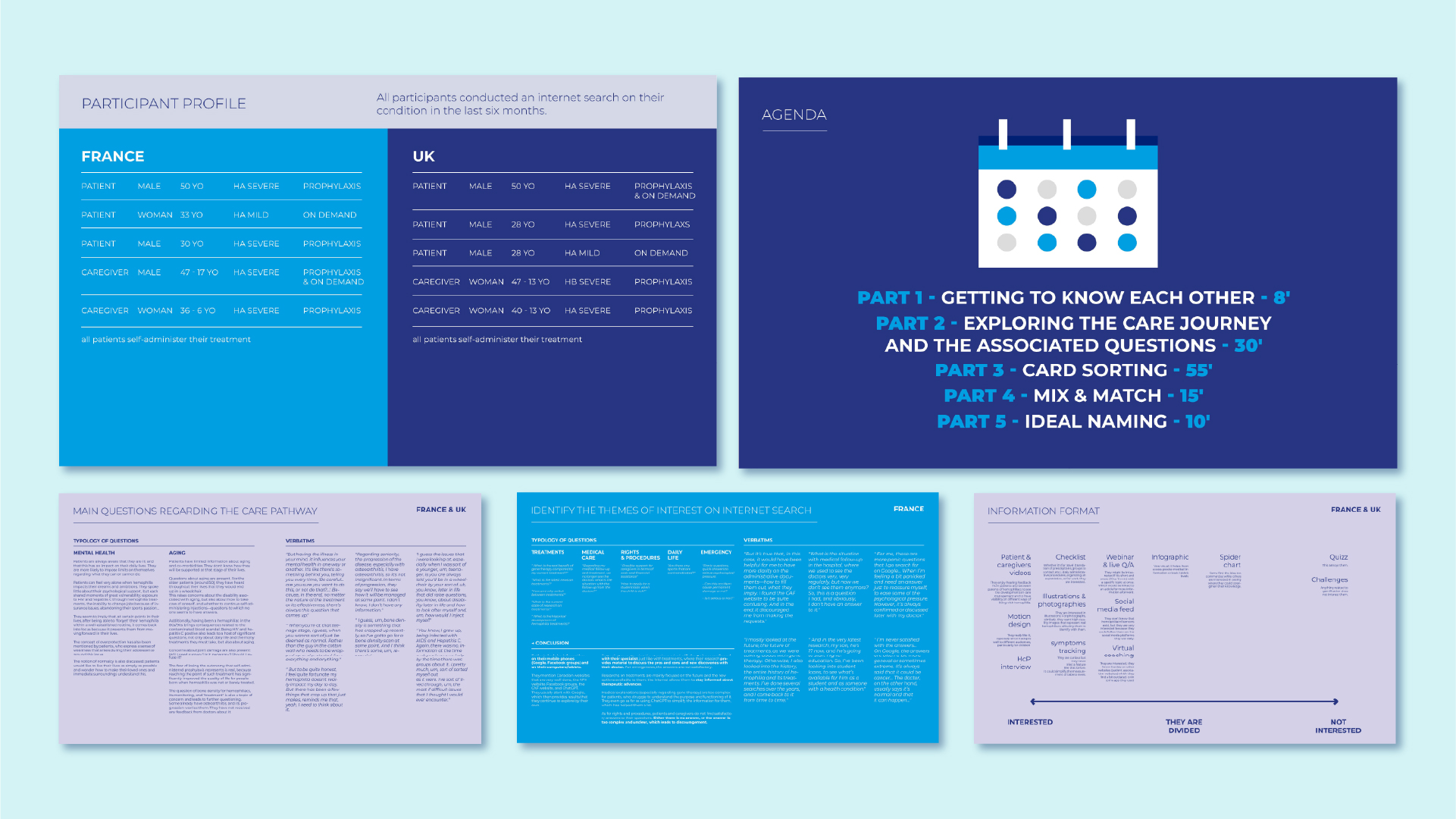
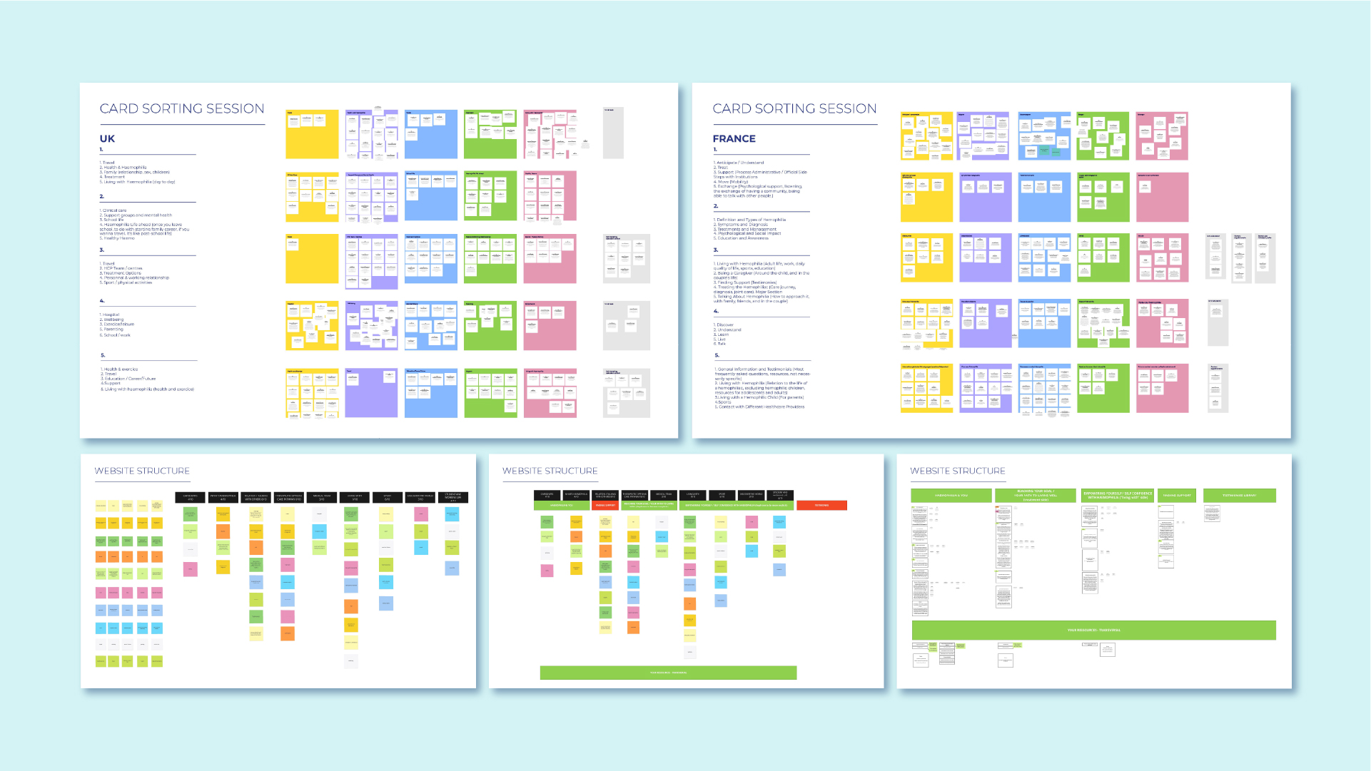
These models were then validated through international focus groups conducted in France and the United Kingdom, involving diverse patient profiles and caregivers.
These sessions allowed us to: understand patients’ real-life experiences and care journeys, identify information gaps and friction points, explore preferred formats and services, validate potential navigation pathways.
Participants also helped co-design realistic user journeys, ensuring that the future platform would reflect real patient needs rather than theoretical assumptions.
A second phase of user testing was then conducted to evaluate: navigation clarity, accessibility of content and usability of interactive components.
This iterative process ensured that design decisions remained grounded in real user feedback.
The redesign translated these insights into a new digital ecosystem built around three core principles.
Simplify the experience
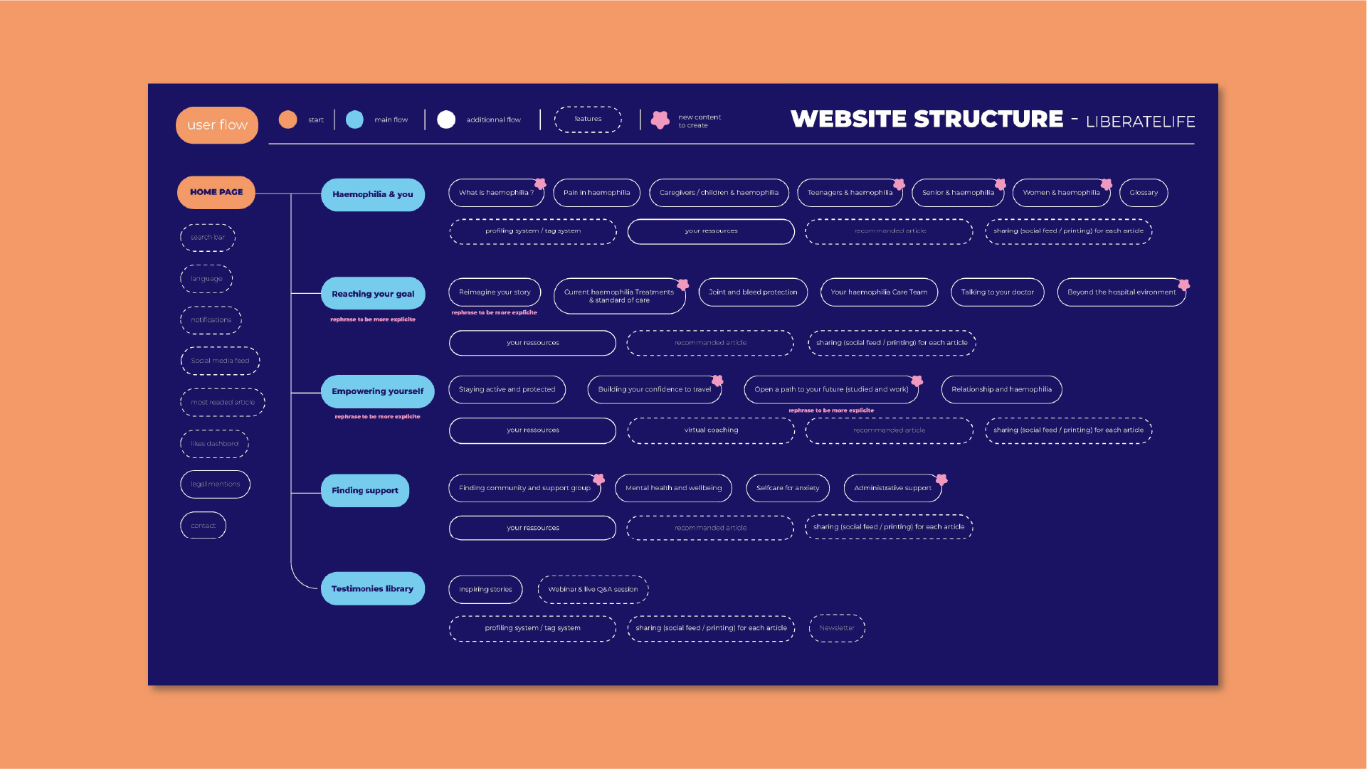
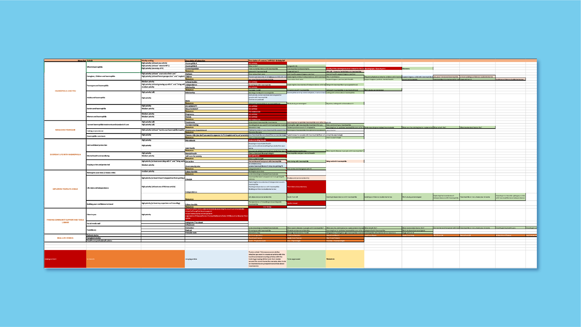
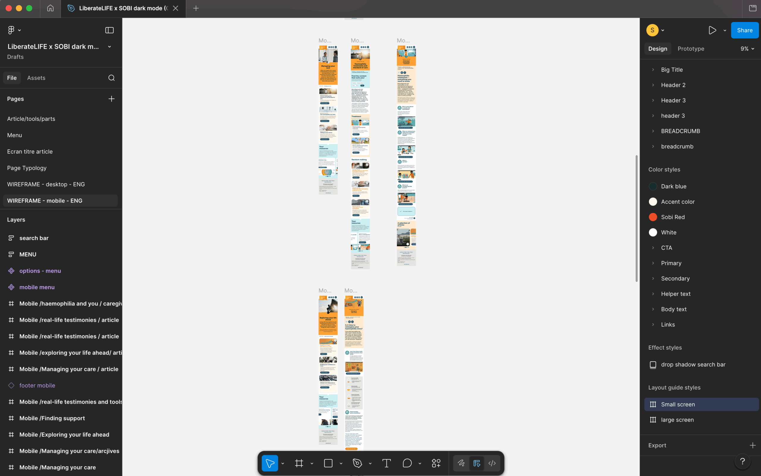
The information architecture was completely restructured. The number of primary navigation sections was reduced and content was organised around patient needs rather than internal categories. This made it easier for users to quickly identify the information relevant to their situation.
Adapt content to patient journeys
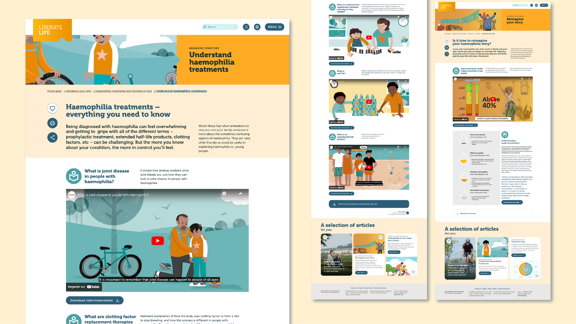
Instead of presenting information as a static library, the platform now offers content pathways aligned with life stages and patient profiles. Parents, teenagers, young adults and older patients can access resources adapted to their specific questions and priorities. Content formats were also redesigned to be clear, visual and interactive, making complex information easier to understand.
Anchor the platform in daily life
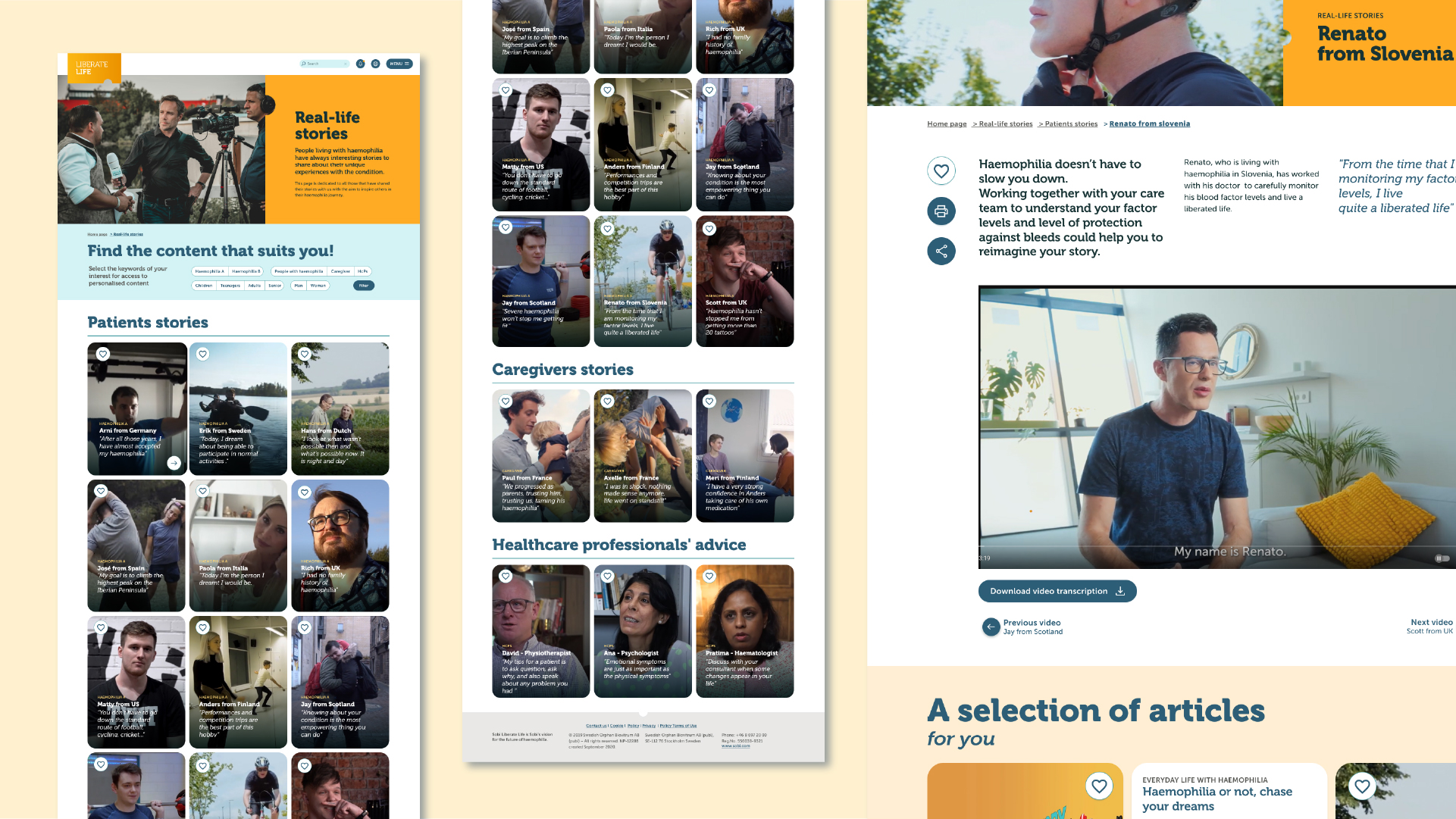
Patients repeatedly expressed the need to live beyond the disease. Liberate Life was therefore designed as a digital companion supporting everyday life with haemophilia. The platform includes practical advice, inspirational patient stories, educational resources and tools that help users manage their condition while maintaining independence.
It also acts as a crossroads platform, connecting users to patient associations, healthcare resources and local Sobi websites across Europe.
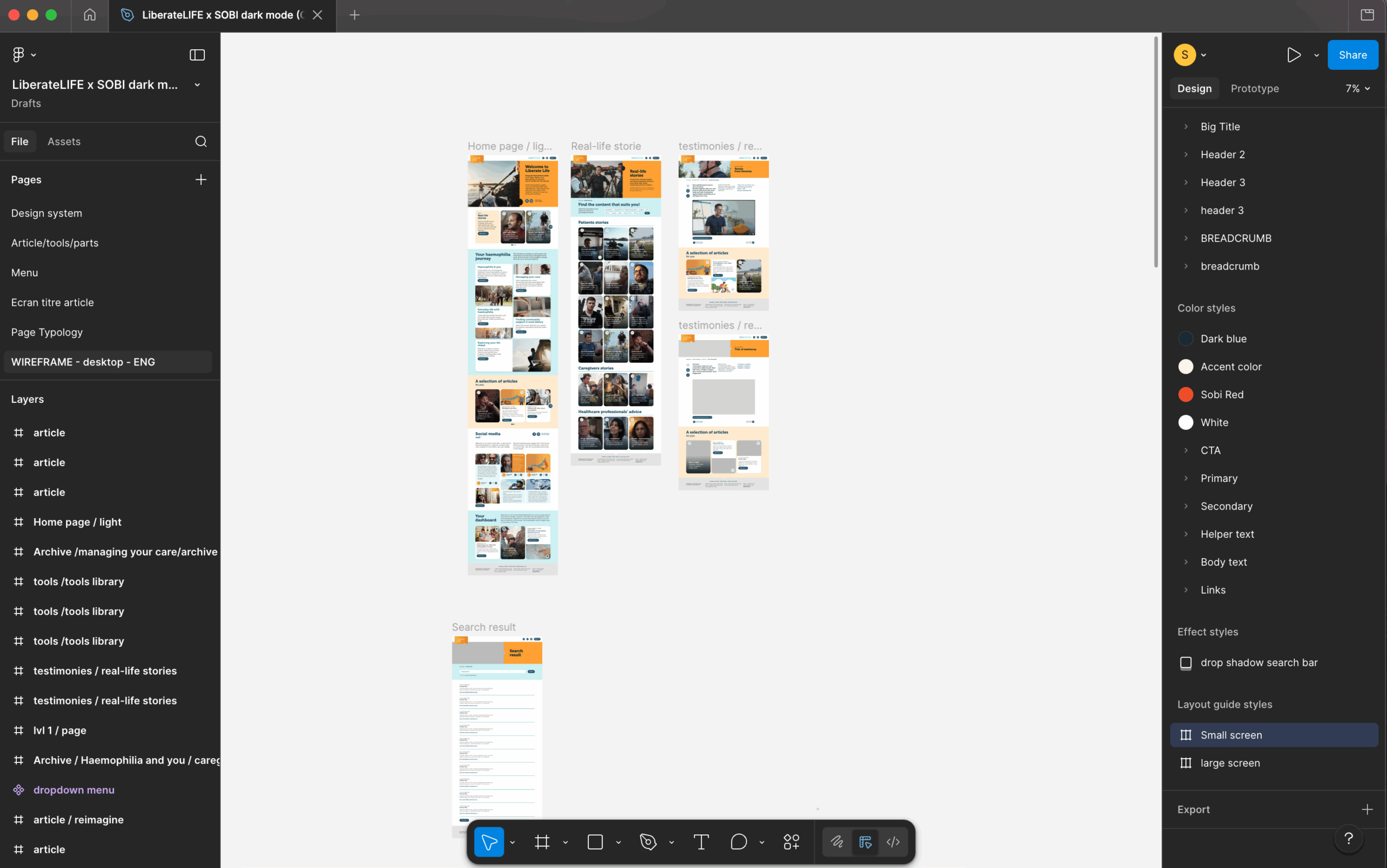
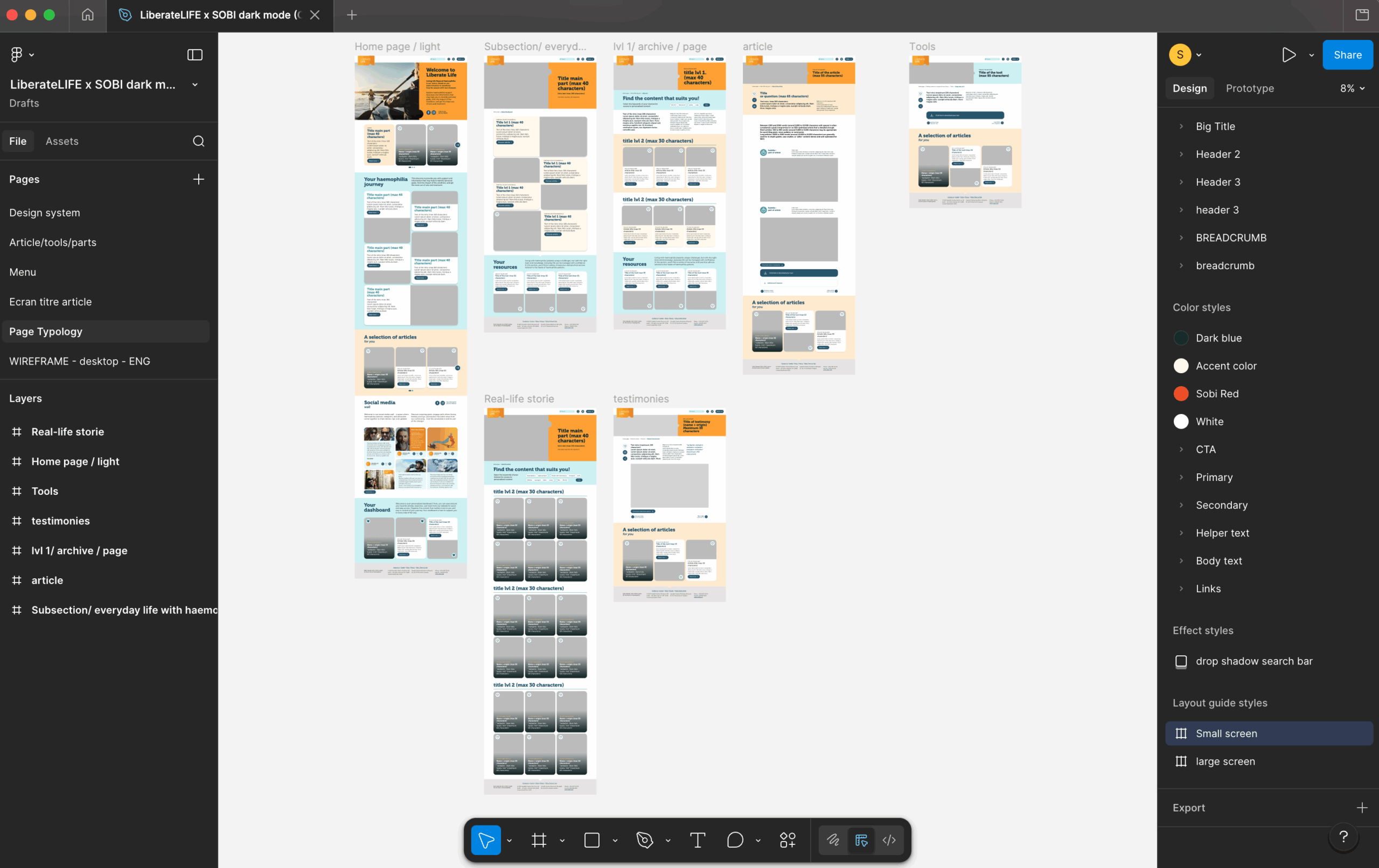
One of the key challenges of the redesign was to clearly differentiate the main types of content available on the platform. Users needed to quickly identify whether they were reading editorial information, accessing a practical resource, or discovering a personal experience.
To address this, we defined a clear content architecture based on three core formats:
-
Articles provide structured and educational information on specific topics related to haemophilia. They combine text, visuals and sometimes embedded resources to explore a subject in depth.
-
Tools are practical resources designed to support patients in their daily lives, such as podcasts, videos or downloadable materials that can be easily accessed and reused.
-
Testimonials bring the human dimension to the platform, sharing real-life experiences from patients, caregivers or healthcare professionals, and offering inspiration and representation for the community.
This distinction was reinforced through dedicated templates, colour coding and visual markers, ensuring that users could immediately recognise the nature and purpose of each content type.
Beyond individual pieces of content, landing pages were designed as navigation hubs, organising articles, tools and testimonials around key themes and guiding users toward relevant resources.
The project was built on old Sobi’s digital brand guidelines. I adapted the color palette to introduce more warmth and reduce the institutional feel, creating a more approachable experience for patients. The digital brand system has since been further redesigned at the end of 2025.
To ensure consistency and scalability, I also developed a comprehensive content guide for international teams, explaining the logic behind the content types, their templates and their editorial usage. This guide was accompanied by a 2-hour international training workshop, enabling teams and content agencies to confidently update and maintain the platform over time.