
Empowering prostate
cancer patients
through accessible design
artistic direction – illustration – graphic design – information design
Empowering prostate
cancer patients
through accessible
and modern design
Date
– 2024
Client
– Janssen / Johnson&Johnson
Role
– artistic direction
– illustration
– graphic design
– edition
– information design
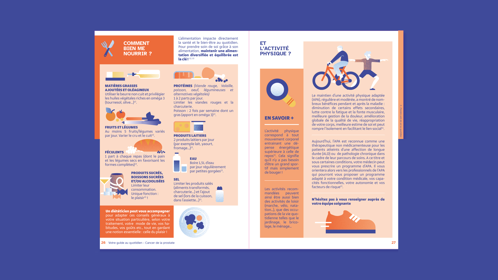
In a competitive landscape where numerous tools exist for prostate cancer patients, my challenge was to reimagine a five-year-old brochure and make it more impactful, inclusive, and relevant. To achieve this, I partnered with Vivio (part of the Vivactis Group), specialists in patient-focused visual education, and collaborated closely with an Advanced Practice Nurse (APN) specialising in oncology. Our approach addressed three key priorities:
-
Modernising the graphic design to stand out from existing materials.
-
Enhancing accessibility for patients with visual or motor impairments.
-
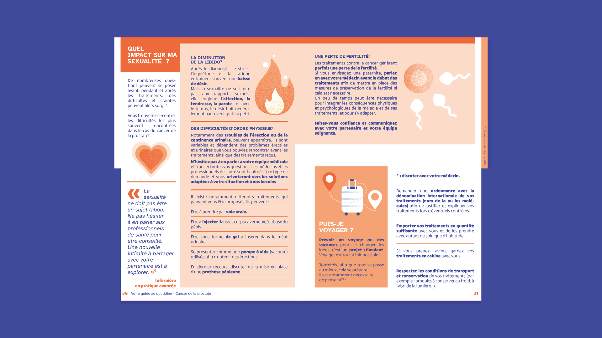
Updating the content with new sections on stress management, fatigue, and practical day-to-day advice.
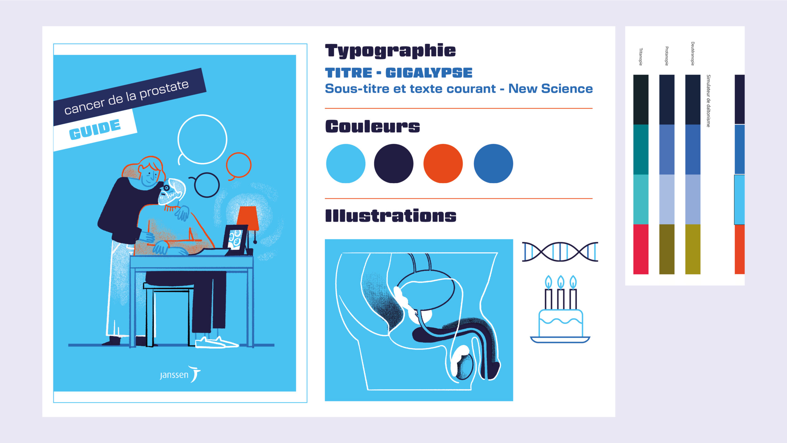
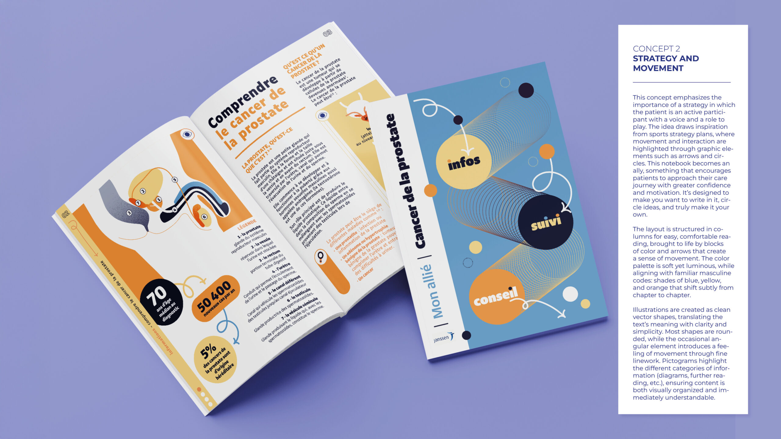
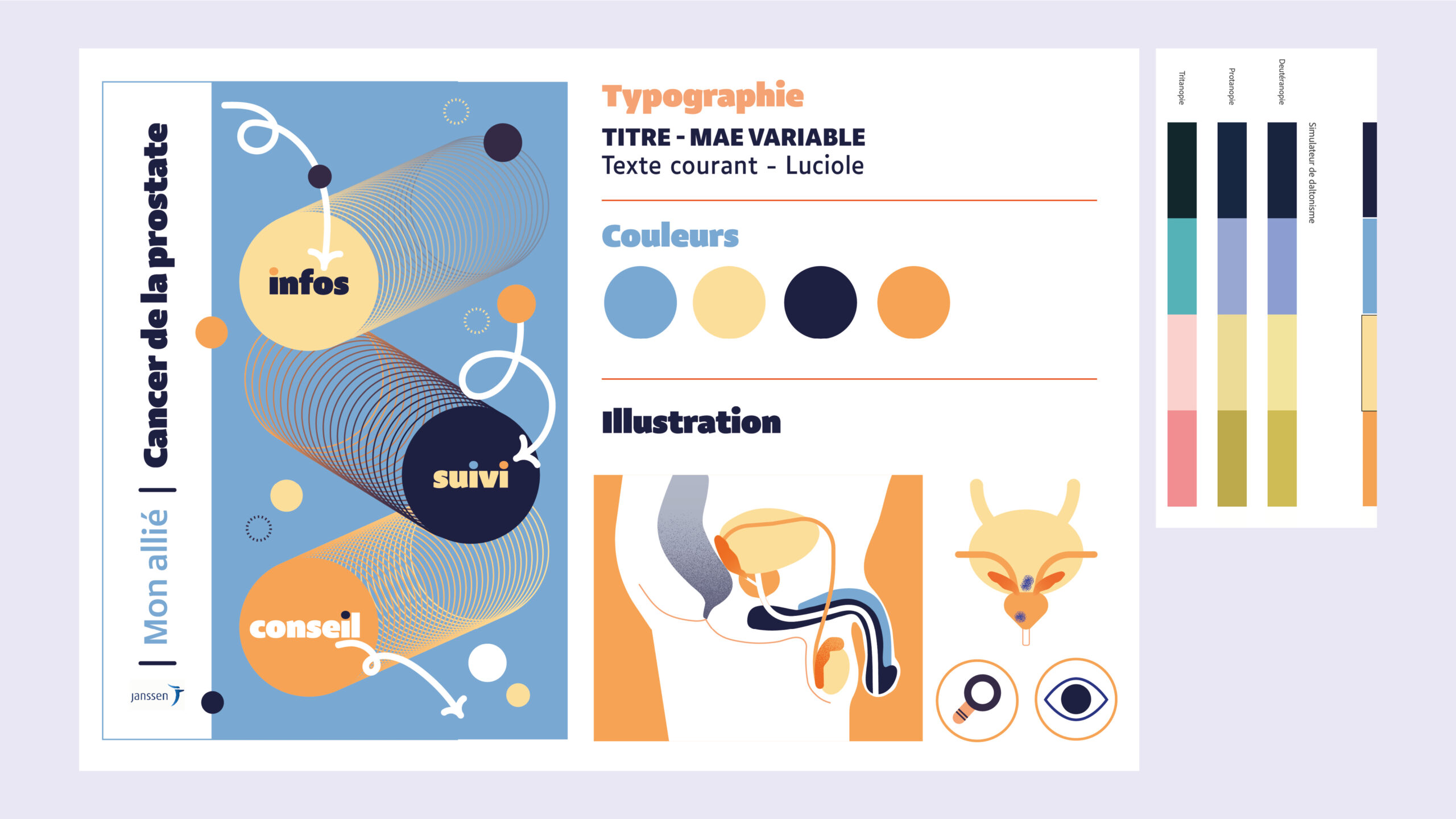
Graphic Direction: From Bold to Consensus
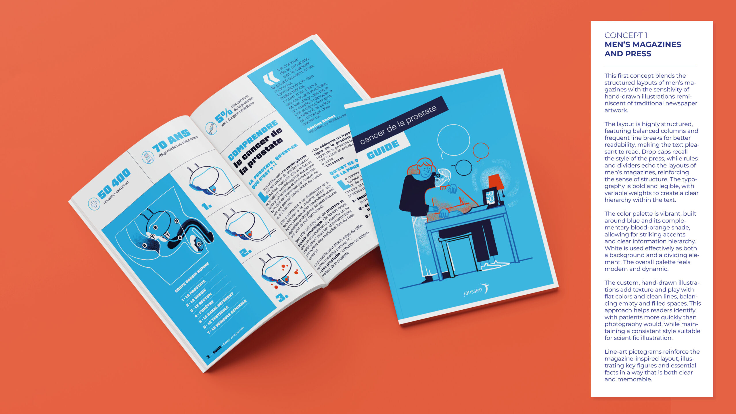
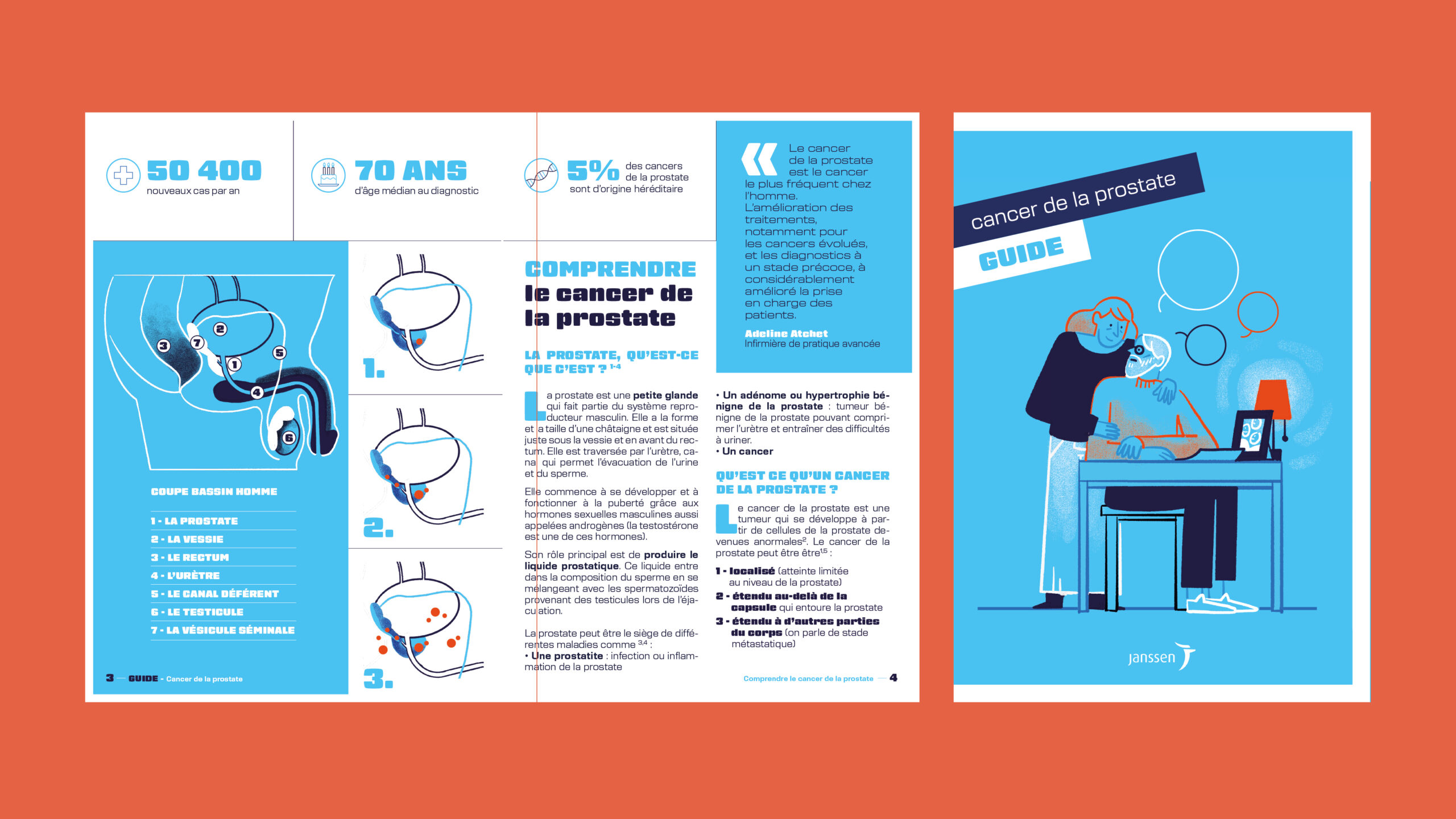
I developed three distinct graphic concepts to better address patient needs and bridge gaps found in existing prostate cancer patient booklets.
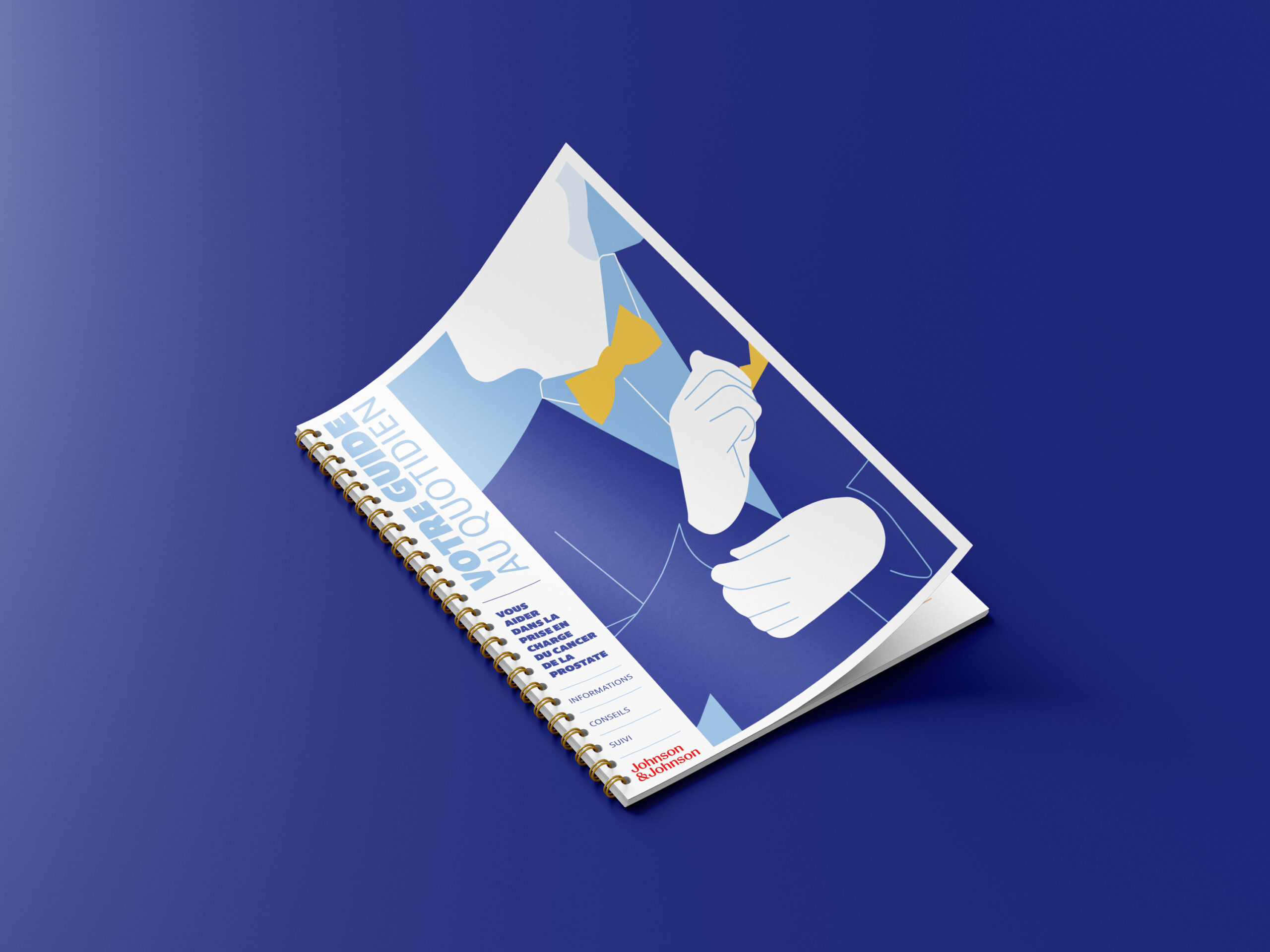
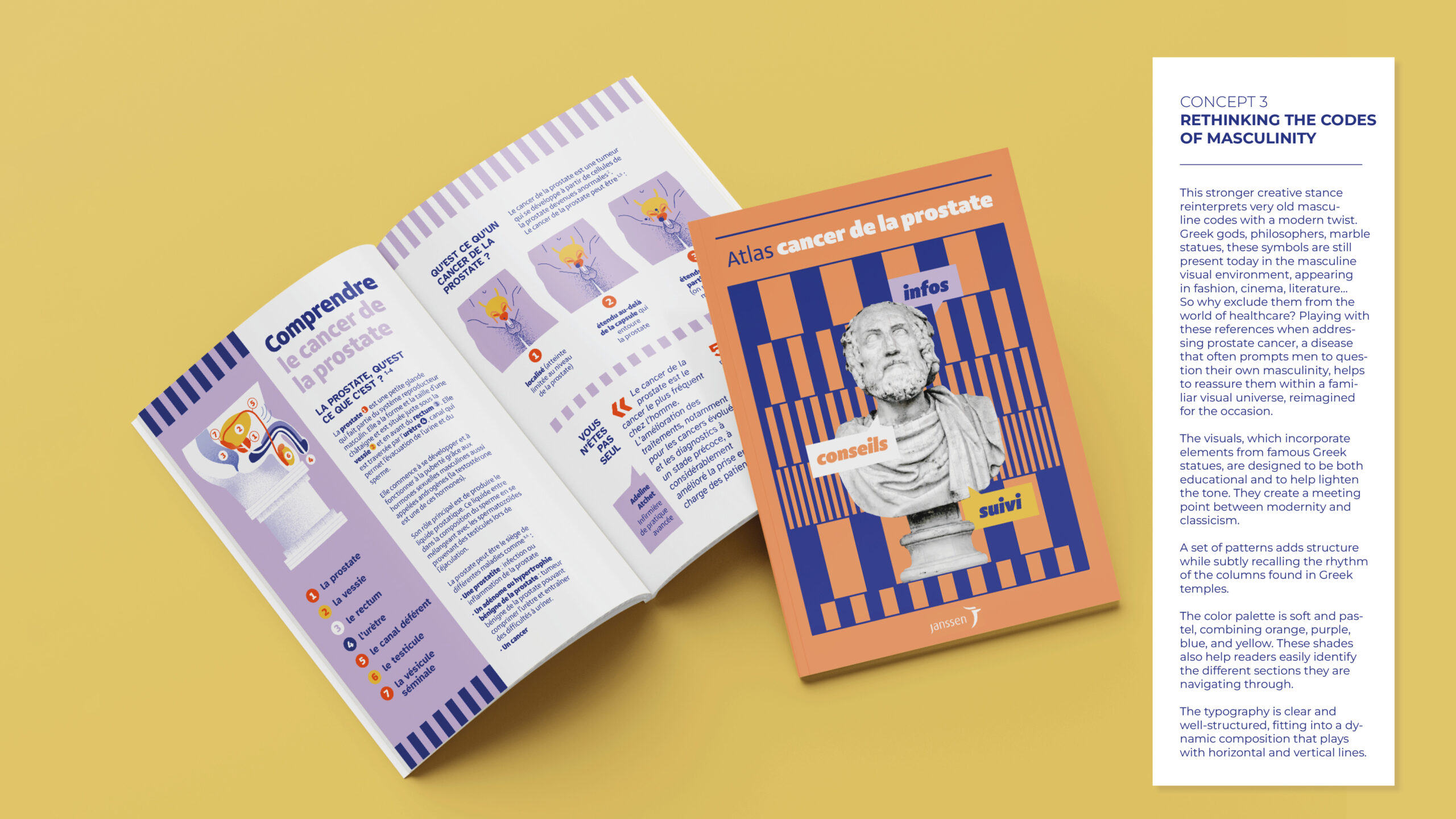
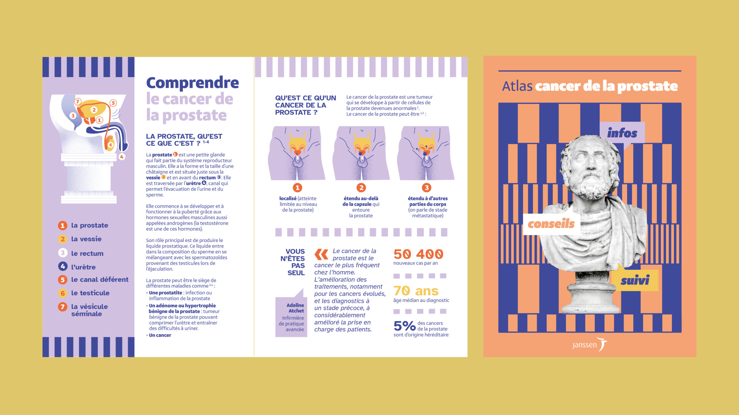
Selected for its bold vision, my visual concept, “Rethinking the Codes of Masculinity,” reimagined classic masculine symbols, like Greek statues and philosophical motifs, through a contemporary design lens to evoke both reassurance and familiarity.
At the client’s request, the concept was refined by removing mythological elements while preserving a clean, structured, and empathetic aesthetic.

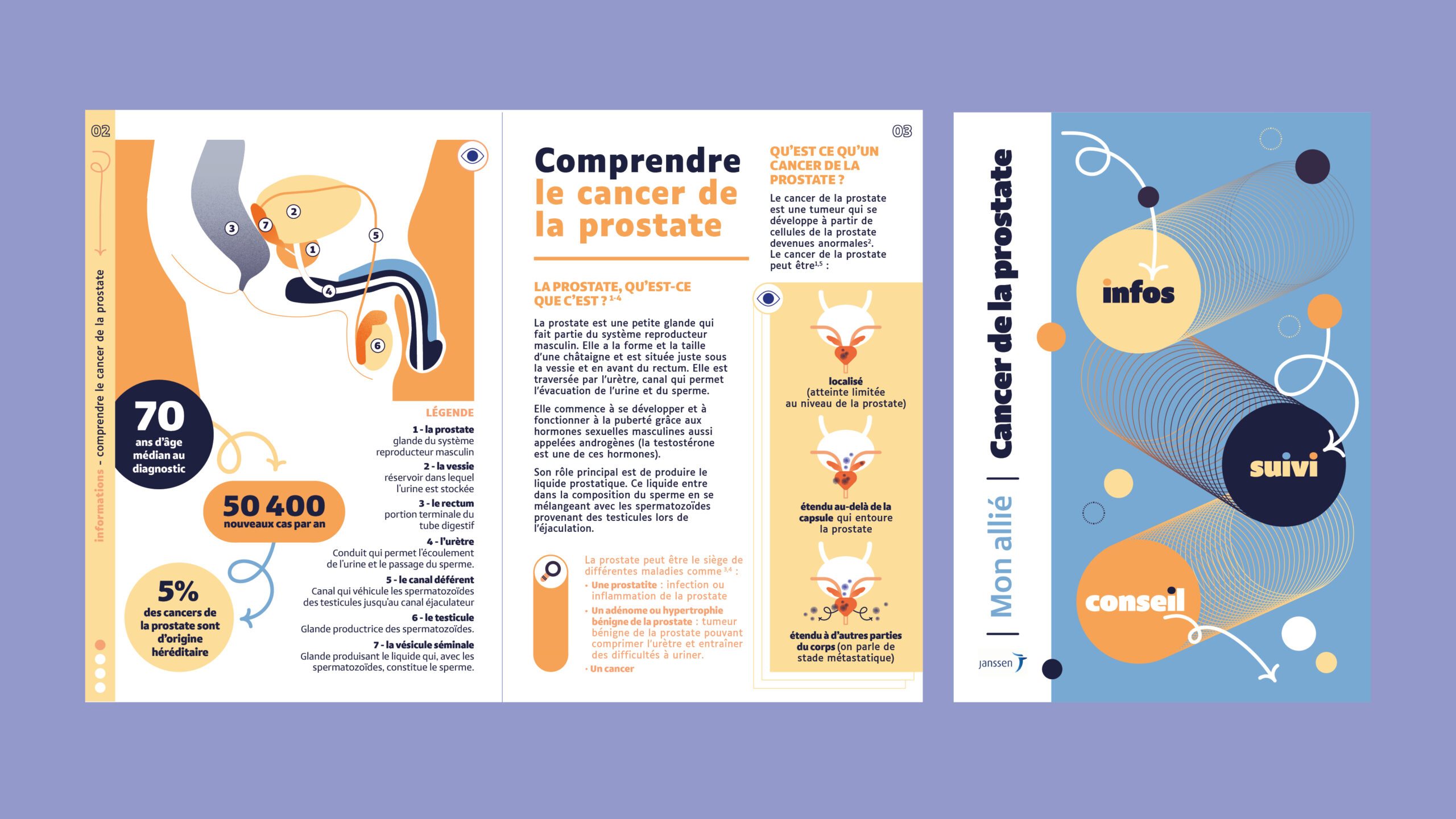
A Co-Creation Process for Accuracy and Empathy
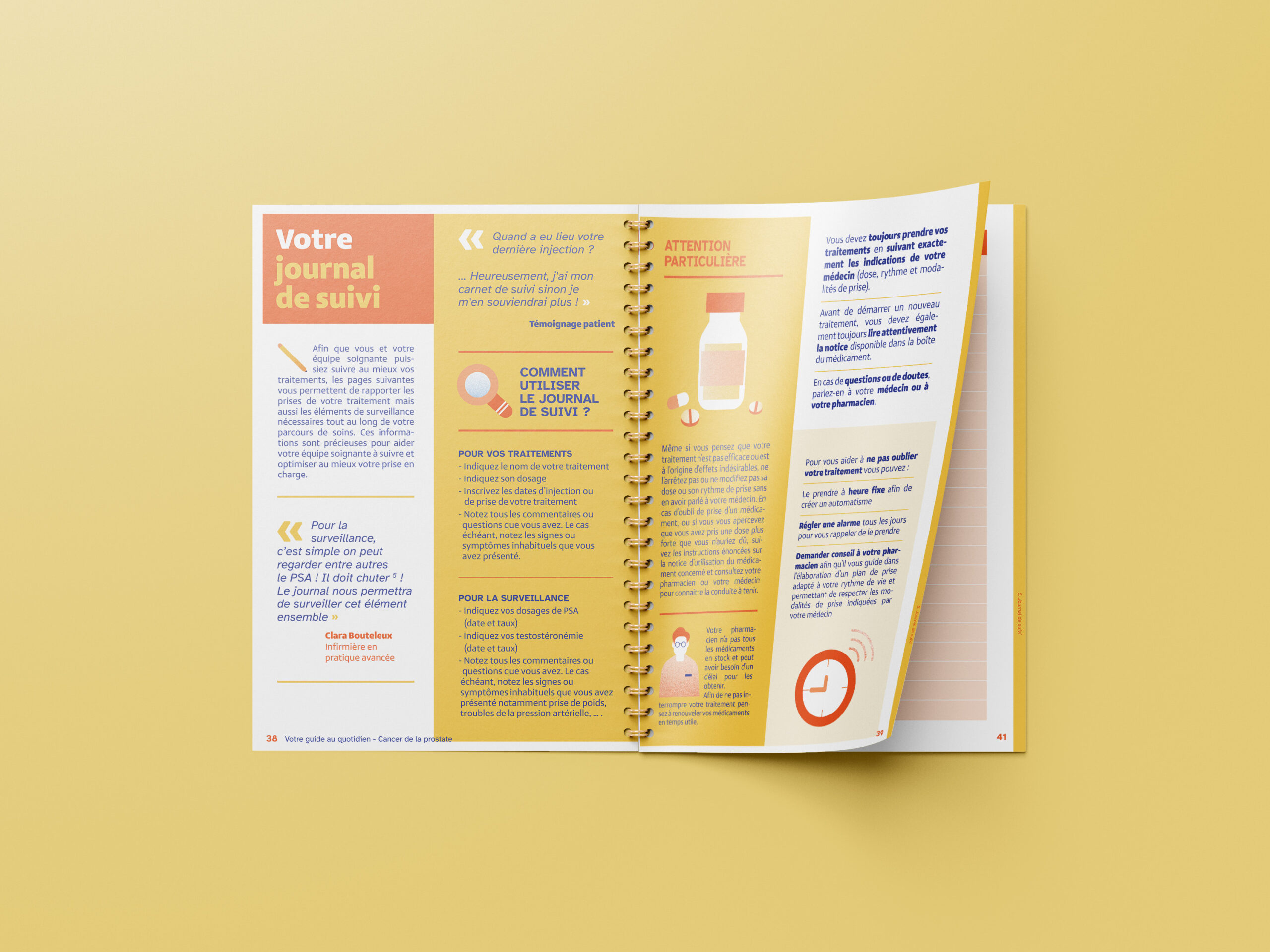
Working in a designer–medical copywriter duo (with Alice Marceau) ensured the scientific content was accurate yet approachable. This partnership transformed complex knowledge into practical, actionable information. The APN’s expertise (Clara Bouteleux) brought sharp insight into treatment updates, infographics necessary for patients’ clear understanding and enriched the text with expert verbatims to answer frequent patient questions.


Accessible by Design
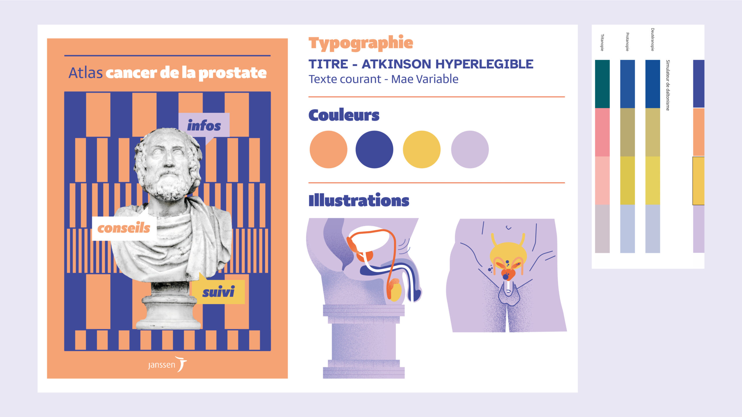
Accessibility was at the heart of the redesign. We selected inclusive typefaces, high-contrast colour palettes, and visually comfortable layouts. The A4 matte format reduced glare, while short line lengths and clear text hierarchies minimised eye strain. The graphic system used soft pastels to differentiate sections, combined with a dynamic grid of vertical and horizontal alignments.


Human-Centred Content Structure
The new table of contents guides patients through each stage of their care and life journey, reinforcing therapeutic alliance and fostering empowerment. Additional elements such as decision-making tools, communication tips, and homecoming preparation checklists help patients feel supported both clinically and emotionally.
