Celtic Interconnector:
Branding Europe’s first
France–Ireland power link
artistic direction – graphic design – illustration – information design – edition
Celtic Interconnector:
Visual identity design for
the first France–Ireland
electricity link
Date
– 2023
Client
– Sennse
– RTE
Role
– artistic direction
– graphic design
– illustration
– information design
Project overview
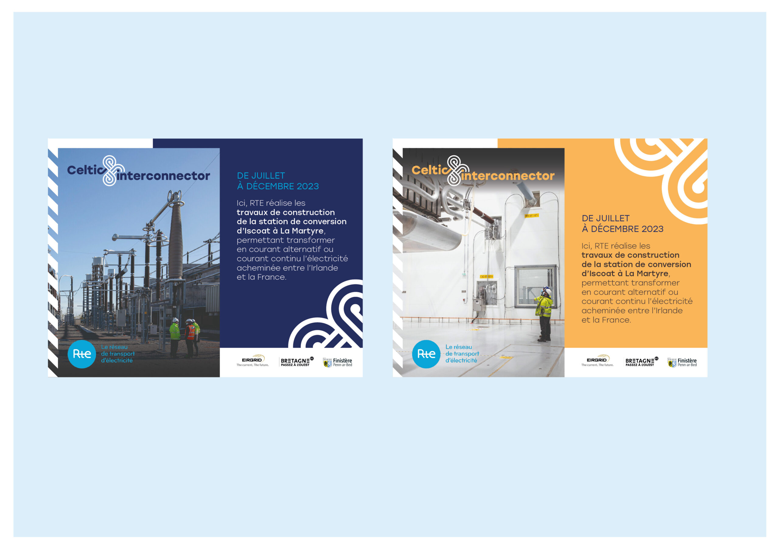
As part of the communication strategy for the Celtic Interconnector, the first electricity link between France and Ireland, I was responsible for designing a comprehensive visual identity and a full suite of communication tools tailored to the project’s values: territorial anchoring, human connection, and technical transparency.
Led by RTE (France) and EirGrid (Ireland), the Celtic Interconnector is a 575 km high-voltage link that will facilitate electricity exchange between the two countries. Recognised as a Project of Common Interest (PCI) by the European Union, it plays a key role in the energy transition, contributing to a low-carbon, secure, and affordable energy future.
Design intentions
The communication system had to address several goals:
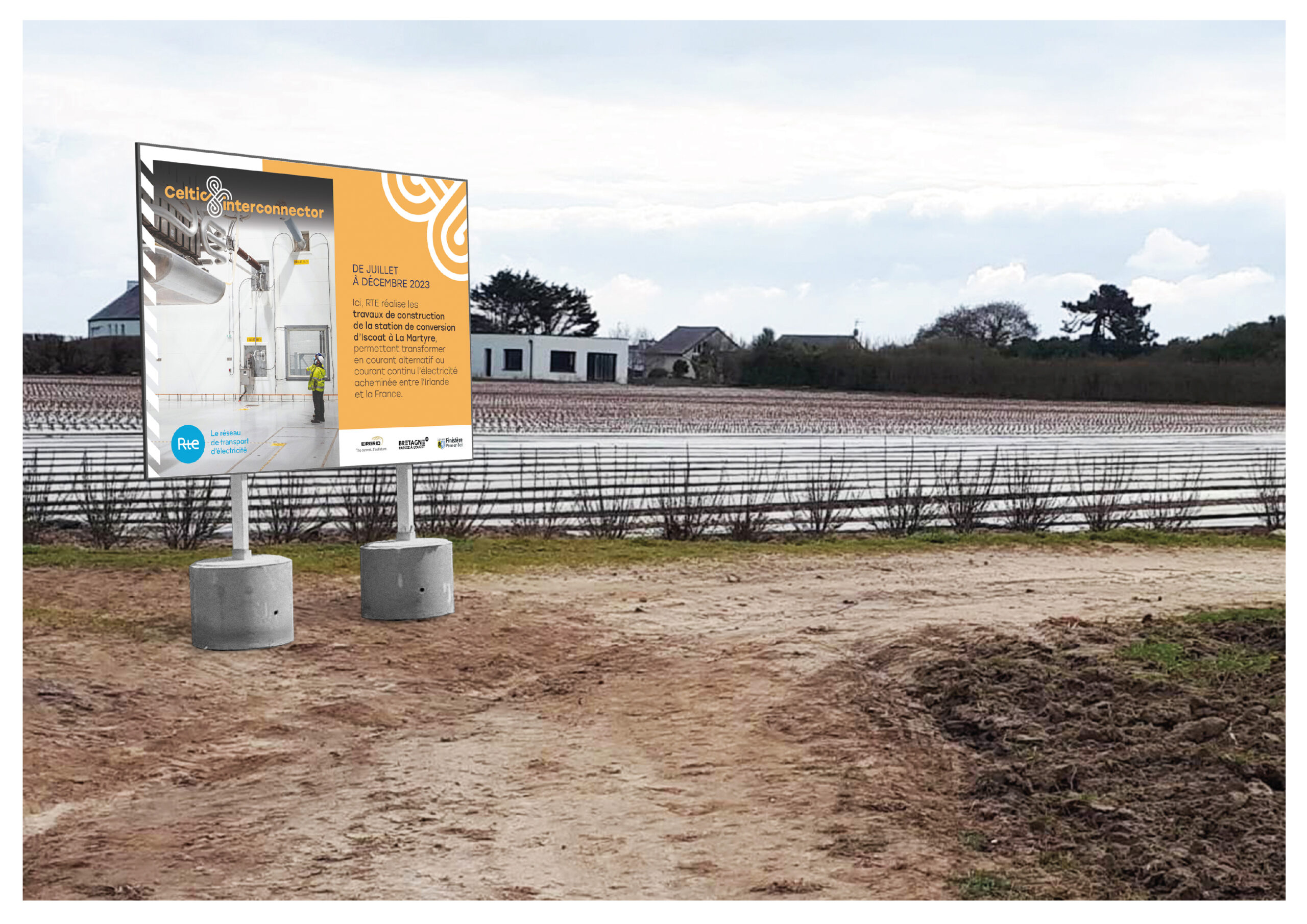
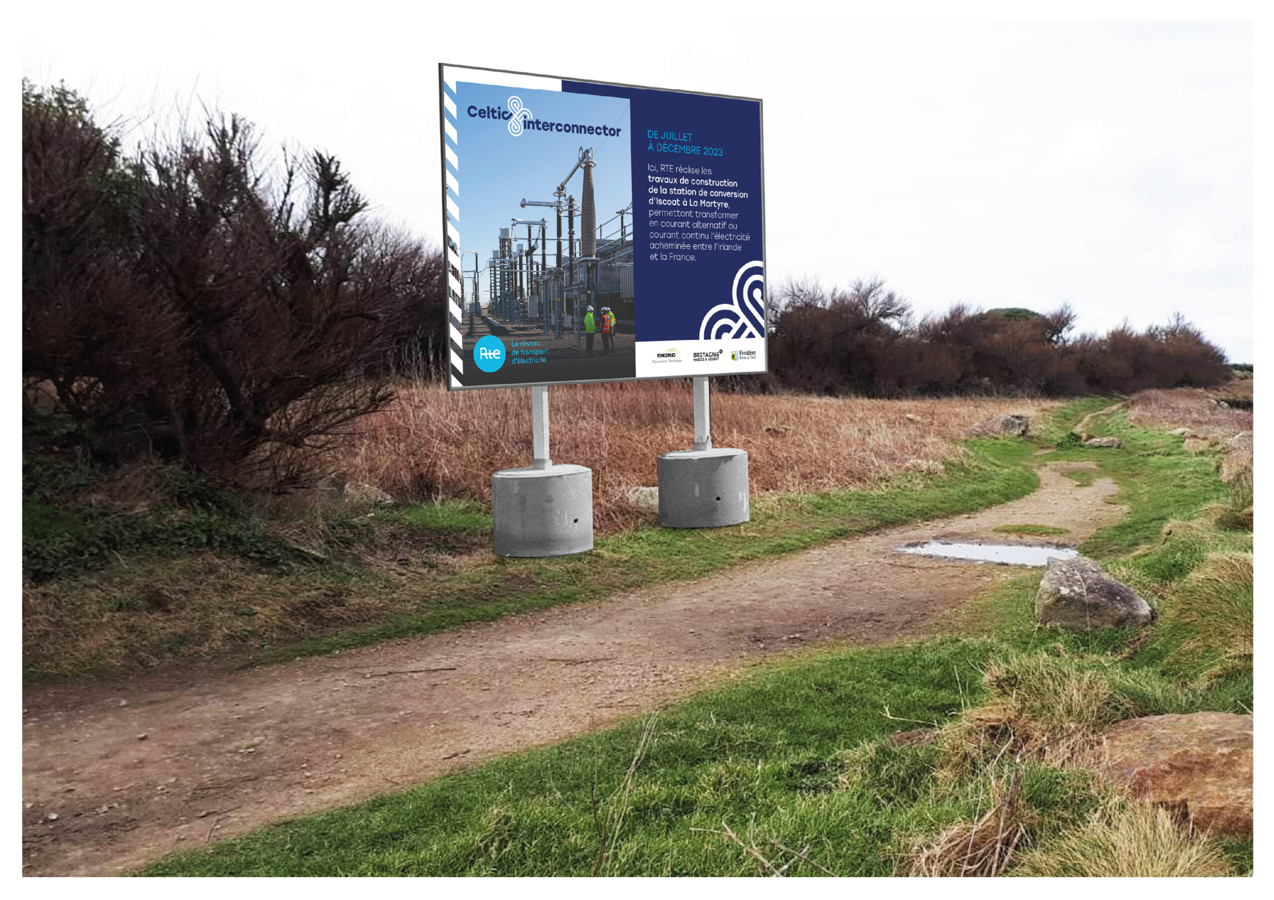
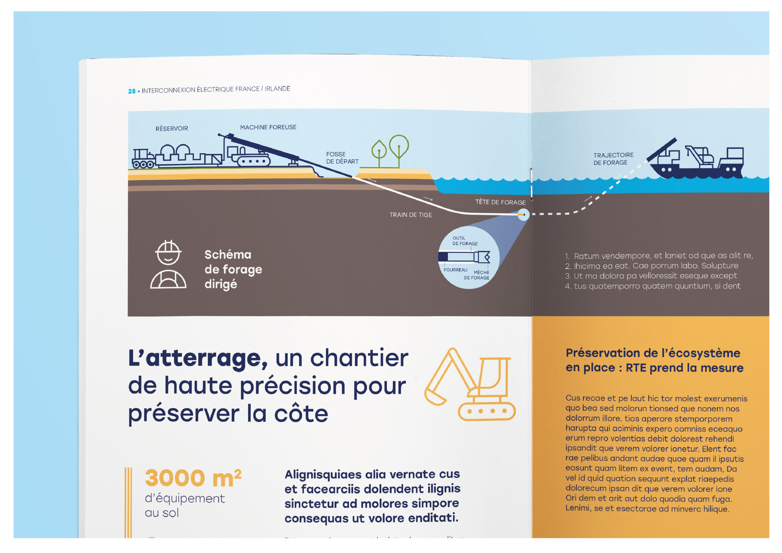
It needed to clearly explain complex technical processes in an accessible and engaging way, reflect the cultural heritage of both Ireland and France, emphasize the people behind the infrastructure, particularly those working on-site, and remain highly modular, so it could be deployed across various channels, including print, digital, exhibitions, construction signage, and social media.


A visual langage rooted in territory
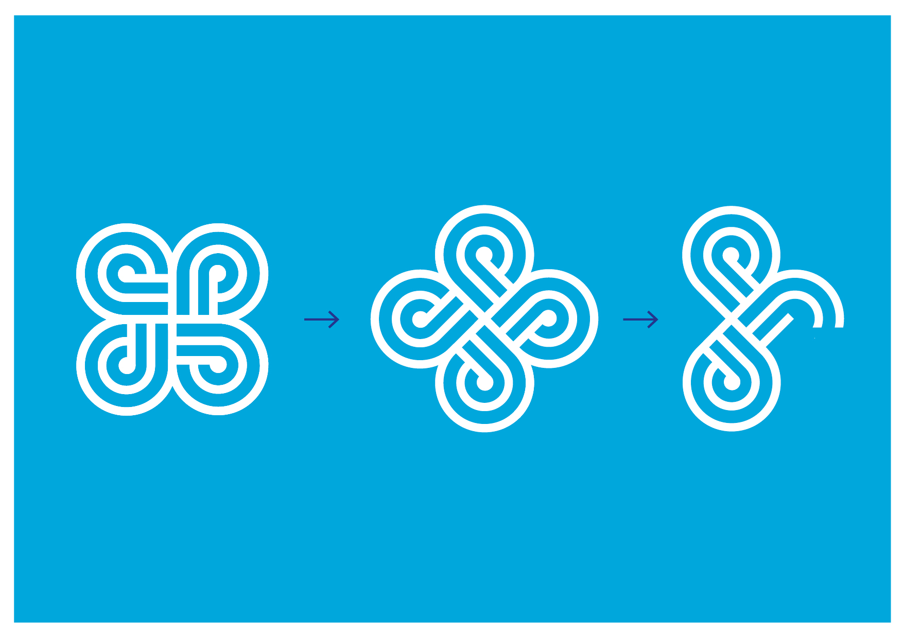
The graphic identity draws inspiration from the shared Celtic heritage of Ireland and Brittany, expressed through a dynamic visual language that evokes energy flow, continuity, and cooperation.
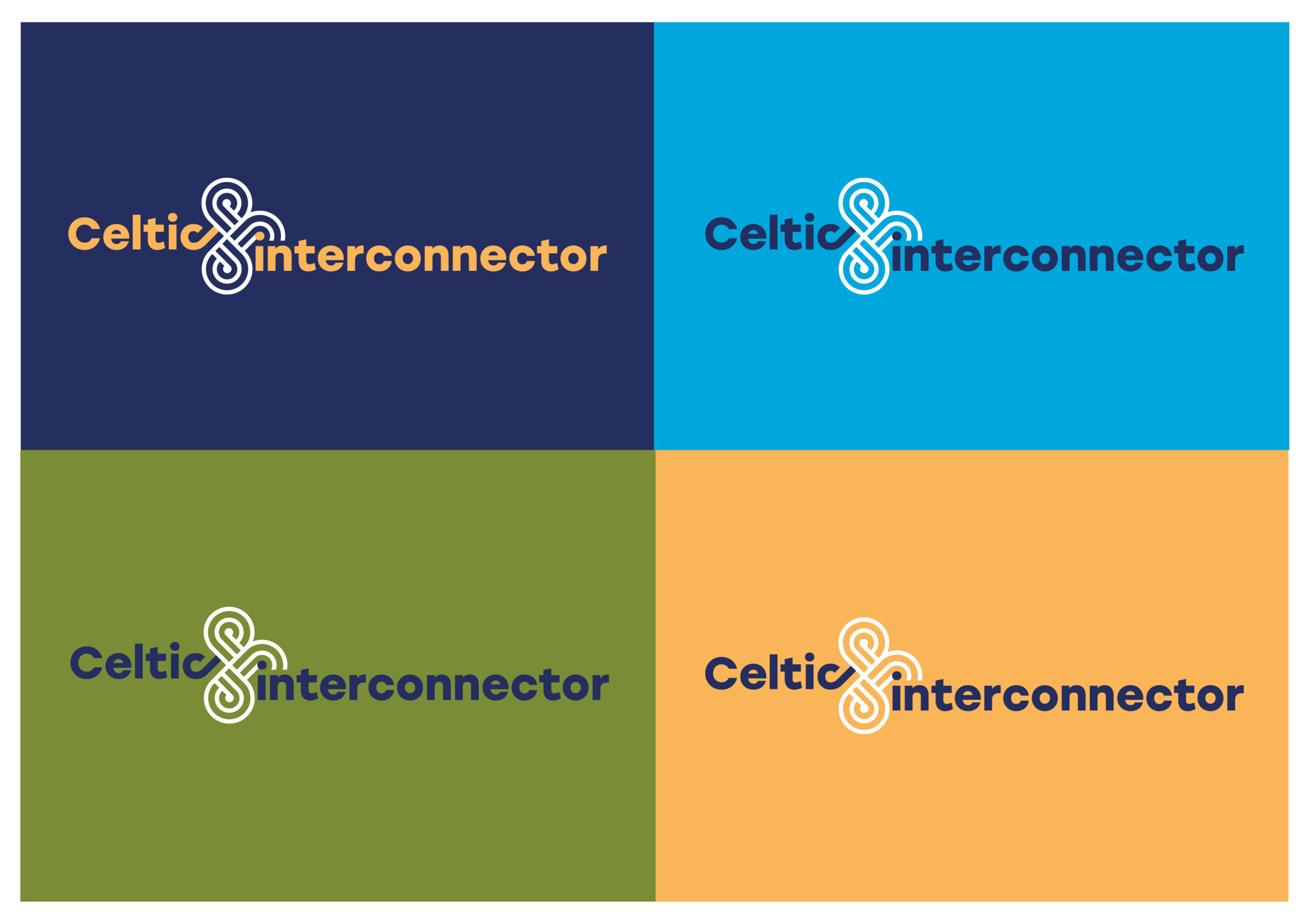
The color palette combines RTE’s blue with EirGrid’s warm gold, extended by natural tones inspired by the local environment, sea, rock, and farmland, to reflect the landscape crossed by the interconnector.
A custom motif referencing Celtic knots and electrical circuits was developed as the foundation of the graphic system, supporting wayfinding, infographics, and layout. The typographic choice, Stolzl, a geometric sans-serif font with soft curves, brings a sense of clarity and humanism to all textual content.
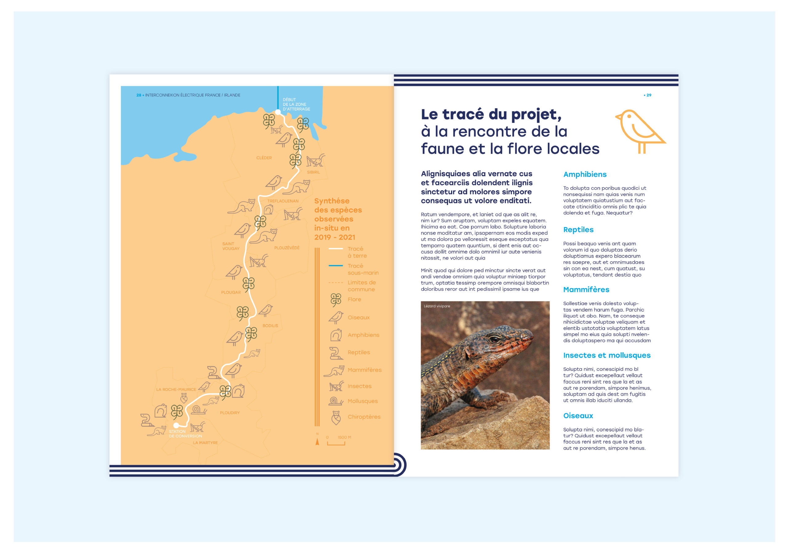
Visual storytelling through photography and pictograms
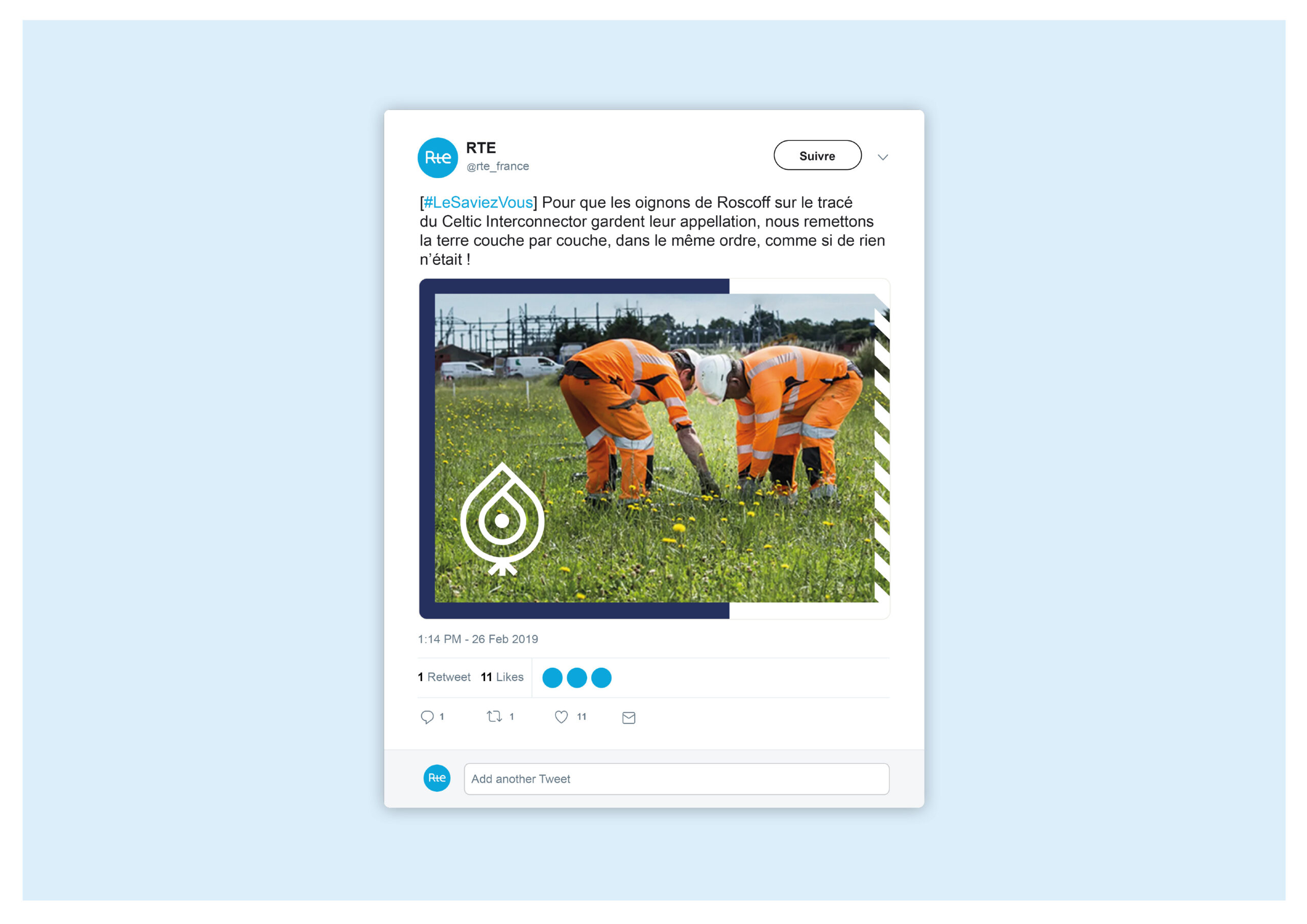
To reinforce the human dimension of this major infrastructure project, photography plays a central role in the visual identity. The images highlight the people behind the interconnector, engineers, technicians, site workers, and local residents, turning a highly technical project into a tangible, relatable human story. By making the invisible visible, this narrative approach fosters empathy and helps build trust with the communities impacted by the construction.
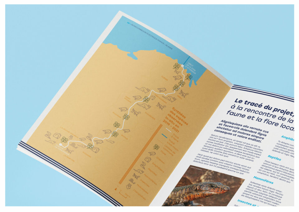
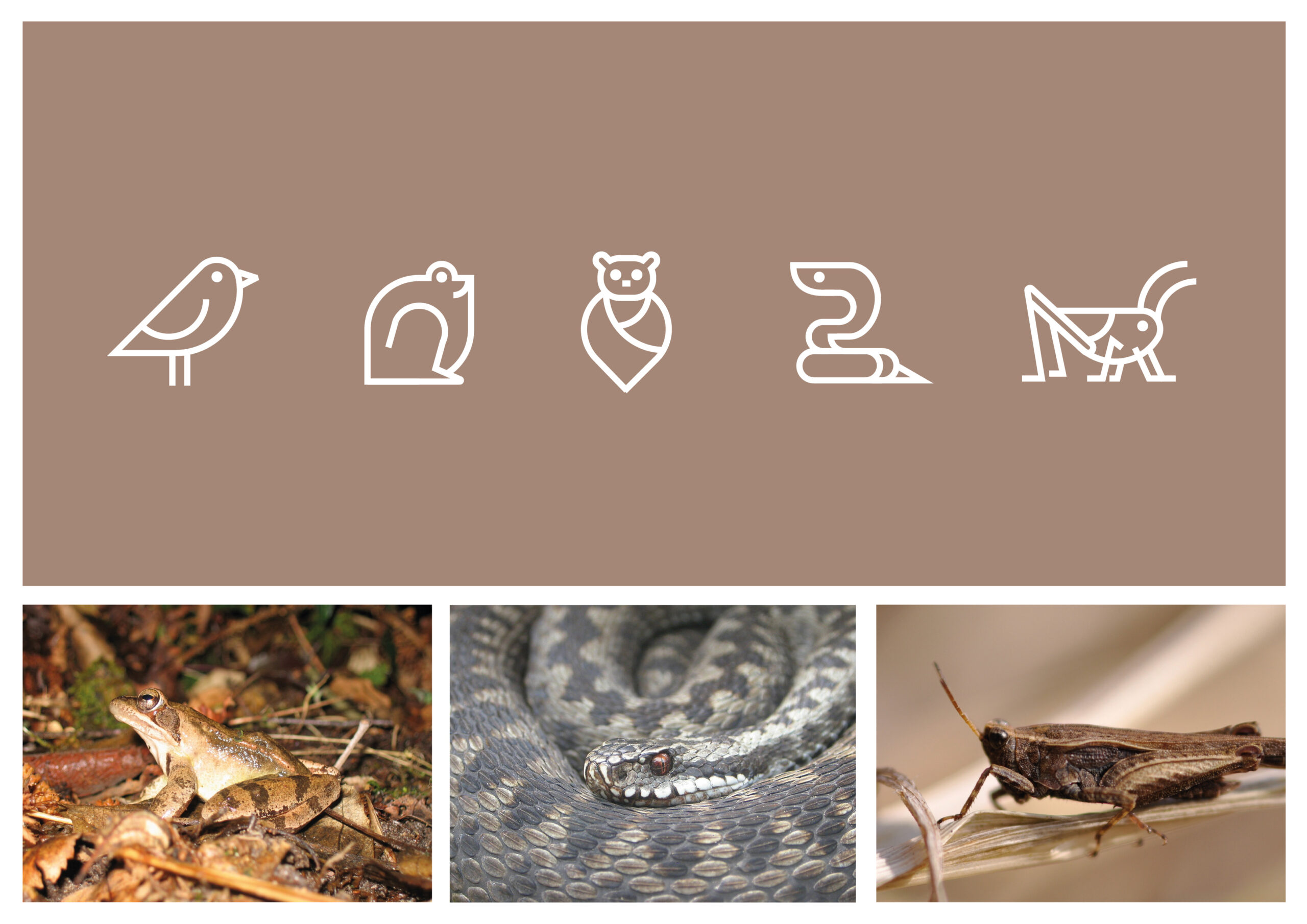
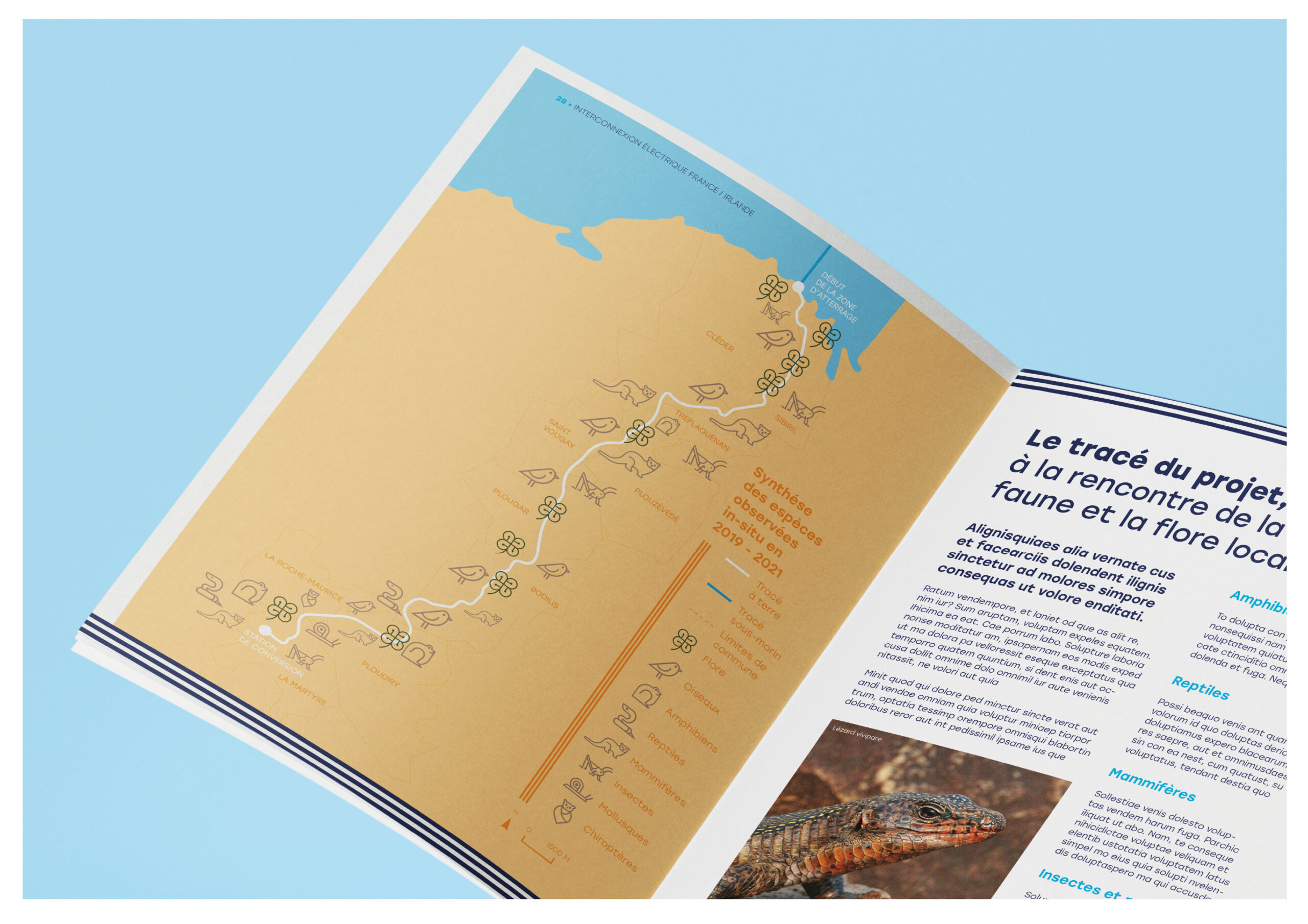
In parallel, we developed a bespoke system of pictograms to further support clarity and understanding. These custom-designed icons reflect the specific environments, themes, and functions linked to the project, such as renewable energy, engineering processes, environmental protection, or local geography. Stylistically, the pictograms draw inspiration from the Celtic visual language used in the logomark, ensuring aesthetic consistency across all materials. Modular and scalable, this system enhances both printed and digital formats, helping to simplify complex information and guide users intuitively through the content.
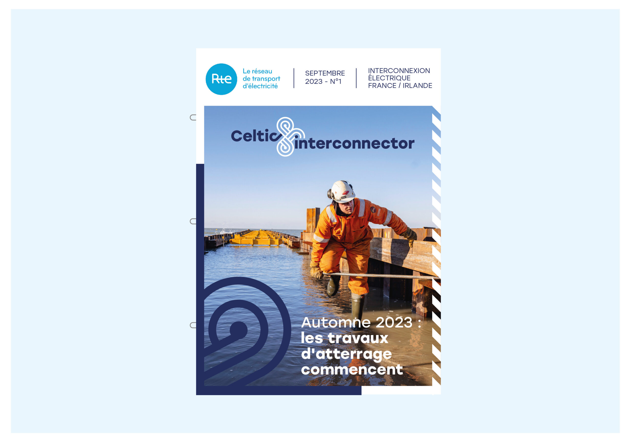
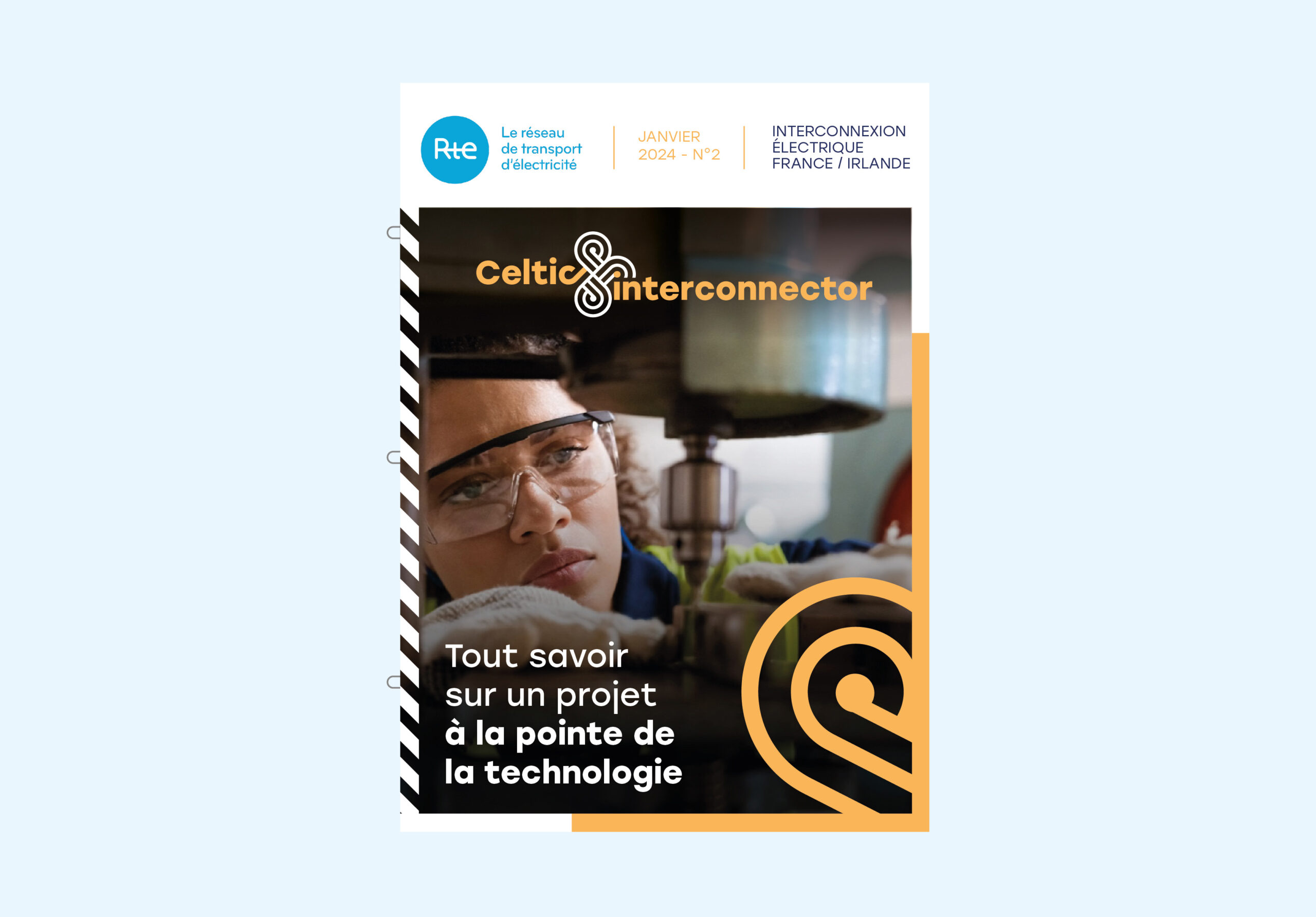
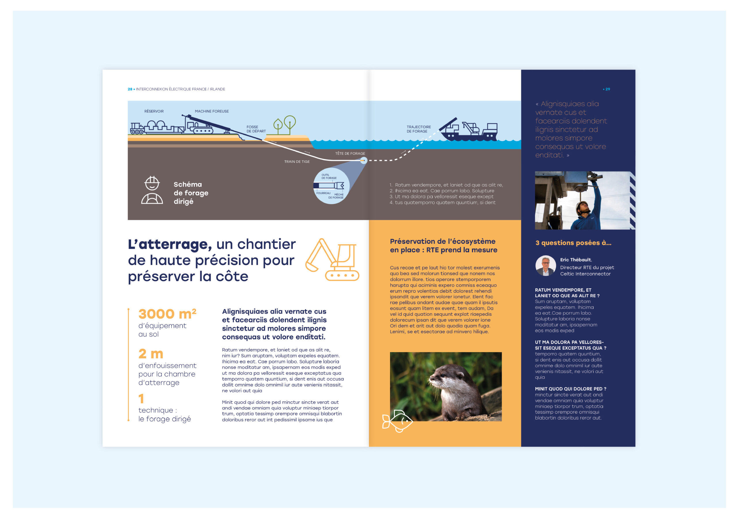
A first iteration of a co-created identity
The visual identity presented here is the first version developed as part of a successful competitive pitch with Sennse Agency. It served as a creative foundation to signal the project’s entry into its construction phase. This initial proposal will be further refined in collaboration with the project team, allowing space for adaptation based on operational needs, technical constraints, and collective input. This co-construction process is key to ensuring that the final identity remains both coherent and meaningful for all stakeholders.
